Code4Lib North 2011
Last month I was down at McMaster University Libraries in Hamilton for the second Code4Lib North get-together. My thanks to Nick Ruest (ruebot on Identi.ca) and John Fink (adr on Identi.ca) for organizing it, and to everyone else who helped. It was a great success, really well run, generously provided for, with a top-notch bunch of people in attendance. On top of that, the room that was perfectly suited to the hackfest and the talks, with a big multiple flat-panel wall, lots of pods of computers, comfy chairs, room to move around — just the kind of space you want when geeks are hanging out for two days, hacking and talking.
As usual at Code4Lib events, there were some twenty-minute talks and some five-minute talks. They were all so good that through the day I hardly looked at my computer. I was so engrossed in what was going on my attention was completely focused. When I did grab my computer it was to do something like download Google Refine or Dan Cohen’s Million Syllabi because of something someone had said that made me think — like so many things people said that day — I want to try that!
There were too many people there to mention, old chums and new acquaintances, and I look forward to seeing them all again. The conversation and lunches and dinners were, of course, one of the best parts of it all. Code4Lib is a great bunch of people.
All of the talks were videotaped, and Nick Ruest put all the Code4Lib North slides and videos up in McMaster’s institutional repository. Another indication of how well the event was run.
I gave a talk called “Getting Started with R.” I posted some links to get anyone started with R. Here’s my talk, though I warn you it turned out rather dark and I wasn’t speaking into the microphone so I’m hard to hear. That thing running on the screens is RStudio, which is an incredible application, so if you do nothing other than consider downloading it and trying it out, I’ll be happy.
(As an aside, today I heard (through some blog post or tweet I can’t find now, merely hours later) of Conway’s Law: “organizations which design systems … are constrained to produce designs which are copies of the communication structures of these organizations.” True where I work, true at McMaster, true at all academic libraries whose home pages are divided into four quadrants. What about Code4Lib, though? It’s a decentralized co-operative structure of volunteering library geeks who do what they do for sheer love of their jobs and vocations. How does that structure affect the designs?)
Best Library Conference Talks of the Year 2011, with Steve Buscemi and Kate Winslet
Next month Adam Taves and I are doing a performance at Strange Bedfellows: IT and Reference Collaborations to Enhance User Experiences, a workshop run by RUSA, the Reference and User Services Association, the day before the huge American Library Association annual conference begins in New Orleans. It looks like the others there are a fine bunch of people and we hope it’ll be a great day.
Now, what we’re doing is an updated version of a staged reading we did at Access in Winnipeg in October last year: After Launching Search and Discovery, Who Is Mission Control? The audio recording, the accompanying slides, and the script for it are all available online under a Creative Commons license that allows anyone to perform the work on their own. You could perform it where you are! Or … you could hire professional actors to do it.
The other day I was chatting with my fellow librarian Timothy Bristow, and we riffed on this and came up with an idea. Find the best conference talks of the year that are under CC licences. Get the scripts or notes, or transcribe the talk if you need to. Hire professional actors to perform the talks. Call it “Best Library Conference Talks of the Year 2011.” Do it all in one day, single track, in a professional theatre with good seats and proper lighting and sound.
The talks that would benefit the most would be the ones where the content was great but the performance wasn’t. Have you ever seen a talk where you knew the material was interesting but the speaker had no stage presence, spoke in a dull monotone, and sent you to sleep? Imagine if Sigourney Weaver was giving the talk! Or Michael Caine! Or — keeping our goals reasonable for the first year — some talented stage actors from whatever city the conference is in.
Even talks given by excellent speakers would probably benefit from a new staging with a new cast. I once was at an excellent talk about Blacklight by Bess Sadler, but as good as she is, I don’t think she’d object if Steve Buscemi or Kate Winslet (or both) took a go at it. Roy Tennant said in 2002 that MARC Must Die, but it’s still alive. Perhaps if Clint Eastwood said it, MARC really would be dead. “I know what you’re thinking. ‘Did he link to five URIs, or six?’ Well, to tell you the truth, in all this excitement, I’ve kind lost track myself. But being this is a Python script, the most powerful linked data library in the world, and would ingest your data completely, you’ve got to ask yourself one question: 'Do I feel lucky?’ Well, do you, punk?”
The conference in its first year would probably be heavy on scholarly communications, open access, and technology topics, three areas where speakers stand for what they believe and put their work under CC licenses. If the conference was a success, it’d drive more people to use open licenses for their talks, so that they could be considered. Everyone wins.
R links
Some R links for my Code4Lib North talk tomorrow, for those interested in trying it out:
- R
- RStudio, a great IDE that makes R easy and fun to use
- Get help with ?command
- An Introduction to R by WV Venables, DM Smith, and others
- R In a Nutshell: A Desktop Quick Reference by Joseph Adler, and R Cookbook by Paul Teetor, both from O'Reilly
- Lots of questions about R at Stack Overflow and when I search the web for how to do something I often end up there
- Inside R who did a recent post on How to Learn R
- Revolutions, from Revolution Analytics, who’ve built a business around R
- R-bloggers, an R planet
Jack Layton's face
I’m as amazed as any Canadian at the idea that the NDP might do better than the Liberals in the election on Monday and could form the official opposition or even lead a coalition government.
I had one encounter with Jack Layton, the leader of the NDP. Three or four years ago I was taking a taxi through downtown Toronto and cut west along Wellesley through Queen’s Park, a beautiful park in the centre of Toronto, the south end of which is home to the provincial legislature.
Some sort of event had been going on in the park that afternoon, and Layton was there. Now, evidently, it was over and he wanted to go home. He was near the street, chatting with someone, and saw my cab coming. He walked forward and held up his arm, his face illuminated with hope that this taxi would be the one to take him home after what had undoubtedly been a lengthy and tiring day. Suddenly, he saw that it was occupied, and instantly dejection flooded over his face. His face sank and he stood there downcast. I waved at him from the back seat. Elation! He beamed joyfully, a wide smile appearing from nowhere, his face now a picture of delight as he gave me a big thumbs up.
Hope, dejection, elation: all expressed in their truest, purest, absolutely unadulterated form on Jack Layton’s face, all in one second. I’ve never forgotten it.
Code4Lib++, or, Why I'm Still Going to McMaster Even Though Jeff Trzeciak Spreads Fear, Uncertainty and Doubt
I considered boycotting Code4Lib North because it’s happening at McMaster University, where Jeff Trzeciak is the University Librarian.
I decided against it. I’m going, and I’ll do what I can to help make it another great Code4Lib event, because Code4Lib stands against the fear, uncertainty and doubt that Trzeciak spreads.
Last week Trzeciak gave a talk called Transforming Traditional Organizations in which, among much else, he talks about how librarians shouldn’t be in supervisory positions and he doesn’t plan on hiring any more of them anyway. It’s been getting a lot of attention, and Jenica Rogers’s This is NOT the Future of Librarianship is a good post to start with if you’re looking for reactions. (See also Mita Williams’s Cassandra and the Future of Libraries Without Librarians, Karen Schneider’s Thoroughly Modern Karen: A Response to Jeff Trzeciak and Lane Wilkinson’s Shut Up, Jeff.)
don’t disagree with everything Trzeciak’s tried out at McMaster. He came with a much-needed fresh outlook and arranged for new positions that brought in some excellent people. He put in an Endeca-based catalogue, which was good, though it seemed like it was done as much for the prestige and newsworthiness of being the first academic library in Canada to do it as for the sake of having a better catalogue. He got the library involved in Second Life, which is something I was glad they were testing because I had absolutely no interest in it. It turned out to be a dud, but someone had to find that out. He’s changed how the reference desk works, which is something we all need to look at. I don’t think he went at it with the right approach, and it seems like it ended up worse than before, which I hope they can fix, but there’s nothing wrong with changing how the desk works.
What I do object to is the poisonous atmosphere of anxiety, worry, and fear that Trzeciak has brought to Mac. He fired two librarians in 2009 and is now getting rid of five more through “voluntary separations” (early retirements, I think). “Involuntary separations” (firings) might follow. In 2010 McMaster librarians unionized and formed the McMaster University Academic Librarians’ Association. MUALA recently finished bargaining their first agreement, but I don’t know the details and I don’t know how much defense they have against cuts initiated for “budgetary” reasons. (Other Canadian librarian unions and associations need to get involved with what’s going on at Mac.)
I’m acquainted with some McMaster librarians. All the ones I’ve met are good. They don’t talk much in public about what it’s like to work there. I wish they would. The more the rest of us know, the better.
Two very good McMaster librarians, Nick Ruest (who just said I may work at an institution with arguably the worst morale among librarians in Canada, but I love my job) and John Fink, organized the second Code4Lib North chapter meeting for 5-6 May 2011. Forty or fifty library and archives geeks are going to get together for a hackfest and an informal, self-run conference.
Here’s what Code4Lib is about:
code4lib isn’t entirely about code or libraries. It is a volunteer-driven collective of hackers, designers, architects, curators, catalogers, artists and instigators from around the world, who largely work for and with libraries, archives and museums on technology “stuff.” It started in the fall of 2003 as a mailing list when a group of library programmers decided to create an overarching community agnostic towards any particular language or technology.
… Things get done because people share ideas, step up to lead, and work together, not because anyone is in charge. We prefer to make community decisions by holding open votes, e.g. on who gets to present at our conferences, where to host them, etc. If you’ve got an idea or an itch to scratch, please join in; we welcome your participation!
Code4Lib is friendly, open, supportive, helpful and welcoming. Code4Lib is a good time. It’s a loose, baggy community of people (with library degrees or not) who love hacking on library and archives stuff, making information and knowledge available for free, sharing what they’ve done, improving what someone else has done, and giving others a helping hand.
Code4Lib is what Trzeciak isn’t. When I go down to Mac I’ll bring as much Code4Lib spirit as I can. If you can make it then I hope you’ll come too. We’ll hack on stuff, show each other things, go to the pub, have a great time, and cheer up our McMaster friends and colleagues. Thanks to Nick and John for organizing it. I’ll see you there.
Using R on some ARL statistics
The Association of Research Libraries records a lot of statistics every year from its member libraries and makes them available in machine-readable format (CSV files). A Guide to the Machine-Readable Version of the ARL Statistics explains all about the numbers. With all of that we’re armed with a nice big set of data about ARL members, the libraries of the research universities in North America (see Principles of Membership for more).
To have a bit of fun and learn more about R I decided to use lattice graphics to compare ratios at Canadian university libraries. Here’s what I did.
Before anything else, I had to clean up the ARL data to put it all into one big valid CSV file. I wrote a Ruby script to remove dollar signs, turn “-1” into an empty string, remove double spaces, and a few other things. The result is arl-statistics-clean.csv. (I can’t guarantee I didn’t make mistakes, so don’t base any important decisions on that file; use the raw stuff from the ARL.)
With that out of the way, let’s look at how total circulation per student (initial circs plus renewals) is changing over the years at Canadian universities. To follow along with my snippets, just run R and get to the command prompt and paste in the lines below. We’re going to load the ARL stats into a “data frame,” then make a subset of that for just the Canadian libraries, and then plot different variables.
# You can load in data by HTTP.  Pretty cool.
> arl = read.csv("http://www.miskatonic.org/files/arl-statistics-clean.csv", header=T)

# Check the data.  I won't show the output.
> head(arl)

# These are column headings
> names(arl)
 [1] "YEAR"       "INSTNO"     "INAM"       "TYPE"       "REGION"
 [6] "MEMBYR"     "LAW"        "MED"        "EXCH"       "VOLS"
[11] "VOLSADG"    "VOLSADN"    "VOLSWDN"    "TITLES"     "MONO"
[16] "SERPUR"     "SERPURE"    "SERPURP"    "SERNPUR"    "SERNPURC"
[21] "SERNPURF"   "SERNPURP"   "SERNPURGD"  "SERNPURE"   "SERNPURP.1"
[26] "CURRSER"    "MICROF"     "GOVDOCS"    "MSS"        "MAPS"
[31] "GRAPHIC"    "AUDIO"      "VIDEO"      "COMPFIL"    "ILLTOT"
[36] "ILBTOT"     "GRPPRES"    "PRESPTCP"   "REFTRANS"   "TOTCIRC"
[41] "RSRVCIRC"   "PRFSTF"     "NPRFSTF"    "STUDAST"    "TOTSTF"
[46] "TOTSTFX"    "EXPMONO"    "EXPSER"     "EXPOTH"     "EXPMISC"
[51] "EXPLM"      "EXPBND"     "SALPRF"     "SALNPRF"    "SALSTUD"
[56] "TOTSAL"     "OPEXP"      "TOTEXP"     "EXPCOMPF"   "EXPESERL"
[61] "EXPBIBUL"   "EXPBIBUE"   "EXPHASO"    "EXPDDILL"   "SVCPOINT"
[66] "SVCHOURS"   "TOTSTU"     "GRADSTU"    "PHDAWD"     "PHDFLD"
[71] "FAC"        "INDEX"

# Let's pick out just the Canadian libraries and put them in a new
# data frame.  If TYPE is C then the library is Canadian.
> canada <- subset(arl, TYPE=="C")

# Load in lattice, to make the next command work.
> library(lattice)

# Now chart total circulation per student at these libraries
> xyplot (TOTCIRC/TOTSTU~YEAR|INAM, canada)
If you’re running R and you enter those commands, this image will magically appear:
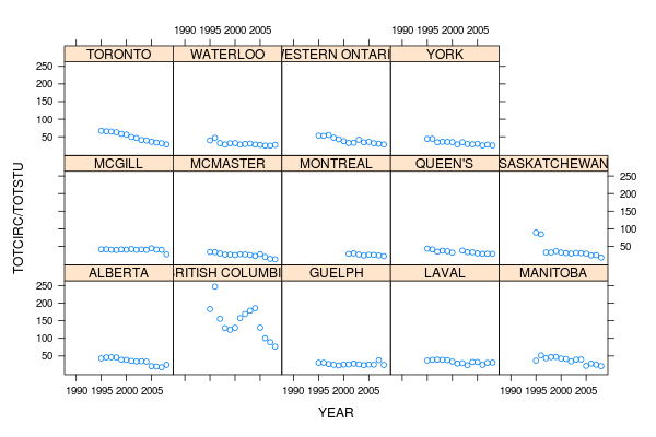
Three commands to get that image! Pretty easy, eh? Could have done it in two, and included the subsetting in the xyplot command, but this is easier to read. xyplot has quite a few options, but here we’re saying “plot TOTCIRC divided by TOTSTU on the y-axis, against YEAR on the x-axis, conditional on the variable INAM” (which means that each university will end up in its own little box).
Let’s have a look at that chart. The first thing I notice is that the University of British Columbia is wildly different from all the others. In 1996 they were apparently circulating about 250 books per student, while everyone else (except for Saskatchewan) was around 50. Up until five years ago their numbers are still bizarrely high. Why? Who knows. But let’s assume UBC is anomalous and discard them for now. And just because Saskatchewan’s first two years look odd, let’s discard them too. Sorry, Saskatchewan.
One more thing: notice how 1990-1994 is always blank? They started recording total circulation in 1995, so let’s toss out years before that.
Let’s make a new data frame for years 1995 and onwards, ignoring UBC and Saskatchewan, and call it canada.1995.
> canada.1995 <- subset(canada, YEAR %in% seq(1995,2008) & INAM != "BRITISH COLUMBIA" & INAM != "SASKATCHEWAN")
> xyplot (TOTCIRC/TOTSTU~YEAR|INAM, canada.1995)
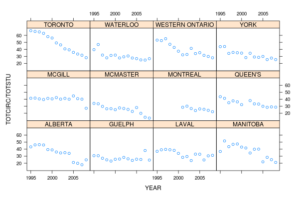
Aha! We can make out a lot more detail now. There’s a very clear and almost linear decline at Toronto; York, McMaster, Western (as we call the University of Western Ontario), and Alberta are all declining, but Guelph and McGill seem much flatter.
Let’s polish this chart up by adding labels to the x- and y-axis (with xlab and ylab), a title at the top (main), and shrinking the names of the universities in the “strips” so they fit (par.strip.text, which is a confusing parameter name). Let’s have the y-axis start at 0 (ylim) so McMaster, which is under 20 circs per student now, doesn’t look like it’s at 0. And for fun let’s have R do some linear regression for us and draw a best-fit line for each university (setting the type so its both p, the default, for points, and r, for regression).
> xyplot (TOTCIRC/TOTSTU~YEAR|INAM, canada.1995,
  type=c("p","r"), par.strip.text=list(cex=0.8),
  ylab="Circulation per student", xlab = "Year",
  main = "Total circs per student at Canadian ARL members (except two)",
  ylim=c(0,75))
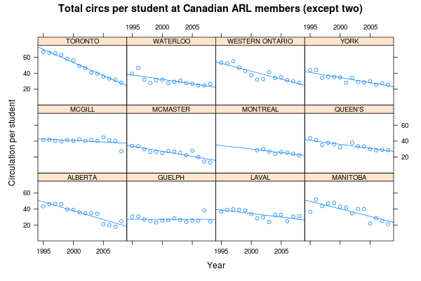
That’s not the simplest command, but by R standards it’s not complicated, and if you’ve used Perl or Python or Ruby you’re not blanching at it. Once we knew a bit about the data and made a couple of refinements, we could generate this nice diagram in one command. Imagine doing that in Excel! You’d be clicking and doing all kinds of junk for a long time. A few quick commands in R, however, and we show at a glance that circ per student is decline across the country, except possibly at Guelph, and that Toronto’s decline is the steepest. (Of course, as always with circ numbers, electronic resources aren’t included, so this is just one part of a much larger picture. I have no idea how Toronto’s other usage numbers are changing.)
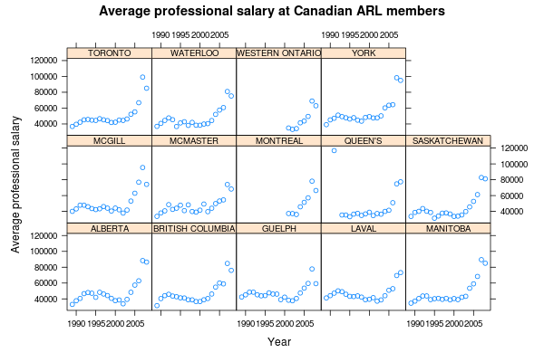
You can plot any other ratio you want by putting in different variables, but if you do, make sure you drop the ylim setting because the y-axis numbers will be different. For example, we could map SALPRF (professional salaries) against PRFSTF (number of professional staff) to find the average salary for professional staff (librarians and others, but not support staff or students).
> xyplot (SALPRF/PRFSTF~YEAR|INAM, canada, par.strip.text=list(cex=0.8), ylab="Average professional salary", xlab = "Year", main = "Average professional salary at Canadian ARL members")
For a last thing, let’s plot a different ratio among a different set of universities. Let’s make a new data frame of some large American and Canadian universities, the kind to which York might want to compare itself:
# Make a subset of the arl data frame, specifying particular universities by name.
# c() is how you make an array
> comparison <- subset(arl, INAM %in% c('YORK', 'HARVARD', 'YALE', 'TORONTO', 'CALIFORNIA BERKELEY', 'MCGILL', 'BROWN', 'PRINCETON', 'CHICAGO', 'CORNELL', 'SOUTHERN CALIFORNIA', 'TEXAS', 'WATERLOO', 'MCMASTER'))

# Now plot ratio of students to professional staff, with font size of strip text at 0.7 ratio.
> xyplot (TOTSTU/PRFSTF~YEAR|INAM, comparison, par.strip.text=list(cex=0.7))
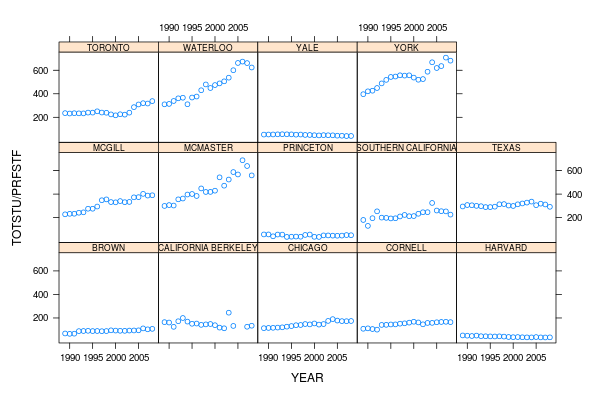
Look at Yale and Harvard! The ratio is actually declining, which is good: there are more librarians per student! Look how low Princeton is! But at some universities the ratio is bad and getting worse. McMaster, Waterloo and York (all Canadian) have the worst ratios of this set of libraries — in fact they have about the worst ratios of all ARL members. I work at York.
Notice how few commands we needed to generate these charts. R and the lattice package are very powerful, and this is just a small taste of what you can do with them. And compare how easy and friendly this is to Excel (for certain values of “easy” and “friendly”)!
An improved graph
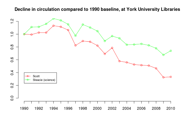
I posted More about declining circulation at York on Friday, and then as often happens the next day I realized there was a better way to do it.
 at York University Libraries")
There’s a new line in this chart: the Frost Library, which serves York’s small Glendon campus across town. I looked up how many undergraduate students were at Glendon each year from 1994 on, and then divided Frost’s circulation numbers by that population. (There are grad students at Glendon, but not very many, and I don’t have that number.) This gives a fair representation of how Frost’s circ has been changing over the years. The circ numbers for the main Scott library and the Steacie science library I continue to divide by York’s total population.
The other changes are cosmetic and I hope make the chart easier to read. I moved the y-axis to the right-hand side, and changed the labels to show percentages. It’s now clearer that Scott circulation has fallen to 33% of what it as in 1990. Frost is at 40% and Steacie at 74%.
Here’s the revised R script that did this:
# Read in number of students and circulation per student
enrolment <- read.csv("york-enrolment-1990-2010.csv", header=T)
glendon <- read.csv("glendon-enrolment-1990-2010.csv", header=T)

# Read in branch circ numbers, from annual reports
circ <- read.csv("york-circulation-1990-2010.csv", header=T)

scottPerYearPerStudent = circ$Scott / enrolment$Total
steaciePerYearPerStudent = circ$Steacie / enrolment$Total

# Set extra space on right-margin
par(xpd=T, mar=par()$mar+c(0,0,0,2))

plot(scottPerYearPerStudent / scottPerYearPerStudent[1], type="o", ylim=c(0, 1.2), col="red", axes = FALSE, xlab = "", ylab = "", main="Circulation change to 1990 baseline (%) at York University Libraries")

par(new=T)

plot(steaciePerYearPerStudent / steaciePerYearPerStudent[1], type="o", ylim=c(0, 1.2), col = "green", axes = FALSE, xlab="", ylab="")

par(new=T)

frostPerGlendonStudent = circ$Frost / glendon$Undergraduates
plot(frostPerGlendonStudent / frostPerGlendonStudent[5], type="o", ylim=c(0, 1.2), col="yellow", axes = F, xlab = "", ylab = "")

axis(1, at = 1:21, labels = enrolment$Year)

rhs = seq(0,1.2, by=0.1)

axis (4, las = 1, at = rhs, labels = rhs *100)

legend(1, 0.4, c("Frost (1994 baseline)","Scott", "Steacie (science)"), cex=0.8, col=c("yellow", "red", "green"), pch=21, lty=1)
More about declining circulation at York
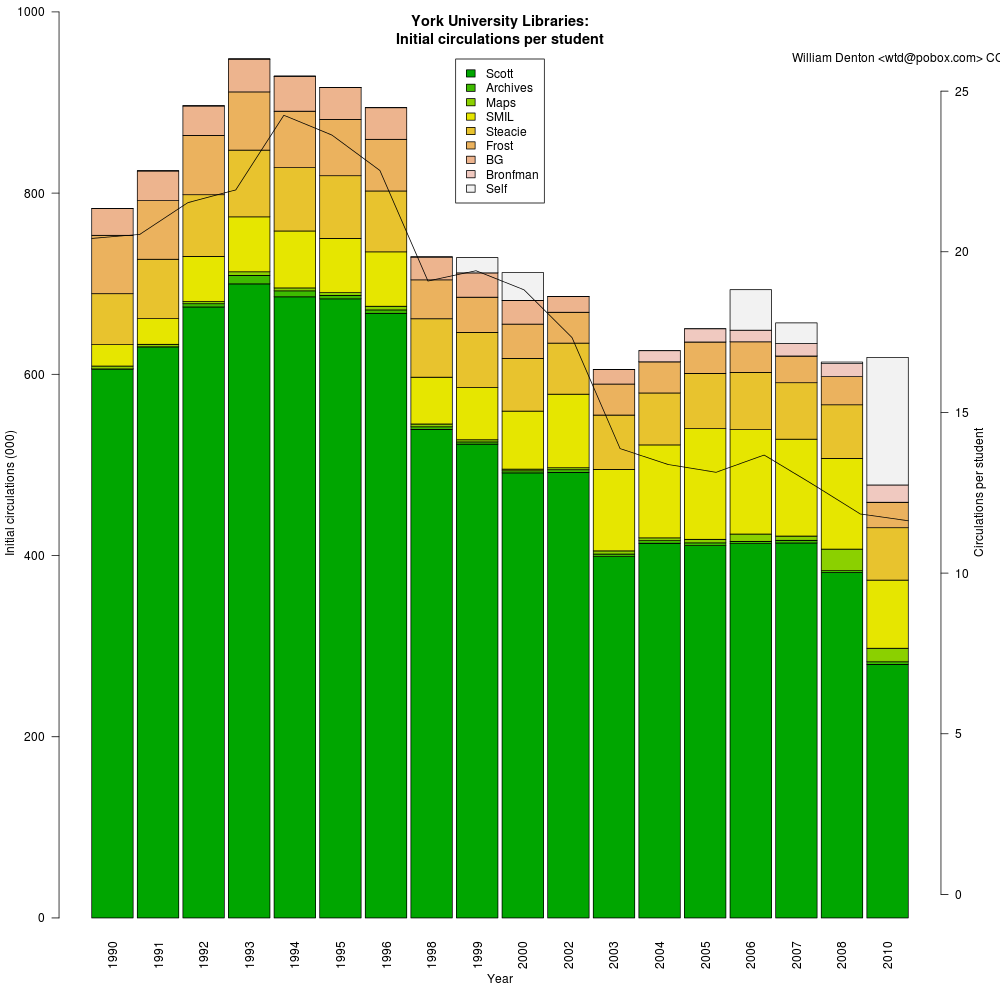
A couple of months ago I posted Initial circs per student, which showed how circulation was declining in the York University Library system in Toronto. I had two suggestions about it and today I made two new charts.
First, Dorothea Salo wondered what the chart would look like if I removed the three strike years when classes were interrupted and library usage went down. Here’s what that looks like:
The steady decline is still evident, but without the anomalous interruptions of the strike years. Perhaps I’ll try doing some linear regression and predicting what this year’s number will be.
Second, Walter Giesbrecht, the data librarian at York, suggested comparing numbers against a 1990 baseline, so the percentage decrease or increase per branch was more evident. The stacked bar chart made it hard to compare branches, because Scott Library, the arts/humanities/social sciences libraries, is by far the largest of our system. I made a graph that shows how two libraries have compared to 1990. (For various different reasons I don’t think comparisons for the other branches would be accurate or representative.)
This shows branch circulations per total student each year, by which I mean that to keep things simple I divided the total number of circulations at each branch each year by the total number of students enrolled at York that year. This is a bit brute force, but I don’t know how many students are studying science, so I can’t divide the numbers for Steacie (the science library) by the number of science students. I should add that York’s science program has always been disproportionately small, though it’s growing. York concentrates on the humanities and social sciences.
What does this show? After rising from 1990 to 1994, circulation has been declining. The decline has been least at the Steacie science library, which is now circulating about 80% of what it did in 1990. At Scott (arts/humanities/social sciences), circulation is under 40% of what it was twenty years ago.
This chart shows just one part of how use of university libraries has changed over the last twenty years. University education and the library’s role in it is very different. The effect of the Internet and electronic resources is huge and is not represented here — online journals and ebooks didn’t exist in 1990, and now almost all journal reading is online. There are details about how York’s population has changed that confuse the numbers as well. Nevertheless, it seems that circulation at the largest library of Canada’s third-largest university is less than 40% of what it was twenty years ago.
Here’s how I did that chart in R. If you grab the original data files, linked in Initial circs per student, you can do it yourself.
# Read in number of students and circulation per student
enrolment <- read.csv("york-enrolment-1990-2010.csv", header=T)

# Read in branch circ numbers, from annual reports
circ <- read.csv("york-circulation-1990-2010.csv", header=T)

scottPerYearPerStudent = circ$Scott / enrolment$Total
steaciePerYearPerStudent = circ$Steacie / enrolment$Total

plot(scottPerYearPerStudent / scottPerYearPerStudent[1], type="o", ylim=c(0, 1.2), col="red", axes = FALSE, xlab = "", ylab = "", main="Decline in circulation compared to 1990 baseline, at York University Libraries")

par(new=T)

plot(steaciePerYearPerStudent / steaciePerYearPerStudent[1], type="o", ylim=c(0, 1.2), col = "green", axes = FALSE, xlab="", ylab="")

axis(1, at = 1:21, labels = enrolment$Year)
axis(2, at = c(0, 0.2, 0.4, 0.6, 0.8, 1.0, 1.2))
legend(1, 0.4, c("Scott", "Steacie (science)"), cex=0.8, col=c("red", "green"), pch=21, lty=1)