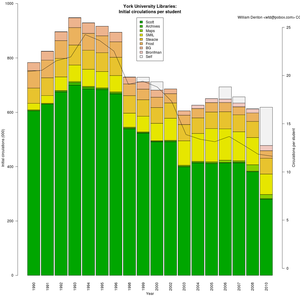
A couple of months ago I posted Initial circs per student, which showed how circulation was declining in the York University Library system in Toronto. I had two suggestions about it and today I made two new charts.
First, Dorothea Salo wondered what the chart would look like if I removed the three strike years when classes were interrupted and library usage went down. Here's what that looks like:
The steady decline is still evident, but without the anomalous interruptions of the strike years. Perhaps I'll try doing some linear regression and predicting what this year's number will be.
Second, Walter Giesbrecht, the data librarian at York, suggested comparing numbers against a 1990 baseline, so the percentage decrease or increase per branch was more evident. The stacked bar chart made it hard to compare branches, because Scott Library, the arts/humanities/social sciences libraries, is by far the largest of our system. I made a graph that shows how two libraries have compared to 1990. (For various different reasons I don't think comparisons for the other branches would be accurate or representative.)
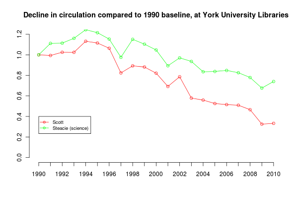
This shows branch circulations per total student each year, by which I mean that to keep things simple I divided the total number of circulations at each branch each year by the total number of students enrolled at York that year. This is a bit brute force, but I don't know how many students are studying science, so I can't divide the numbers for Steacie (the science library) by the number of science students. I should add that York's science program has always been disproportionately small, though it's growing. York concentrates on the humanities and social sciences.
What does this show? After rising from 1990 to 1994, circulation has been declining. The decline has been least at the Steacie science library, which is now circulating about 80% of what it did in 1990. At Scott (arts/humanities/social sciences), circulation is under 40% of what it was twenty years ago.
This chart shows just one part of how use of university libraries has changed over the last twenty years. University education and the library's role in it is very different. The effect of the Internet and electronic resources is huge and is not represented here — online journals and ebooks didn't exist in 1990, and now almost all journal reading is online. There are details about how York's population has changed that confuse the numbers as well. Nevertheless, it seems that circulation at the largest library of Canada's third-largest university is less than 40% of what it was twenty years ago.
Here's how I did that chart in R. If you grab the original data files, linked in Initial circs per student, you can do it yourself.
# Read in number of students and circulation per student
enrolment <- read.csv("york-enrolment-1990-2010.csv", header=T)

# Read in branch circ numbers, from annual reports
circ <- read.csv("york-circulation-1990-2010.csv", header=T)

scottPerYearPerStudent = circ$Scott / enrolment$Total
steaciePerYearPerStudent = circ$Steacie / enrolment$Total

plot(scottPerYearPerStudent / scottPerYearPerStudent[1], type="o", ylim=c(0, 1.2), col="red", axes = FALSE, xlab = "", ylab = "", main="Decline in circulation compared to 1990 baseline, at York University Libraries")

par(new=T)

plot(steaciePerYearPerStudent / steaciePerYearPerStudent[1], type="o", ylim=c(0, 1.2), col = "green", axes = FALSE, xlab="", ylab="")

axis(1, at = 1:21, labels = enrolment$Year)
axis(2, at = c(0, 0.2, 0.4, 0.6, 0.8, 1.0, 1.2))
legend(1, 0.4, c("Scott", "Steacie (science)"), cex=0.8, col=c("red", "green"), pch=21, lty=1)