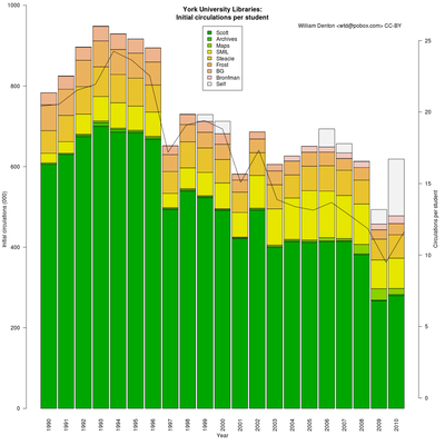
I've been learning R recently and did something that was mildly interesting so I thought I'd post about it.
I wanted to try graphing some data, so I needed some numbers. I remembered there were a lot of circulation statistics in the annual reports of York University Libraries, where I work, and that seemed like something interesting to look at. How is circulation changing over the years? I graphed ten years of circ data (we call it "circ" in the library world) and found that ... it seemed to be staying about the same, at 600,000 initial circs per year. (Initial circulation means an item is being checked out for the first time. We count renewals separately. Initial circs + renewals = total circs.)
That was odd, I thought. But wait, the number of students at York has grown a lot over the last decade. In fact, from about 35,000 to over 50,000. What does that mean? I graphed initial circs per student, which showed the numbers on a steady decline. I got the numbers from the decade before and added them in, and the decline became even more obvious.
Here's the chart (see also the full-size image):
Notice the three years (1997, 2001, 2009) where circulation drops sharply? Those were years there were strikes at York and teaching was interrupted (in 2009 for 88 days!). Peak circ was in 1993, peak circ per student in 1994, and after that things really started to change, with CD-ROMs and then the web. (See also Thom Hickey's blog post Peak books.)
About our branches: Scott (the dark green) is by far the largest, covering arts, social sciences and humanities, and containing within it the Sound and Moving Image Library, Maps, and the Archives. Steacie is the science library, BG is the business and government documents library that closed in 2003, Bronfman is the business library that opened in 2003, and Frost the all-purpose library on a smaller second campus. The "self" number is for self-checkout, which is counted on its own though there are self-checkout machines in every branch.
I generated this with R and two data files. Here's what I did. (If you know R then you'll probably see lots of things I could have done better.) First, the two data files:
- York University Libraries circulation, 1990-2010 (taken from annual reports)
- York University enrolment, 1990-2010 (taken from the York University Factbook)
Notes about the data: the student enrolment numbers are for the November of the previous year. In the 1990s music and film were counted separately but I added those together into SMIL, the Sound and Moving Image Library, where they've been together for a long time. For the students I'm counting the total of all undergraduates and graduates, both full- and part-time. They behave differently but as long as I'm comparing the same thing year over year it's a fairly reliable indicator, I think. I don't include renewals in the figuring because renewing something doesn't necessarily mean something the way that actually checking out an item does.
If you have R installed, and download those files, you should be able to run R at the command line and then copy and paste these lines in. You'll see an image be created and then things get added to it bit by bit.
# Read in number of students and circulation per student
enrolment <- read.csv("york-enrolment-1990-2010.csv", header=T)

# Read in branch circ numbers, from annual reports
circ <- read.csv("york-circulation-1990-2010.csv", header=T)

# Set extra space on right-margin
par(xpd=T, mar=par()$mar+c(0,0,0,2))

# Stacked bar chart of circ numbers
# (Save the midpoints (which are the output of barplot) for use in
# x-axis labelling)
midpoints <- barplot(t(circ[2:10]), col=terrain.colors(9),
  space=0.1, axes=F, ylab="Initial circulations (000)", xlab="Year",
  main="York University Libraries:\nInitial circulations per student")

# Draw x-axis
axis(1, las=2, tick = F, labels=circ$Year, at = midpoints)

# Draw legend
legend("top", colnames(circ[2:10]), fill=terrain.colors(9), cex=1.0)

# Label the left-hand y-axis nicely at intervals
yat <- seq(0, 1000000, 200000)
axis(2, las=1, at = yat, labels = yat / 1000)

# Get ready to add a new plot to the same image
par(new=T)

# Line plot of circulation per student, setting y-axis limits
plot(circ$InitialCirc/enrolment$Total, type="l",  xlab="", ylab="", axes=F, ylim=c(0, 25))

# Label the y-axis on right-hand side
axis(4, las=1)

# Add text to right-hand side
mtext("Circulations per student", 4, line=2)

# Clean up image margins (unncessary in a standalone script)
par(mar=c(5, 4, 4, 2) + 0.1)

text(18,26, "William Denton <wtd@pobox.com> CC-BY")
How are electronic resources (ebooks and articles) doing per student? I got two or three years of data and it was going up, but I ran into some problems graphing it nicely so I can't show that. I didn't think it was a long enough stretch of time, either. I'll post about it if I get it working.
All comments welcome, including about how understandable this graph is.
(UPDATE 1 February 2011: I had two years of circ data (2004 and 2005) for Bronfman put under its predecessor BG. I corrected that in the data file and regenerated the graph.)
 Miskatonic University Press