Rogers roaming data charges
Rogers charges 0.6 cents per kilobyte of roaming data use when their customers are in the United States, which works out to $199.41 for 32.45 megs when I was at Code4Lib 2013 in Chicago.
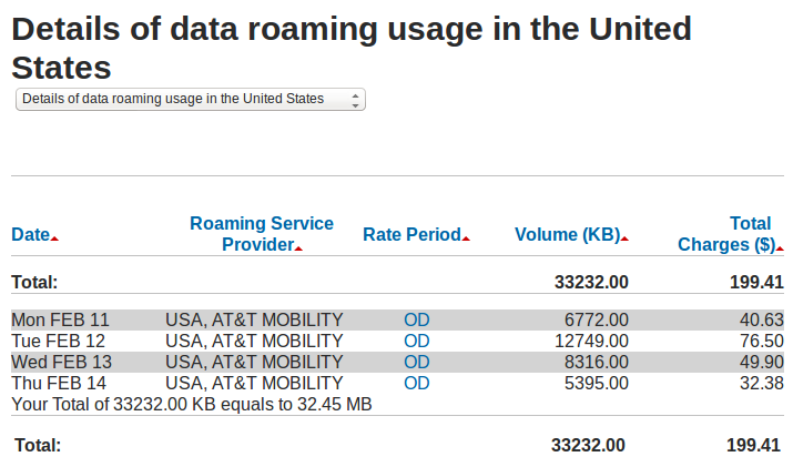
32 megabytes is a little more than four minutes of music if if it’s encoded losslessly. I used it to run Layar a few times, a bit of Twitter, once to check Google Maps, and once to ssh to a shell and do some email.
The major Canadian mobile phone companies (Rogers, Bell and Telus) charge ridiculous prices for everything.
Seriation and the kayiwa-yo_bj vortex
After my last post about #c4l13 tweets I got a couple of tweets from Hadley Wickham pointing me at the R package seriation: it “will make it much easier to see clusters,” he said. If Hadley Wickham recommended it I had to check it out.
I installed it in R:
> install.packages("seriation")
Then I read the documentation. Like a lot of R documentation for it looks rather forbidding and cryptic at the start (to me, at least), but all R documentation includes examples, and once you find the right thing to copy and paste and then fiddle with, you’re on your way.
The seriate function is explained thusly: “Tries to find an linear order for objects using data in form of a dissimilarity matrix (two-way one mode data), a data matrix (two-way two-mode data) or a data array (k-way k-mode data).” Hadley mentioned clusters … this says dissimilarity … hmm.
I tried the example code, which uses the iris data set that’s built into R.
> data("iris")
> x <- as.matrix(iris[-5])
> x <- x[sample(1:nrow(x)),]
> d <- dist(x)
> order <- seriate(d)
> order
object of class ‘ser_permutation’, ‘list’
contains permutation vectors for 1-mode data

  vector length seriation method
1           150             ARSA
> def.par <- par(no.readonly = TRUE)
> layout(cbind(1,2), respect = TRUE)
> pimage(d, main = "Random")

> pimage(d, order, main = "Reordered")

Aha! Something interesting is going on there.
One of the other parts of the documentation is a Townships data set: “This data set was used to illustrate that the conciseness of presentation can be improved by seriating the rows and columns.” Let’s try the example code, just copying and pasting:
> data(Townships)
> pimage(Townships)

Ho hum.
> order <- seriate(Townships, method = "BEA", control = list(rep = 5))
> pimage(Townships, order)

Hot diggity! If I could use this package to improve the stuff I did last time, fantastic.
I’m going to skip over two or three hours of fiddling with things and not understanding what was going on. Crucial to all of what comes next, especially in getting it to work with the ggplot2 package, is this gist of an example of seriation, which I found in a Google search. As often happens my first attempt to get things working failed, so I created a very minimal example and went through the steps many times until it worked. I’m not sure what the problem was any more—probably something to do with not referring to a column of data properly—but once it worked, it was easy to apply the steps to the full data set.
That full data set is online, so you can copy and paste what follows and it should work. If you haven’t installed the ggplot2, plyr and reshape2 packages (all created by Hadley Wickham, apparently an inexhaustible superhuman repository of Rness), you’ll need to. Skip the first three lines if you have, but either way you’ll need to load them in.
> install.packages("ggplot2")
> install.packages("plyr")
> install.packages("reshape2")
> library(ggplot2)
> library(plyr)
> library(reshape2)
> mentions.csv <- read.csv("http://www.miskatonic.org/files/20130223-tweets-mentioned.csv")
> head(mentions.csv)
        tweeter       mentioned
1   anarchivist mariatsciarrino
2   anarchivist        eosadler
3 tararobertson         ronallo
4     saverkamp        benwbrum
5     saverkamp mathieu_boteler
6     saverkamp          kayiwa
> mentions <- count(m, c("tweeter", "mentioned"))
> head(mentions)
         tweeter     mentioned freq
1     3windmills         yo_bj    1
2    aaroncollie        kayiwa    1
3 aaronisbrewing tararobertson    1
4     abedejesus tararobertson    1
5       abugseye  bretdavidson    1
6       abugseye     cazzerson    1
> nrow(mentions)
[1] 2201
This mentions data frame is what we’ll be working with. It’s 2,201 lines long and tells how many times anyone using the #c4l13 hashtag mentioned anyone else.
> ggplot(count(mentions, c("tweeter", "mentioned")), aes(x=tweeter, y=mentioned))
+ geom_tile(aes(fill=freq))
+ theme(axis.text = element_text(size=4), axis.text.x = element_text(angle=90))
+ xlab("Who mentioned someone") + ylab("Who was mentioned")
+ labs(title="People who mentioned other people (using the #c4l13 hastag)")

All right, folks. Let’s seriate.
> mentions.cast <- acast(mentions, tweeter ~ mentioned, fill = 0)
Using freq as value column: use value.var to override.
> mentions.seriation <- seriate(mentions.cast, method="BEA_TSP")
> mentions$tweeter <- factor(mentions$tweeter, levels = names(unlist(mentions.seriation[[1]][])))
> mentions$mentioned <- factor(mentions$mentioned, levels = names(unlist(mentions.seriation[[2]][])))
> ggplot(count(mentions, c("tweeter", "mentioned")), aes(x=tweeter, y=mentioned))
+ geom_tile(aes(fill=freq))
+ theme(axis.text = element_text(size=4), axis.text.x = element_text(angle=90))
+ xlab("Who mentioned someone") + ylab("Who was mentioned")
+ labs(title="People who mentioned other people (using the #c4l13 hastag)")

WHOA!
The acast command turns the three-column mentions data frame into a 433x339 matrix, with tweeter names as rows and mentioned names as columns. The value of the matrix at each cell is how many times the mentioned person was mentioned by the tweeter. We know what 3windmills mentioned yo_bj once, so there’s a 1 at that spot in the matrix. We need this matrix to feed into the seriate command, which creates a special object:
> mentions.seriation
object of class ‘ser_permutation’, ‘list’
contains permutation vectors for 2-mode data

  vector length seriation method
1           433          BEA_TSP
2           339          BEA_TSP
We can poke into it a bit by working through the commands used above:
> head(mentions.seriation[[1]][])
       jaleh_f  NowWithMoreMe  WNYLIBRARYGUY andrewinthelib         p3wp3w
           186            301            422             23            306
     Hypsibius
           175
> head(unlist(mentions.seriation[[1]][]))
       jaleh_f  NowWithMoreMe  WNYLIBRARYGUY andrewinthelib         p3wp3w
           186            301            422             23            306
     Hypsibius
           175
> head(names(unlist(mentions.seriation[[1]][])))
[1] "jaleh_f"        "NowWithMoreMe"  "WNYLIBRARYGUY"  "andrewinthelib"
[5] "p3wp3w"         "Hypsibius"
This is a list of names ordered in a way that seriate has determined will make an optimal ordering. We force our data frame to use this ordering, and then we get the nicer chart.
All right, that’s pretty fine, but that’s a lot of people and a lot of stuff going on. What if we dig into it a bit and simply things? What if we pick a user and analyze the nexus of tweeting action around them? Let’s start with a boring example: me.
> wdenton.tweets <- subset(mentions, (tweeter == "wdenton" | mentioned == "wdenton"))
> wdenton.nexus <- subset(mentions, tweeter %in% unique(c(as.vector(wdenton.tweets$tweeter), as.vector(wdenton.tweets$mentioned))))
> wdenton.cast <- acast(wdenton.nexus, tweeter ~ mentioned, fill = 0)
Using freq as value column: use value.var to override.
> wdenton.seriation <- seriate(wdenton.cast, method="BEA_TSP")
> wdenton.nexus$tweeter <- factor(wdenton.nexus$tweeter, levels = names(unlist(wdenton.seriation[[1]][])))
> wdenton.nexus$mentioned <- factor(wdenton.nexus$mentioned, levels = names(unlist(wdenton.seriation[[2]][])))
> ggplot(wdenton.nexus, aes(x=tweeter, y=mentioned))
+ geom_tile(aes(fill=freq))
+ theme(axis.text.y = element_text(size=3), axis.text.x = element_text(size=10, angle=90))
+ xlab("Who did the mentioning") + ylab("Who was mentioned")
+ labs(title="The wdenton nexus of #c4l13 tweeting")

Blowing my mind!
What’s going on here? First we pick out every instance where I either mention someone or someone mentions me.
> head(wdenton.tweets)
        tweeter mentioned freq
131         arg   wdenton    1
312   calvinmah   wdenton    1
812    ian_chan   wdenton    1
1099 lljohnston   wdenton    1
1466 nelltaylor   wdenton    1
1469   nihiliad   wdenton    1
Then we expanded that to a tweet nexus (this is like superduping) by saying: for every person that I mentioned or mentioned me, find everyone who mentioned them or they mentioned.
> head(wdenton.nexus)
      tweeter    mentioned freq
128       arg      sabarya    1
129       arg     save4use    1
130       arg       tmasao    1
131       arg      wdenton    1
310 calvinmah       kayiwa    2
311 calvinmah PuckNorris19    1
Then we just did the same as we’d done before to seriate it and make a chart.
There’s something shared between this chart and the big one, and I call it the kayiwa-yo_bj vortex. yo_bj mentioned a lot of people (because Becky Yoose is a lively tweeter), and kayiwa was mentioned by a lot of people (because Francis Kayiwa was the chief conference organizer) and Becky mentioned Francis, so a common set of people emerges.
Let’s see what happens if we look at yo_bj herself.
> yobj.tweets <- subset(mentions, (tweeter == "yo_bj" | mentioned == "yo_bj"))
> yobj.nexus <- subset(mentions, tweeter %in% unique(c(as.vector(yobj.tweets$tweeter), as.vector(yobj.tweets$mentioned))))
> yobj.cast <- acast(yobj.nexus, tweeter ~ mentioned, fill = 0)
Using freq as value column: use value.var to override.
> yobj.seriation <- seriate(yobj.cast, method="BEA_TSP")
> yobj.nexus$tweeter <- factor(yobj.nexus$tweeter, levels = names(unlist(yobj.seriation[[1]][])))
> yobj.nexus$mentioned <- factor(yobj.nexus$mentioned, levels = names(unlist(yobj.seriation[[2]][])))
> ggplot(yobj.nexus, aes(x=tweeter, y=mentioned))
+ geom_tile(aes(fill=freq))
+ theme(axis.text.y = element_text(size=3), axis.text.x = element_text(size=10, angle=90))
+ xlab("Who did the mentioning") + ylab("Who was mentioned") + labs(title="The yo_bj nexus of #c4l13 tweeting")

Fewer people who did the mentioning, but a lot of people getting mentioned, and roughly the same kind of shape as we saw before.
I did this a few more times on different people, then I realized that I was just repeating myself: I was running the same commands over and over, just starting with a different username. When that happens, you need to automate things. So I made a function.
> chart.nexus <- function (username) {
  username <- tolower(username)
  tweets <- subset(mentions, (tweeter == username | mentioned == username))
  tweets.nexus <- subset(mentions, tweeter %in% unique(c(as.vector(tweets$tweeter), as.vector(tweets$mentioned))))
  tweets.cast <- acast(tweets.nexus, tweeter ~ mentioned, fill = 0)
  tweets.seriation <- seriate(tweets.cast, method="BEA_TSP")
  tweets.nexus$tweeter <- factor(tweets.nexus$tweeter, levels = names(unlist(tweets.seriation[[1]][])))
  tweets.nexus$mentioned <- factor(tweets.nexus$mentioned, levels = names(unlist(tweets.seriation[[2]][])))
  ggplot(tweets.nexus, aes(x=tweeter, y=mentioned)) + geom_tile(aes(fill=freq)) + theme(axis.text.y = element_text(size=3), axis.text.x = element_text(size=10, angle=90)) + xlab("Who did the mentioning") + ylab("Who was mentioned") + labs(title=paste("The", username, "nexus of #c4l13 tweeting"))
}
> chart.nexus("eosadler")

That’s the tweet nexus around Bess Sadler, whose talk Creating a Commons was a highlight of conference. (More about that and a couple of other talks soon, I hope.) You can see the kayiwa-yo_bj vortex.
Aaron Swartz was missed by us all. You can see the vortex around him, too.
> chart.nexus("aaronsw")

Ed Summers wasn’t there, but he was watching the video stream and chatting in IRC and on Twitter:
> chart.nexus("edsu")

yo_bj doesn’t show there in the mentioners on the x-axis, which surprised me. The kayiwa part of the vortex is evident, though.
Brewster Kahle was mentioned a few times in discussions relating to the Open Library. No vortex here, but you can see edsu tweeting at him a few times.
> chart.nexus("brewster_kahle")

Having done all this, two things strike me: first that I should try Shiny for this, and second that some sort of graph would probably be a better representation of the connections between people. Still, I learned a lot, the charts are cool, and I coined the ridiculous phrase “the kayiwa-yo_bj vortex.”
One last #c4l13 tweet thing: who mentioned whom?
I had an idea for one more thing to look at in the #c4l13 tweets: instead of seeing who retweeted whom, how about who mentioned whom?
To do this I use a little Ruby script to make my life simpler. I could have done this all in R, but it was starting to get messy (I’m no R expert) and I could see right away how to do it in Ruby, so I did it that way.
In that big CSV file we downloaded of all the tweets, there’s one column called entities_str that is a chunk of JSON that holds what we want. Twitter has parsed each tweet and figured out some things about it, including who is mentioned in the tweet. This means we don’t have to do any pattern matching, but we do need to parse some JSON. That’s why I used Ruby.
#!/usr/bin/env ruby

require 'csv'

require 'rubygems'
require 'json'

archive = "Downloads/Collect %23c4l13 Tweets - Archive.csv"

# Thanks http://stackoverflow.com/questions/3717464/ruby-parse-csv-file-with-header-fields=as-attributes-for-each-row

puts "tweeter,mentioned"
CSV.foreach(archive, {:headers => true, :header_converters => :symbol}) do |row|

  # (Those header directives make it easier to reference elements in each row.)
  # row[:from_user] is the person who tweeted.
  # To find out who they mention, we can use information supplied by Twitter.
  # row[:entities_str] is a chunk of JSON.  It has an object called "user_mentions" which is an array of objects
  # like this:
  # {"id"=>18366992, "name"=>"Jason Ronallo", "indices"=>[83, 91], "screen_name"=>"ronallo", "id_str"=>"18366992"}
  # So all we need to do is loop through that and pick out out screen_name

  JSON.parse(row[:entities_str])["user_mentions"].each do |mention|
    puts "#{row[:from_user]},#{mention["screen_name"]}"
  end

end
I saved this as mentioned.rb and then ran this at the command line:
$ ruby mentioned.rb > tweets-mentioned.csv
$ head -5 tweets-mentioned.csv
tweeter,mentioned
anarchivist,mariatsciarrino
anarchivist,eosadler
tararobertson,ronallo
saverkamp,benwbrum
Perfect. Now let’s get this into R and use geom_tile again. We’ll read it into a data frame and then use count to see who’s mentioned who how much:
> library(ggplot2)
> library(plyr)
> mentioned.csv <- read.csv("tweets-mentioned.csv")
> head(count(mentioned.csv, c("tweeter", "mentioned")))
         tweeter     mentioned freq
1     3windmills         yo_bj    1
2    aaroncollie        kayiwa    1
3 aaronisbrewing tararobertson    1
4     abedejesus tararobertson    1
5       abugseye  bretdavidson    1
6       abugseye     cazzerson    1
That’s just the first few mentions, but we’ve got what we want. Now let’s make a big huge chart.
> ggplot(count(mentioned.csv, c("tweeter", "mentioned")), aes(x=tweeter, y=mentioned))
+ geom_tile(aes(fill=freq))
+ scale_fill_gradient(low="brown", high="yellow")
+ theme(axis.text = element_text(size=4), axis.text.x = element_text(angle=90))
+ xlab("Who mentioned someone") + ylab("Who was mentioned")
+ labs(title="People who mentioned other people (using the #c4l13 hastag)")

That’s got an awful lot going on, but we can can see some strong horizontal lines (showing people who were mentioned a lot, especially chief conference organize Francis Kayiwa @kayiwa) and some strong vertical lines (showing people who mentioned many other people). To simplify it a lot, let’s subset the frequency table to include only people who mentioned other people at least twice.
> ggplot(subset(count(mentioned.csv, c("tweeter", "mentioned")), freq > 2), aes(x=tweeter, y=mentioned))
+ geom_tile(aes(fill=freq)) + scale_fill_gradient(low="brown", high="yellow")
+ theme(axis.text = element_text(size=8), axis.text.x = element_text(angle=90))
+ xlab("Who mentioned someone") + ylab("Who was mentioned")
+ labs(title="People who mentioned other people more than twice (using the #c4l13 hash tag")

Now it’s easier to see that kayiwa was mentioned by a lot of people, and going vertically, among others TheStacksCat mentioned a lot of different people, especially yo_bj.
And now I think I’ve exhausted my interest in this. Time to look at something else!
#c4l13 tweets in R
I’ve done this before (#accessyul tweets chart and More #accessyul tweet chart hacks), but it’s fun to do, so let’s try it again: use R to visualize tweets from a conference, in this case Code4Lib 2013 in Chicago. I was there and had a wonderful time. It was a very interesting conference in many ways.
The conference hashtag was #c4l13, and Peter Murray used a Twitter-Archiving Google Spreadsheet to collect all of the conference-related tweeting into one place: Collect #c4l13 Tweets. The tweets themselves are in the “Archive” sheet listed at the bottom. When you’re looking at that sheet you can use the menus (File, Download As, Comma Separated Values (.csv, current sheet)) to download the spreadsheet. Let’s assume it’s downloaded into your ~/Downloads/ directory as ~/Downloads/Collect %23c4l13 Tweets - Archive.csv. Have a look at it. It has these columns: id_str, from_user, text, created_at, time,geo_coordinates, iso_language_code, to_user,to_user_id_str, from_user_id_str, in_reply_to_status_id_str, source, profile_image_url, status_url, entities_str. We’re most interested in from_user (who tweeted) and time (when).
Here are some commands in R that will parse the data and make some charts. All of this should be fully reproducible, but if not, let me know.
As before, what I’m doing is completely taken from the mad genius Tony Hirst, from posts like Visualising Activity Around a Twitter Hashtag or Search Term Using R. If you’re interested in data mining and visualization, you should follow Tony’s blog.
First, if you don’t have the ggplot2 and plyr packages installed in R, you’ll need them.
> install.packages("ggplot2")
> install.packages("plyr")
All right, let’s load in those libraries and get going.
> library(ggplot2)
> library(plyr)
> c4l.tweets <- read.csv("~/Downloads/Collect %23c4l13 Tweets - Archive.csv")
> nrow(c4l.tweets)
[1] 3653
> c4l.tweets$time <- as.POSIXct(strptime(c4l.tweets$time, "%d/%m/%Y %H:%M:%S", tz="CST") - 6*60*60)
This loads the CSV file (change the path to it if you need to) into a data frame which has 3653 rows, which means 3653 tweets. That’s a nice set to work with. R read the time column (which looks like “21/02/2013 20:20:58”) as a character string, so we need to convert into a special time format, in this case something called POSIXct, which is the best time format to use in a data frame. When R knows something is a time or date it’s really good at making sense of it and making it easy to work with. Subtracting six hours (6x60x60 seconds) forces it into Chicago time in what is probably an incorrect way, but it works.
Let’s plot time on the x-axis and who tweeted on the y-axis and see what we get. One thing I really like about R is that when you’ve got some data it’s easy to plot it and see what it looks like.
> ggplot(c4l.tweets, aes(x=time,y=from_user)) + geom_point() + ylab("Twitter username") + xlab("Time")

(The image is a link to a larger version.)
That’s a bit of a mess. Clearly a lot happened the days the conference was on, but how to make sense of the rest of it? Let’s arrange things so that the usernames on the y-axis are arranged in chronological order of first tweeting with the hashtag. These two lines will do it, by making another data frame that is usernames and time of first tweet in descending chronological order and then by reordering the from_user factor in the c4l.tweets data frame to use that arrangement.
> first.tweet.time <- ddply(c4l.tweets, "from_user", function(x) {return(subset(x, time %in% min(time), select = c(from_user, time)))})
> first.tweet.time <- arrange(first.tweet.time, -desc(time))
> c4l.tweets$from_user = factor(c4l.tweets$from_user, levels = first.tweet.time$from_user)
It’s nontrivial to grok, I know, but let’s just let it work and try our chart again:
> ggplot(c4l.tweets, aes(x=time,y=from_user)) + geom_point() + ylab("Twitter username") + xlab("Time")

Well, that’s interesting! A few people tweeted here and there for a couple of weeks leading up to the conference, and then when it started, a lot of people started tweeting. Then when the conference was over, it tapered off. “That’s not interesting, it’s obvious,” I hear you say. Fair enough. But let’s dig a little deeper and make a prettier chart.
> ggplot(subset(c4l.tweets, as.Date(time) > as.Date("2013-02-10") & as.Date(time) < as.Date("2013-02-15")),
aes(x=time,y=from_user))
+ geom_point() + ylab("Twitter username") + xlab("Time")
+ theme(axis.text.y = element_text(size=3))
+ geom_vline(xintercept=as.numeric(as.POSIXct(c("2013-02-11 09:00:00", "2013-02-11 17:00:00",
"2013-02-12 09:00:00", "2013-02-12 17:00:00", "2013-02-13 09:00:00", "2013-02-13 17:00:00",
"2013-02-14 09:00:00", "2013-02-14 12:00:00"), tz="CST")), colour="lightgrey", linetype="dashed")
This does a few things: takes the subset of the tweets that happen from the preconference day (Tuesday 11 February 2013) to the day after the conference (Friday 15 February 2013), shrinks the size of the labels on the y-axis so they’re tiny by not overlapping, and draws dashed lines that show when the preconference and conference was on (9am - 5pm except the last day, which was 9am - noon).

The vast majority of the tweets are made while the conference is actually on, that’s clear. And it looks like the most frequent tweeters were the ones who started earliest (the heavy bands at the bottom) but also some people started the day the conference proper began and then kept at it (the busy lines in the middle).
Let’s bring tweeting and retweeting into it. Even if someone retweeted by pressing the retweet button, when the tweet is stored in the spreadsheet it has the RT prefix, so we can use a pattern match to see which tweets were retweets:
> install.packages("stringr")
> library(stringr)
> c4l.tweets$rt <- sapply(c4l.tweets$text, function(tweet) { is.rt = str_match(tweet, "RT @([[:alnum:]_]*)")[2];})
> c4l.tweets$rtt <- sapply(c4l.tweets$rt, function(rt) if (is.na(rt)) 'T' else 'RT')
> head(subset(c4l.tweets, select=c(rt,rtt)), 20)
            rt rtt
1         <NA>   T
2         <NA>   T
3         <NA>   T
4         <NA>   T
5         <NA>   T
6         <NA>   T
7         <NA>   T
8       kayiwa  RT
9         <NA>   T
10        <NA>   T
11        <NA>   T
12        <NA>   T
13   saverkamp  RT
14        <NA>   T
15     helrond  RT
16        <NA>   T
17 anarchivist  RT
18     helrond  RT
19 anarchivist  RT
20     helrond  RT
The rt columns shows who was retweeted, and rtt just shows whether or not it was a retweet. sapply is a simple way of applying a function over lines of a data frame and putting the results into a new column, which is the sort of approach you generally want to use in R instead of writing for-next loops.
Let’s now plot out all of the tweets, colouring them depending on whether they were original or retweets, for the entire set, starting the day of the preconference (you can always mess around with the subsetting on your own—it’s fun):
> ggplot(subset(c4l.tweets, as.Date(time) > as.Date("2013-02-10")) ,aes(x=time,y=from_user))
+ geom_point(aes(colour=rtt), alpha = 0.4)
+ ylab("Twitter username") + xlab("Time")
+ theme(axis.text.y = element_text(size=3))
+ scale_colour_manual("Tweet or retweet?", breaks = c("T", "RT"),
labels = c("tweet", "retweet"), values = c("green", "black"))
+ geom_vline(xintercept=as.numeric(as.POSIXct(c("2013-02-11 09:00:00", "2013-02-11 17:00:00",
"2013-02-12 09:00:00", "2013-02-12 17:00:00", "2013-02-13 09:00:00", "2013-02-13 17:00:00",
"2013-02-14 09:00:00", "2013-02-14 12:00:00"), tz="CST")), colour="lightgrey", linetype="dashed")
That’s got a lot going on in it, but really all we did was tell geom_point to colour things by the value of the rtt column and to set the level of transparency to 0.4, which makes things somewhat transparent, and then we used scale_colour_manual to set a colour scheme. The ggplot2 docs go into all the detail about this.

What if we have a close look at just the first day?
> ggplot(subset(c4l.tweets, time > as.POSIXct("2013-02-12 09:00:00", tz="CST")
& time < as.POSIXct("2013-02-12 18:00:00", tz="CST")),
aes(x=time,y=from_user))
+ geom_point(aes(colour=rtt), alpha = 0.4)
+ ylab("Twitter username") + xlab("Time")
+ theme(axis.text.y = element_text(size=3))
+ scale_colour_manual("Tweet or retweet?", breaks = c("T", "RT"), labels = c("tweet", "retweet"), values = c("green", "black"))

Very little tweeting over lunch or in the midafternoon breakout sessions.
All right, this is all pretty detailed. What about some simpler charts showing how much tweeting was happening? The chron package lets us truncate timestamps by minute, hour or day, which is handy.
> install.packages("chron")
> library(chron)
> c4l.tweets$by.min <- trunc(c4l.tweets$time, units="mins")
> c4l.tweets$by.hour <- trunc(c4l.tweets$time, units="hours")
> c4l.tweets$by.day <- trunc(c4l.tweets$time, units="days")
> ggplot(count(c4l.tweets, "by.hour"), aes(x=by.hour, y=freq))
+ geom_bar(stat="identity") + xlab("Number") + ylab("Date") + labs(title="#c4l13 tweets by the hour")
The count function is a really useful one, and I posted a few examples at Counting and aggregating in R. Here we use it to add up how many tweets there were each hour and then chart it.

So we peaked at over 250 #c4l13 tweets per hour, and went over 200 per hour three times. What about if we look at it per minute while the conference was on?
> ggplot(count(subset(c4l.tweets, time > as.POSIXct("2013-02-12 09:00:00", tz="CST")
& time < as.POSIXct("2013-02-14 12:00:00", tz="CST")), "by.min"),
aes(x=by.min, y=freq))
+ geom_bar(stat="identity") + xlab("Number") + ylab("Date")
+ labs(title="#c4l13 tweets by the minute")

We hit a maximum tweet-per-minute count of 10. Not bad!
We could zoom in on just the tweets from the morning of the first day.
> ggplot(count(subset(c4l.tweets, time > as.POSIXct("2013-02-12 09:00:00", tz="CST")
& time < as.POSIXct("2013-02-12 12:00:00", tz="CST")), "by.min"),
aes(x=by.min, y=freq))
+ geom_bar(stat="identity") + xlab("Number") + ylab("Date")
+ labs(title="#c4l13 tweets by the minute")

Once you’ve got the data set up it’s easy to keep playing with it. And if you had timestamps for when each talk began and ended, you could mark that here (same as if you were analyzing the IRC chat log, which is timestamped).
Finally, let’s look at who was tweeting the most.
> c4l.tweets.count <- arrange(count(c4l.tweets, "from_user"), desc(freq))
> head(c4l.tweets.count)
     from_user freq
1        yo_bj  214
2       kayiwa  155
3      msuicat  126
4 TheStacksCat  125
5  TheRealArty  122
6       sclapp   96
Becky Yoose was the most frequent tweeter by a good bit. How does it all look when we count up tweets per person?
> c4l.tweets.count$from_user <- factor(c4l.tweets.count$from_user, levels = arrange(c4l.tweets.count, desc(freq))$from_user)
> ggplot(c4l.tweets.count, aes(x=from_user, y=freq)) +geom_bar(stat="identity")

That’s crude, but it shows that a few people tweeted a lot and a lot of people tweeted a little. Again, unsurprising. What sort of power law if any are we seeing here? I’m not sure, but I might dig into that later.
> nrow(c4l.tweets.count)
[1] 485
> nrow(subset(c4l.tweets.count, freq == 1))
[1] 246
> nrow(subset(c4l.tweets.count, freq > 1))
[1] 239
> median(c4l.tweets.count)
Error in median.default(c4l.tweets.count) : need numeric data
> median(c4l.tweets.count$freq)
[1] 1
> mean(c4l.tweets.count$freq)
[1] 7.531959
This shows us that 485 people tweeted. On average people tweeted 7.5 times each, but the median number of tweets was 1. I know so little of statistics I can’t tell you how skewed that distribution is, but it seems very skewed.
Let’s chart out everyone who tweeted more than average.

I don’t know if that’s interesting or useful, but it does show how to rotate the labels on the x axis.
What about looking at who retweeted whom how often? Let’s make a new simpler data frame that just shows that, and sort it, and then show who retweeted whom the most.
> retweetedby <- count(subset(c4l.tweets, rtt=="RT", c("from_user", "rt")))
> retweetdby <- arrange(retweetedby, from_user, freq))
> head(retweetedby)
      from_user          rt freq
1       wdenton       dchud    1
2       wdenton      kayiwa    1
3 carmendarlene anarchivist    1
4 carmendarlene       chrpr    1
5 carmendarlene      danwho    1
6 carmendarlene      declan    1
> head(arrange(retweetedby, desc(freq)))
     from_user          rt freq
1 TheStacksCat       yo_bj   13
2        yo_bj TheRealArty   11
3      msuicat       yo_bj    7
4        yo_bj      kayiwa    6
5        mexkn       yo_bj    6
6       sclapp       yo_bj    6
The record was TheStacksCat retweeting yo_bj 13 times, following, somewhat transitively, by yo_bj retweeting TheRealArty 11 times.
We can look at this in two ways:
> ggplot(subset(retweetedby, freq > 2), aes(x=from_user, y=rt))
+ geom_point(aes(size=freq))
+ theme(axis.text = element_text(size=10), axis.text.x  = element_text(angle=90))
+ xlab("Who did the retweeting") + ylab("Who was retweeted")
+ labs(title="People who retweeted other people more than twice")

> ggplot(subset(retweetedby, freq > 2), aes(x=from_user, y=rt))
+ geom_tile(aes(fill=freq)) + scale_fill_gradient(low="purple", high="orange")
+ theme(axis.text = element_text(size=10), axis.text.x  = element_text(angle=90))
+ xlab("Who did the retweeting") + ylab("Who was retweeted")
+ labs(title="People who retweeted other people more than twice")

Notice that the way ggplot works, we just had to change geom_point (with size = frequency) to geom_tile (with fill colour = frequency, and adding our own ugly colour scheme), but all the rest stayed the same.
That’s enough for tonight. Nothing about text mining. Maybe someone else will tackle that?
There must be lots of cool ways to look at this stuff in D3, too.
(UPDATED on Friday 22 February to correct a typo and include the required stringr library before parsing RTs.)
aaronsw
Aaron Swartz hanged himself a couple of weeks ago, it seems perhaps because of a combination of depression and the threat of a lengthy jail sentence for downloading a good chunk of JSTOR. There are links all over the web about it. You probably know all about it already.
I met Aaron Swartz very briefly one day five years ago at a meeting at the Internet Archive headquarters at the Presidio in San Francisco when the Open Library was starting up. I’ll never forget that day. I was staying at a motel a block or two away. It was February. There were palm trees! In February! We don’t have palm trees in Canada any time of year. I walked over to the building where were were all getting together, and on the way I met a fellow who seemed familiar for some reason. “Hi, I’m Brewster,” he said.
There were a couple of dozen people at the meeting, and I don’t remember the exact details too well any more, but it was a powerhouse of talent. Karen Coyle was there, and Ed Summers, and Bess Sadler, who remembers the same day, and much more. Casey Bisson and Rob Styles and Eric Lease Morgan were there, and others I’ve forgotten. My apologies.
Aaron Swartz was there. I remember him being young and full of nervous energy. He explained about infogami, the engine behind the Open Library. His hair was shaggy. He paced up and down. I remember him walking up and down the side of the room, eating a raw bagel. That’s how I’ll remember him, focused and energetic and trying to do something huge and radical: free all bibliographic metadata. He was 21.
Mark Pilgrim dropped off the internet a while ago. He’s still alive, which is good. Aaron Swartz isn’t. But when Mark was blogging he had a saying he’d use every now and then:
“Fuck everything about this.”
Aaron Swartz hanged himself, alone in his apartment in New York City, because the US government was coming down hard on him for downloading articles from JSTOR.
Fuck everything about this.
I uses this
Almost three years ago I posted I uses this, a description of what hardware and software I use, based on the profiles done at The Setup. Here’s a revised version just for fun. Make your own and post it!
What hardware do I use?
I have one laptop, a Lenovo Thinkpad X120e with an 11.6" screen and 4 gigs of RAM. It’s fine except for the CPU, dual AMD E-350 chips, which are way too slow.
My phone is a Samsung Galaxy S3 running Android 4.1. It’s wonderful.
I have two tablets, both running Android 4.1: an ASUS Transformer Prime and a Nexus 7. I bought the Nexus 7 second and now that I have it I don’t use the Transformer much except for some augmented reality development. The Nexus 7 is a great device and the perfect size for me. If it had a backwards-facing camera it’d be everything I need.
For backups, I have a BlacX Duet holding two big drives, currently BACKUP_ONE and BACKUP_FOUR. BACKUP_THREE is in my safety deposit box. In a while I’ll swap it with BACKUP_FOUR, then back again, so I always have a fairly recent offsite backup.
And what software?
Ubuntu as the OS, currently 12.10, with Unity as the GUI because it’s the default and because I run everything full screen, maximized to use all available real estate, so it doesn’t really matter what I use. My virtual desktop is three by two. I do most of my work in the top left window, Firefox is top centre, LibreOffice is top right, Chrome is bottom centre, and various other programs move through bottom left and bottom right. I use the super key to pull up applications I want to run or files I want to open.
I do as much as I can in Emacs. For almost all text writing I use Markdown (as I write this I’m looking at Markdown in a full-screen Emacs buffer, and Ctrl-c Ctrl-c p will render it into HTML and throw it into Firefox for review) but when I need to produce paper I use use Latex (the TeX Live distribution) with AucTeX. I use outline-minor-mode wherever possible. Generally, whenever I can do something inside Emacs, I do, including using it as a database client. But for a shell I use bash in a terminal window. I never got used to Emacs’s shell.
I use text files whenever possible. When I need to I use LibreOffice. GIMP for graphics.
I use Git every day to manage and distribute files, and not just source code. For work I use it to help with my Getting Things Done implementation. For my hacking I use it with GitHub.
I handle my personal email myself, hosted on a Debian virtual private server at VPSVille. I filter mail with procmail and I read it with Alpine, which I’ve been using for 20 years now. Work email I read with Thunderbird.
My regular web browser is Firefox, with Adblock Plus, Cookie Monster, HTTPS-Everywhere, Readability (so I can send things to my phone), RSS Icon, Screengrab and Session Manager. I’m strict about cookie use with Firefox, I don’t allow any Google cookies, and I use DuckDuckGo as my default search engine. For my Google account and those annoying web sites that require cookies just to work, I use Chrome, where I allow all cookies. I don’t know if this makes sense.
Zotero is my research management tool and penseive.
I hack, just well enough to get by, with Ruby.
R is an amazingly powerful tool for data analysis, data mining and visualization. RStudio is a marvellous IDE for it, and I sometimes use it, but usually I work in ESS mode in Emacs. Lately I’ve been using knitr for generating reports. It lets you mix Markdown and R code all in one and then turn it into a web page. ggplot2 produces beautiful charts.
Backups I do with a combination of rdiff-backup (for local files) and rsync (for remote accounts). I put everything on BACKUP_ONE and then rsync that to BACKUP_FOUR.
I use Dropbox for sharing files across computers and with other people. I use the Camera Upload option on my phone so photos are automatically copied to my account. It still seems amazing when I take a picture on my phone and two seconds the Dropbox monitor on my computer tells me it’s added a file.
My work and personal computers are practically identical (though the work one is bigger and faster). With Git and Dropbox I have the same files in both places and everything is seamless.
My web site runs on Drupal, but I run a few others on WordPress and it’s much better. If I’d known a few years ago what I know now, I’d’ve used WordPress for my personal site, but I didn’t, and now it will be a huge pain to migrate. WordPress is one of the best software applications out there. Upgrading it is remarkably easy and safe. I host at Pair Networks.
Android apps: Firefox (usually) and Chrome (sometimes), Next TTC to tell me when the bus is coming, the Guardian app, Layar and some others for augmented reality, Google Maps, My Tracks, MapQuest. WolframAlpha, which I bought. Readability. ConnectBot for SSH. Meditation Helper. Toshl Finance for keeping track of what I spend. Tasker is an insanely powerful program that gives you control over all aspects of your phone; I don’t have it doing a lot yet, but I set up a “Home” profile so when I’m near home (based on cell towers nearby) it turns on the volume and when I leave home it goes into vibrate mode. I’ve played around with Utter a bit, but don’t really have a place for it on my phone yet, though it could be great for tablets, especially if I can activate them just by saying a command phrase.
Last summer I realized that I didn’t ever want to have to run apps on my phone, actually press an icon, when I wanted to know something. It should just tell me without my asking. Now I use my phone’s home screen as a dashboard, with widgets that show me information I need, such as how many days old I am and the weather and so on. I also use Tasker to speak any incoming texts—why should I have to press buttons to see a text when it can just read it out to me?
I use the Library of Congress Classification but I also love the Dewey Decimal Classification.
What would be your dream setup?
A much faster laptop; devices where Bluetooth actually works because I can never get things connecting; augmented reality contact contact lenses that do real augmented reality, though in the meantime glasses that do more of a heads-up display would be fine; the ability to easily make applications for my smartphone or the AR system in my preferred scripting language or some nice new AR-enhanced programming language; and everything around me with a data feed I could tap.
More #accessyul tweet chart hacks
I got curious about what else I might pull out of that set of tweets I had with a bit of basic R hacking, just for fun, while I’m on a train watching the glories of autumnal Ontario pass by.
What does the data frame look like? These are the column names:
> colnames(y)
 [1] "text"         "favorited"    "replyToSN"    "created"      "truncated"
 [6] "replyToSID"   "id"           "replyToUID"   "statusSource" "screenName"
The rows are too wide to show, but it’s easy to pick out the screenName values, which are the Twitter usernames:
> head(y$screenName)
[1] djfiander    MarkMcDayter shlew        jordanheit   ENOUSERID
[6] AccessLibCon
197 Levels: mjgiarlo anarchivist adr elibtronic weelibrarian ... MarkMcDayter
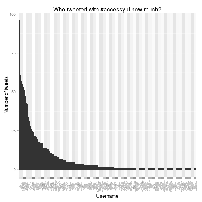
197 different usernames among the 1500 tweets. Who tweeted the most? Is there some kind of power law going on, where a few people tweeted a lot and a lot of people tweeted very little?
> tweeters.count <- count(y, "screenName")
> head(tweeters.count)
    screenName freq
1     mjgiarlo    3
2  anarchivist    2
3          adr   88
4   elibtronic   11
5 weelibrarian   53
6  TheRealArty   57
> ggplot(tweeters.count) + aes(x = screenName, y = freq) + geom_bar(stat="identity")
That’s not very nice: it’s not sorting by number of tweets. I send this chart back to the nether regions whence it sprang!
The chart looks that way because the bars in ggplot2 are ordered by the ordering of the levels in the factor.
> head(factor(tweeters.count$screenName))
[1] mjgiarlo     anarchivist  adr          elibtronic   weelibrarian
[6] TheRealArty
197 Levels: mjgiarlo anarchivist adr elibtronic weelibrarian ... MarkMcDayter
We want to get things sorted by freq. This confusing line will do it:
> tweeters.count$screenName <- factor(tweeters.count$screenName, levels = arrange(tweeters.count, desc(freq))$screenName)
This rearranges the ordering of the rows in the tweeters.count data frame according to the ordering in that arrange statement at the end. Here’s what it does, using head to show only the first few lines:
> head(arrange(tweeters.count, desc(freq)))
    screenName freq
1    verolynne   96
2          adr   88
3       mkny13   61
4  TheRealArty   57
5   SarahStang   55
6 weelibrarian   53
That’s the ordering we want. So, with tweeters.count sorted properly, we can make the chart again, and this time pretty it up:
> ggplot(tweeters.count) + aes(x = screenName, y = freq) + geom_bar(stat="identity") +
  theme(axis.text.x = element_text(angle = 90, size = 4)) +
  ylab("Number of tweets") +
  xlab("Username") +
  labs(title="Who tweeted with #accessyul how much?")
I also wondered: how were these aggregated by time? When were the most tweets happening? The created column holds the clue to that minor mystery.
> head(y$created)
[1] "2012-10-21 10:37:59 EDT" "2012-10-21 10:36:44 EDT"
[3] "2012-10-21 10:36:40 EDT" "2012-10-21 10:36:38 EDT"
[5] "2012-10-21 10:34:55 EDT" "2012-10-21 10:34:49 EDT"
Those timestamps are to the minute. Let’s collapse them down to the hour, aggregate them, and plot them:
> y$tohour <-  format(y$created, "%Y-%m-%d %H")
> head(count(y, "tohour"))
         tohour freq
1 2012-10-18 09   12
2 2012-10-18 10   16
3 2012-10-18 11   15
4 2012-10-18 12    5
5 2012-10-18 13    7
6 2012-10-18 14    8
> ggplot(count(y, "tohour"), aes(x=tohour, y=freq)) + geom_bar(stat="identity") +
xlab("Hour") + ylab("Number of tweets") +
labs(title="#accessyul tweets by hours") +
theme(axis.text.x = element_text(angle = 90, size = 4))
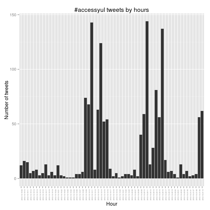
The busy days there are Friday and Saturday, and Friday goes nine-ten-ELEVEN and then nothing over the noon hour when we were at lunch. You can see the rest of the patterns. It would be interesting to correlate this to who was speaking, and to try to figure out what that means.
#accessyul tweets chart
Following on from April’s #thatcamp hashtags the Tony Hirst way, I went back to Tony Hirst’s Visualising activity around a Twitter hashtag or search term using R to see what the #accessyul tweets (for the 2012 Access) looked like. This runs in R.
> require("twitteR")
> require("plyr")
> require("ggplot2")
> yultweets <- searchTwitter("#accessyul", n=1500)
> y <- twListToDF(yultweets)
> y$created <- as.POSIXct(format(y$created, tz="America/Montreal"))
> yply <- ddply(y, .var = "screenName", .fun = function(x) {return(subset(x, created %in% min(created), select = c(screenName,created)))})
> yplytime <- arrange(yply,-desc(created))
> y$screenName=factor(y$screenName, levels = yplytime$screenName)
> ggplot(y) + geom_point(aes(x=created,y=screenName)) + ylab("Twitter username") + xlab("Time")
> savePlot(filename="20121021-accessyul-tweets.png", type="png")
That pulls in the last 1500 #accessyul tweets (I grabbed it a couple of hours ago so it’s now out of date), changes the time zone to show Montreal times, and graphs it with the great ggplot2 library. Time goes along the x axis, with a dot for every time a person (as listed on the y axis) tweets. The thick horizontal lines are heavy tweeters.

The tick labels on the y axis are too big, I know.
There are over 1500 tweets with this hash tag—if I’d thought of this before, I could have been grabbing and saving them this week so I could show all of them.