I’ve done this before (#accessyul tweets chart and More #accessyul tweet chart hacks), but it’s fun to do, so let’s try it again: use R to visualize tweets from a conference, in this case Code4Lib 2013 in Chicago. I was there and had a wonderful time. It was a very interesting conference in many ways.
The conference hashtag was #c4l13, and Peter Murray used a Twitter-Archiving Google Spreadsheet to collect all of the conference-related tweeting into one place: Collect #c4l13 Tweets. The tweets themselves are in the “Archive” sheet listed at the bottom. When you’re looking at that sheet you can use the menus (File, Download As, Comma Separated Values (.csv, current sheet)) to download the spreadsheet. Let’s assume it’s downloaded into your ~/Downloads/ directory as ~/Downloads/Collect %23c4l13 Tweets - Archive.csv. Have a look at it. It has these columns: id_str, from_user, text, created_at, time,geo_coordinates, iso_language_code, to_user,to_user_id_str, from_user_id_str, in_reply_to_status_id_str, source, profile_image_url, status_url, entities_str. We’re most interested in from_user (who tweeted) and time (when).
Here are some commands in R that will parse the data and make some charts. All of this should be fully reproducible, but if not, let me know.
As before, what I’m doing is completely taken from the mad genius Tony Hirst, from posts like Visualising Activity Around a Twitter Hashtag or Search Term Using R. If you’re interested in data mining and visualization, you should follow Tony’s blog.
First, if you don’t have the ggplot2 and plyr packages installed in R, you’ll need them.
> install.packages("ggplot2")
> install.packages("plyr")
All right, let’s load in those libraries and get going.
> library(ggplot2)
> library(plyr)
> c4l.tweets <- read.csv("~/Downloads/Collect %23c4l13 Tweets - Archive.csv")
> nrow(c4l.tweets)
[1] 3653
> c4l.tweets$time <- as.POSIXct(strptime(c4l.tweets$time, "%d/%m/%Y %H:%M:%S", tz="CST") - 6*60*60)
This loads the CSV file (change the path to it if you need to) into a data frame which has 3653 rows, which means 3653 tweets. That’s a nice set to work with. R read the time column (which looks like “21/02/2013 20:20:58”) as a character string, so we need to convert into a special time format, in this case something called POSIXct, which is the best time format to use in a data frame. When R knows something is a time or date it’s really good at making sense of it and making it easy to work with. Subtracting six hours (6x60x60 seconds) forces it into Chicago time in what is probably an incorrect way, but it works.
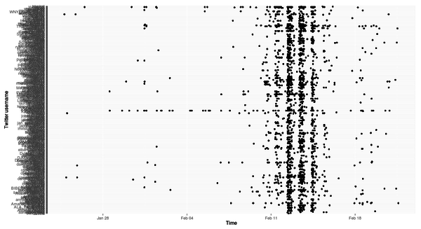
Let’s plot time on the x-axis and who tweeted on the y-axis and see what we get. One thing I really like about R is that when you’ve got some data it’s easy to plot it and see what it looks like.
> ggplot(c4l.tweets, aes(x=time,y=from_user)) + geom_point() + ylab("Twitter username") + xlab("Time")
(The image is a link to a larger version.)
That’s a bit of a mess. Clearly a lot happened the days the conference was on, but how to make sense of the rest of it? Let’s arrange things so that the usernames on the y-axis are arranged in chronological order of first tweeting with the hashtag. These two lines will do it, by making another data frame that is usernames and time of first tweet in descending chronological order and then by reordering the from_user factor in the c4l.tweets data frame to use that arrangement.
> first.tweet.time <- ddply(c4l.tweets, "from_user", function(x) {return(subset(x, time %in% min(time), select = c(from_user, time)))})
> first.tweet.time <- arrange(first.tweet.time, -desc(time))
> c4l.tweets$from_user = factor(c4l.tweets$from_user, levels = first.tweet.time$from_user)
It’s nontrivial to grok, I know, but let’s just let it work and try our chart again:
> ggplot(c4l.tweets, aes(x=time,y=from_user)) + geom_point() + ylab("Twitter username") + xlab("Time")
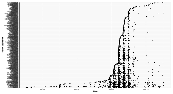
Well, that’s interesting! A few people tweeted here and there for a couple of weeks leading up to the conference, and then when it started, a lot of people started tweeting. Then when the conference was over, it tapered off. “That’s not interesting, it’s obvious,” I hear you say. Fair enough. But let’s dig a little deeper and make a prettier chart.
> ggplot(subset(c4l.tweets, as.Date(time) > as.Date("2013-02-10") & as.Date(time) < as.Date("2013-02-15")),
aes(x=time,y=from_user))
+ geom_point() + ylab("Twitter username") + xlab("Time")
+ theme(axis.text.y = element_text(size=3))
+ geom_vline(xintercept=as.numeric(as.POSIXct(c("2013-02-11 09:00:00", "2013-02-11 17:00:00",
"2013-02-12 09:00:00", "2013-02-12 17:00:00", "2013-02-13 09:00:00", "2013-02-13 17:00:00",
"2013-02-14 09:00:00", "2013-02-14 12:00:00"), tz="CST")), colour="lightgrey", linetype="dashed")
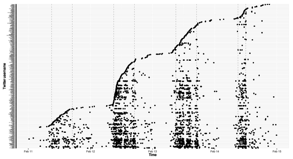
This does a few things: takes the subset of the tweets that happen from the preconference day (Tuesday 11 February 2013) to the day after the conference (Friday 15 February 2013), shrinks the size of the labels on the y-axis so they’re tiny by not overlapping, and draws dashed lines that show when the preconference and conference was on (9am - 5pm except the last day, which was 9am - noon).
The vast majority of the tweets are made while the conference is actually on, that’s clear. And it looks like the most frequent tweeters were the ones who started earliest (the heavy bands at the bottom) but also some people started the day the conference proper began and then kept at it (the busy lines in the middle).
Let’s bring tweeting and retweeting into it. Even if someone retweeted by pressing the retweet button, when the tweet is stored in the spreadsheet it has the RT prefix, so we can use a pattern match to see which tweets were retweets:
> install.packages("stringr")
> library(stringr)
> c4l.tweets$rt <- sapply(c4l.tweets$text, function(tweet) { is.rt = str_match(tweet, "RT @([[:alnum:]_]*)")[2];})
> c4l.tweets$rtt <- sapply(c4l.tweets$rt, function(rt) if (is.na(rt)) 'T' else 'RT')
> head(subset(c4l.tweets, select=c(rt,rtt)), 20)
            rt rtt
1         <NA>   T
2         <NA>   T
3         <NA>   T
4         <NA>   T
5         <NA>   T
6         <NA>   T
7         <NA>   T
8       kayiwa  RT
9         <NA>   T
10        <NA>   T
11        <NA>   T
12        <NA>   T
13   saverkamp  RT
14        <NA>   T
15     helrond  RT
16        <NA>   T
17 anarchivist  RT
18     helrond  RT
19 anarchivist  RT
20     helrond  RT
The rt columns shows who was retweeted, and rtt just shows whether or not it was a retweet. sapply is a simple way of applying a function over lines of a data frame and putting the results into a new column, which is the sort of approach you generally want to use in R instead of writing for-next loops.
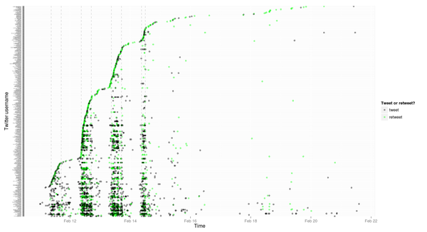
Let’s now plot out all of the tweets, colouring them depending on whether they were original or retweets, for the entire set, starting the day of the preconference (you can always mess around with the subsetting on your own—it’s fun):
> ggplot(subset(c4l.tweets, as.Date(time) > as.Date("2013-02-10")) ,aes(x=time,y=from_user))
+ geom_point(aes(colour=rtt), alpha = 0.4)
+ ylab("Twitter username") + xlab("Time")
+ theme(axis.text.y = element_text(size=3))
+ scale_colour_manual("Tweet or retweet?", breaks = c("T", "RT"),
labels = c("tweet", "retweet"), values = c("green", "black"))
+ geom_vline(xintercept=as.numeric(as.POSIXct(c("2013-02-11 09:00:00", "2013-02-11 17:00:00",
"2013-02-12 09:00:00", "2013-02-12 17:00:00", "2013-02-13 09:00:00", "2013-02-13 17:00:00",
"2013-02-14 09:00:00", "2013-02-14 12:00:00"), tz="CST")), colour="lightgrey", linetype="dashed")
That’s got a lot going on in it, but really all we did was tell geom_point to colour things by the value of the rtt column and to set the level of transparency to 0.4, which makes things somewhat transparent, and then we used scale_colour_manual to set a colour scheme. The ggplot2 docs go into all the detail about this.
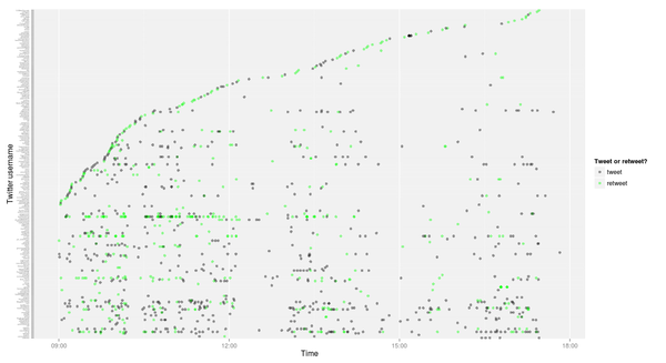
What if we have a close look at just the first day?
> ggplot(subset(c4l.tweets, time > as.POSIXct("2013-02-12 09:00:00", tz="CST")
& time < as.POSIXct("2013-02-12 18:00:00", tz="CST")),
aes(x=time,y=from_user))
+ geom_point(aes(colour=rtt), alpha = 0.4)
+ ylab("Twitter username") + xlab("Time")
+ theme(axis.text.y = element_text(size=3))
+ scale_colour_manual("Tweet or retweet?", breaks = c("T", "RT"), labels = c("tweet", "retweet"), values = c("green", "black"))
Very little tweeting over lunch or in the midafternoon breakout sessions.
All right, this is all pretty detailed. What about some simpler charts showing how much tweeting was happening? The chron package lets us truncate timestamps by minute, hour or day, which is handy.
> install.packages("chron")
> library(chron)
> c4l.tweets$by.min <- trunc(c4l.tweets$time, units="mins")
> c4l.tweets$by.hour <- trunc(c4l.tweets$time, units="hours")
> c4l.tweets$by.day <- trunc(c4l.tweets$time, units="days")
> ggplot(count(c4l.tweets, "by.hour"), aes(x=by.hour, y=freq))
+ geom_bar(stat="identity") + xlab("Number") + ylab("Date") + labs(title="#c4l13 tweets by the hour")
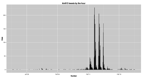
The count function is a really useful one, and I posted a few examples at Counting and aggregating in R. Here we use it to add up how many tweets there were each hour and then chart it.
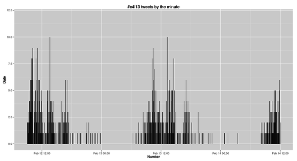
So we peaked at over 250 #c4l13 tweets per hour, and went over 200 per hour three times. What about if we look at it per minute while the conference was on?
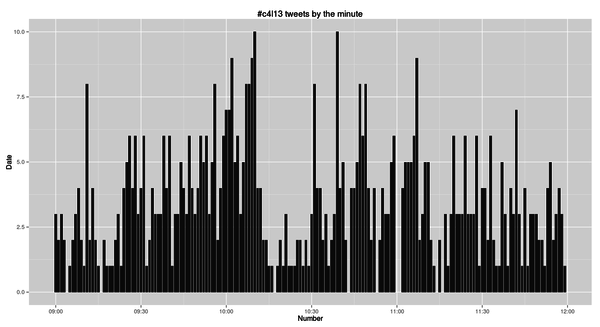
> ggplot(count(subset(c4l.tweets, time > as.POSIXct("2013-02-12 09:00:00", tz="CST")
& time < as.POSIXct("2013-02-14 12:00:00", tz="CST")), "by.min"),
aes(x=by.min, y=freq))
+ geom_bar(stat="identity") + xlab("Number") + ylab("Date")
+ labs(title="#c4l13 tweets by the minute")
We hit a maximum tweet-per-minute count of 10. Not bad!
We could zoom in on just the tweets from the morning of the first day.
> ggplot(count(subset(c4l.tweets, time > as.POSIXct("2013-02-12 09:00:00", tz="CST")
& time < as.POSIXct("2013-02-12 12:00:00", tz="CST")), "by.min"),
aes(x=by.min, y=freq))
+ geom_bar(stat="identity") + xlab("Number") + ylab("Date")
+ labs(title="#c4l13 tweets by the minute")
Once you’ve got the data set up it’s easy to keep playing with it. And if you had timestamps for when each talk began and ended, you could mark that here (same as if you were analyzing the IRC chat log, which is timestamped).
Finally, let’s look at who was tweeting the most.
> c4l.tweets.count <- arrange(count(c4l.tweets, "from_user"), desc(freq))
> head(c4l.tweets.count)
     from_user freq
1        yo_bj  214
2       kayiwa  155
3      msuicat  126
4 TheStacksCat  125
5  TheRealArty  122
6       sclapp   96
Becky Yoose was the most frequent tweeter by a good bit. How does it all look when we count up tweets per person?
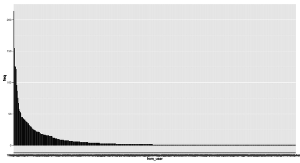
> c4l.tweets.count$from_user <- factor(c4l.tweets.count$from_user, levels = arrange(c4l.tweets.count, desc(freq))$from_user)
> ggplot(c4l.tweets.count, aes(x=from_user, y=freq)) +geom_bar(stat="identity")
That’s crude, but it shows that a few people tweeted a lot and a lot of people tweeted a little. Again, unsurprising. What sort of power law if any are we seeing here? I’m not sure, but I might dig into that later.
> nrow(c4l.tweets.count)
[1] 485
> nrow(subset(c4l.tweets.count, freq == 1))
[1] 246
> nrow(subset(c4l.tweets.count, freq > 1))
[1] 239
> median(c4l.tweets.count)
Error in median.default(c4l.tweets.count) : need numeric data
> median(c4l.tweets.count$freq)
[1] 1
> mean(c4l.tweets.count$freq)
[1] 7.531959
This shows us that 485 people tweeted. On average people tweeted 7.5 times each, but the median number of tweets was 1. I know so little of statistics I can’t tell you how skewed that distribution is, but it seems very skewed.
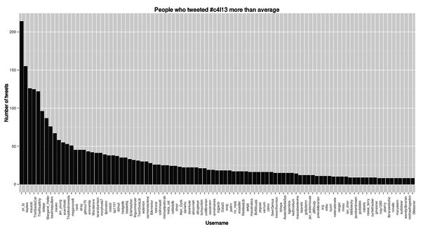
Let’s chart out everyone who tweeted more than average.
I don’t know if that’s interesting or useful, but it does show how to rotate the labels on the x axis.
What about looking at who retweeted whom how often? Let’s make a new simpler data frame that just shows that, and sort it, and then show who retweeted whom the most.
> retweetedby <- count(subset(c4l.tweets, rtt=="RT", c("from_user", "rt")))
> retweetdby <- arrange(retweetedby, from_user, freq))
> head(retweetedby)
      from_user          rt freq
1       wdenton       dchud    1
2       wdenton      kayiwa    1
3 carmendarlene anarchivist    1
4 carmendarlene       chrpr    1
5 carmendarlene      danwho    1
6 carmendarlene      declan    1
> head(arrange(retweetedby, desc(freq)))
     from_user          rt freq
1 TheStacksCat       yo_bj   13
2        yo_bj TheRealArty   11
3      msuicat       yo_bj    7
4        yo_bj      kayiwa    6
5        mexkn       yo_bj    6
6       sclapp       yo_bj    6
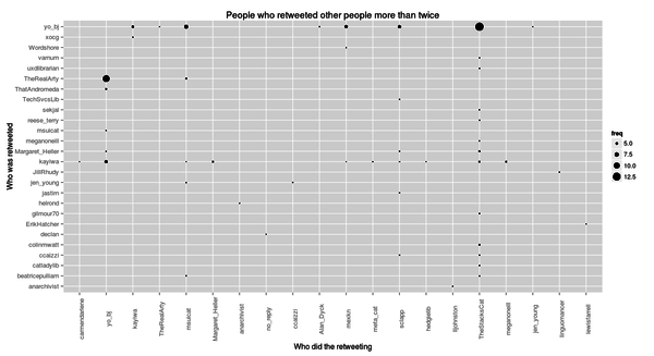
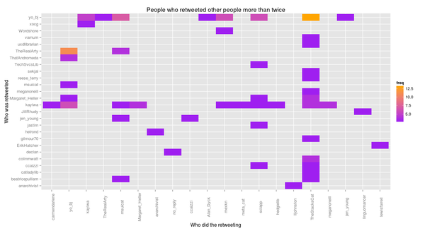
The record was TheStacksCat retweeting yo_bj 13 times, following, somewhat transitively, by yo_bj retweeting TheRealArty 11 times.
We can look at this in two ways:
> ggplot(subset(retweetedby, freq > 2), aes(x=from_user, y=rt))
+ geom_point(aes(size=freq))
+ theme(axis.text = element_text(size=10), axis.text.x  = element_text(angle=90))
+ xlab("Who did the retweeting") + ylab("Who was retweeted")
+ labs(title="People who retweeted other people more than twice")
> ggplot(subset(retweetedby, freq > 2), aes(x=from_user, y=rt))
+ geom_tile(aes(fill=freq)) + scale_fill_gradient(low="purple", high="orange")
+ theme(axis.text = element_text(size=10), axis.text.x  = element_text(angle=90))
+ xlab("Who did the retweeting") + ylab("Who was retweeted")
+ labs(title="People who retweeted other people more than twice")
Notice that the way ggplot works, we just had to change geom_point (with size = frequency) to geom_tile (with fill colour = frequency, and adding our own ugly colour scheme), but all the rest stayed the same.
That’s enough for tonight. Nothing about text mining. Maybe someone else will tackle that?
There must be lots of cool ways to look at this stuff in D3, too.
(UPDATED on Friday 22 February to correct a typo and include the required stringr library before parsing RTs.)
 Miskatonic University Press