I closed my LinkedIn account
Tonight I read All LinkedIn with Nowhere to Go by Ann Friedman (The Baffler 23; it’s worth subscribing to this great journal) and realized that I’d had an account on LinkedIn for years but had never used it for anything, didn’t need it and would never “use” it, however one uses it. (Years ago when I first signed up and connected with an old university friend, he said, “So what do we do know? Hire each other?”) On top of that, it’s a closed platform, and I don’t like closed platforms.
That’s my home view on LinkedIn. Why would I ever want to look at it? It’s useless. This is my profile:
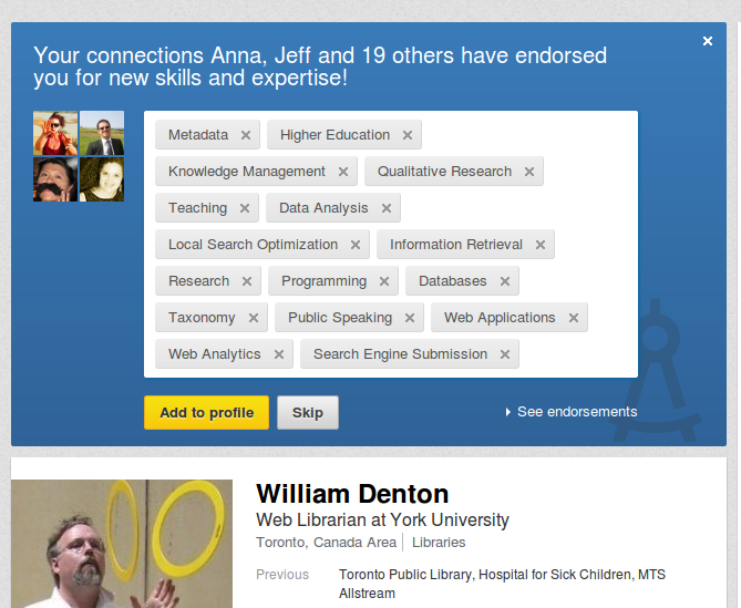
I appreciate that people I know took their time to recommend me for things … but the entire endeavour makes no sense. We’re all endorsing each other for useless categories without knowing why we’re doing it.
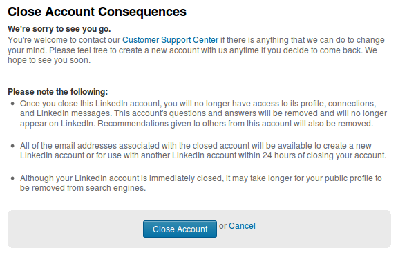
So I deleted my account. No, actually I “closed” it:
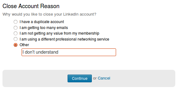
They wanted to know why:
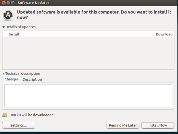
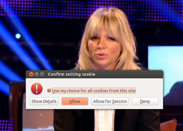
Three odd warnings
First, Ubuntu wanted to update an invisible package.
Then, while watching the BBC’s show about who would be the new Doctor Who, Firefox asked me about an invisible cookie.
Later still I wanted to look at the web site for Bruno Latour’s new book, An Enquiry Into Modes of Existence, and got an unusual alert.
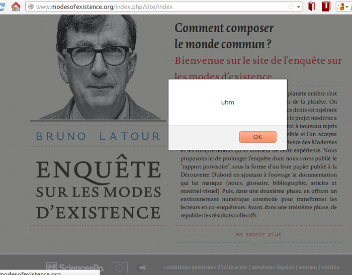
Cryptic. But somehow … inarguable.
Welcome to the Jungle LibGuide
An entry on Neil Gaiman’s tumblr was making the rounds recently. Someone had quoted from a 2010 interview, Neil Gaiman talks about his love of libraries (all of which is worth reading):
For most of the human race, pretty much all of the lifespan of the human race, information was currency. Information was like gold. It was rare, it was hard to find, it was expensive. You could get your information, but you had to know where to go, you had to know what you were looking at, you had to know how to find your information. It was hard. And librarians were the key players in the battle for information, because they could go and get and bring back this golden nugget for you, the thing that you needed.
Over the last decade, which is less than a blink of an eye in the history of the human race, it’s all changed. And we’ve gone from a world in which there is too little information, in which information is scarce, to a world in which there is too much information, and most of it is untrue or irrelevant. You know, the world of the Internet is the world of information that is not actually so. It’s a world of information that just isn’t actually true, or if it is true, it’s not what you needed, or it doesn’t actually apply like that, or whatever. And you suddenly move into a world in which librarians fulfill this completely different function.
We’ve gone from looking at a desert, in which a librarian had to walk into the desert for you and come back with a lump of gold, to a forest, to this huge jungle in which what you want is one apple. And at that point, the librarian can walk into the jungle and come back with the apple. So I think from that point of view, the time of librarians, and the time of libraries—they definitely haven’t gone anywhere.
Gaiman added: “And I stand by every word of it.”
Librarians don’t just want to “walk into a jungle and come back with the apple” for you!
We want you to walk in with us. If we know the way through the jungle, we’ll show you. If we don’t, we’ll find some maps or GIS data and together with you we’ll figure out the best path. Either case, when we come back out, we’ll leave you with a map so you can go back in yourself next time (though we’ll be glad to come along if you want). And we’ll make sure there’s a web page and a handout with all of this clearly set out so it’s all ready for the next person.
Along the way through the jungle, we’ll talk about the jungle, we’ll explain about maps and atlases and OpenStreetMap and GIS, how to leave a trail so you don’t get lost, what all the trees and plants are, how to identify them, and useful tips for next time.
We’ll talk about the jungle itself. We have a lot of questions on our mind about the jungle, and we want you to think about them too. How did it come to be here? Who owns it? Are there property lines? How much is the library paying every year to be able to go into the jungle? Are there rules about what we can take out? Who owns what we take out? If we find this apple, is it all right to give it to you? Can you give it to a friend? Can you plant it and grow your own tree? What if we stop paying for access to the jungle—does the owner come and take away your apple? What’s the real story on the transnational that’s been buying up all of the land in the jungle and driving out all the people that used to be here?
And we’ll ask, “Why are you looking for an apple in a jungle? Maybe you were thinking of a papaya?”
Libraries need to help people build, manage and share their own personal branches of the One Big Library. We’ll do this with a combination of various kinds of information literacy, from the simple (how to use basic tools) to the high level (such as how to build your own tools and how to think critically about social policy). We’ll do this in a supportive and appropriate way for each individual (children do research in very different ways than graduate students), but broadly, to be an informed citizen you need to be good at all of this, and it takes time to learn. Thinking about what’s in the news right now, for example, information literacy helps us make sense of the reports about XKeyscore and all of the other surveillance intelligence agencies are doing. (Other kinds of “literacies” are also important in life, of course, and all of this shocking internet tapping is a political and social problem that goes far beyond IL.)
Gaiman says, “And you suddenly move into a world in which librarians fulfill this completely different function.” But actually what he describes doesn’t show that: in both cases someone needs something and the librarian goes and gets it for them. Sure, we do that a lot. But more and more we’re working to make it not just easier for people to get to the thing they need themselves, but also to know all of the many aspects and issues involved in getting it, about the getting itself this time and next, and about all the useful and helpful tools to make it easier and so they can do it with others.
(An aside: whenever I think of Gaiman I remember a comment my mother’s cousin made about the excellent American Gods. We lend him a few stacks of books every summer, and when he gives them back he includes a note with remarks about each. He said simply: “This book was written by a madman.”)
Paul Dutton, sound poetry, Emacs and Tavis Rudd
This afternoon two things mixed and melded in an unexpected way: sound poetry and programming in Emacs.
It began when I listened to an episode of the Into the Field podcast series with Toronto poet Paul Dutton: it’s about 40 minutes long and you can download it from Into the Field: Paul Dutton. It’s a good interview, very interesting, and gets into many different aspects of Dutton’s work. Even if you don’t know of Dutton, I recommend listening, because it’s always worth it to hear a good poet talk about his work—and what he does with sound poetry (Dutton was one of the Four Horsemen) and vocal improvisations (he’s one of CCMC, with Michael Snow and John Oswald) is wild.
You can get a fine introduction to Dutton’s work for free on the web. His 1991 collection Aurealities is available online from Coach House Books, the excellent Toronto small press. (Coach House is on bpNichol Lane, a delightful little alley named after one of the other Horsemen.) It includes of my favourite poems, The Eighth Sea, which goes in part:
The St. Lawrence 110-gun warship
The Psyche 50-gun warship
The Princess Charlotte 40-gun warship
The Niagara 20-gun warship
The Charwell 14-gun warship
The Prince Regent 60-gun warship
The Oneida 16-gun warship
The Scourge 10-gun warship
The Fair American 2-gun warship
The Queen Charlotte 18-gun warship
The Sylph 16-gun warship
The Lady Gore 3-gun warship
The Tecumseth 4-gun warship
The Madison 20-gun warship
The Newash 4-gun warship
The Chippewa 74-gun warship - pewa shippewar
shippewa shippewar shippewa shippewarship a warship a warship a warship / a warship, yer worship / yer warship, yer worship / yer warship, yer worship / yer worship: yer warship / yer worship: yer warship / yuh worship a warship yuh worship a warship yuh worship a warship a warship a warship a warshippewa shi pawash e pawash e pawash e pawash e pawatchya pawatchya pawatchya pawatchya pawa ta pawa ta pawa ta pawa ta pawa ter pawa ter pawa ter pawa ter pawa ter pawa ther pawa ther pawa ther pawa ther pawa there is no more beautiful, enchanting and sublime portion of the American continent than the lake region of Canada. Commencing at the Thousand Islands and extending to the extreme western shores of Lake Superior is a continuous chain of beer cans and sewage unequalled anywhere in the world for their concentration of polychlorinated biphenyls and as a vast highway for fecal streptococci …
In the podcast, interviewer Stephen McLaughlin asks Dutton to read T’ Her, but Dutton turns the tables and asks McLaughlin to read it. He does a decent—if affected—job of it, then Dutton reads some of it his own way and it’s a hell of a contrast. Here’s a bit of what it looks like in print:
‘roun’ midnight
‘n’ you
‘bout 12 ‘clock
‘n’ ‘round, I guess, oh,
you
‘bout midnight I w’z
12 ‘r so ‘n’ I w’z lookin’ ‘round ‘n’
‘bout midnight I s’z
‘tsabout 12 I s’z
you ‘n’
so I took ‘n’ s’z
‘round here somewhere I think
‘roun’ midnight
Dutton performs (performed?) a lot and has recorded a number of albums, and the whole of Mouth Pieces (Solo Soundsinging) (2000) is on UbuWeb. In the podcast they discuss and play the recording of Snare, Kick, Rack, and Floor (MP3), which is Dutton doing a drum solo based, as he explains in the interview, on the words “compatible” and “combustible”, because he thinks “compatible combustibility” and “combustible compatibility” are both pretty good ways of describing a drum kit.
Here he is performing it in 2009:
This is not I wandered lonely as a cloud.
Later in the afternoon, thanks to a retweet from @ErgoEmacs, I saw Xah Lee’s post Using Voice to Code Faster than Keyboard, which is about a PyCon US 2013 talk given by Tavis Rudd (Github, @tavisrudd) called Using Python to Code by Voice. Here is a recording of the full talk:
This is a delightful presentation. I’d like to talk to my computers, but as advanced as Utter! for Android is, it’s still distinguishable from magic. But Rudd’s hack, getting voice dictation software to work for his very particular and finicky needs as a programmer, is a fantastic piece of work. And he did it so he could work in Emacs! And his talk is being run out of Org mode! Incredible. (His .emacs.d is on GitHub (as is mine, which is a lot simpler).)
In the talk Rudd speaks to Emacs in a fairly natural (for some values of “natural”) way, and uses it to program in Lisp and Python and run shell commands, all by voice. He’s not saying the names of the keys he would otherwise type (“left-bracket space”) or saying English words because it’s more efficient, and easier for the computer to understand, if he uses short forms and special sounds that mean particular things. “Slap” means ENTER, for example. When you program you hit ENTER a lot. Slap slap. He’s got sounds for individual letters, parentheses, and more.
All of this means that when you listen to him program … it’s a poem. Skip to 17:20, where he writes some Python to do a few lines from Monty Python’s Dead Parrot sketch. This is Rudd writing a program:
wake up
xbuf
two slap
hark chook
class dead parrot
studly mapping rule
y’all clap
mapping equal dict
slap slap
for line in enumerated lines
snup
snup
tab lape
quote
say alex part
pah
percent soy
right
percent numbers
lak ish right
camaline
bard mesp bleep
score say alex
xbuf slap
slap chook
grammar dot add rule
studly dead parrot
scratch
studly dead parrot
lape
load this grammar
and
alex part zero
That’s poetry! Found poetry. Let’s call it “Studly Dead Parrot.” It’s not Karen Coyle’s nerd poetry, but it’s on the same shelf. Beautiful.
There are other examples Rudd demonstrates where what he’s saying is sound poetry. What if someone configured a system to use Duttonish sounds to suit their own coding-by-voice needs? What if you read in one of Dutton’s poems? Would it compile? Is it an obscure form of encryption to distribute software in verse form that needs to be read into a system like this to work?
Maybe Dada poems are computer programs that have been waiting one hundred years to be run.
A Modest Proposal for a More Efficient Organizational Decision-Making Effectiveness Structure at York University Libraries
Earlier this week I distributed a proposal to my colleagues: A Modest Proposal for a More Efficient Organizational Decision-Making Effectiveness Structure at York University Libraries. The full document is available in our institutional repository, and will be of interest to librarians thinking about institutional effectiveness and potential reorganization. Here is an excerpt.
Our current inefficient process
The current York University Libraries (YUL) decision-making process is outlined in Figure 1.
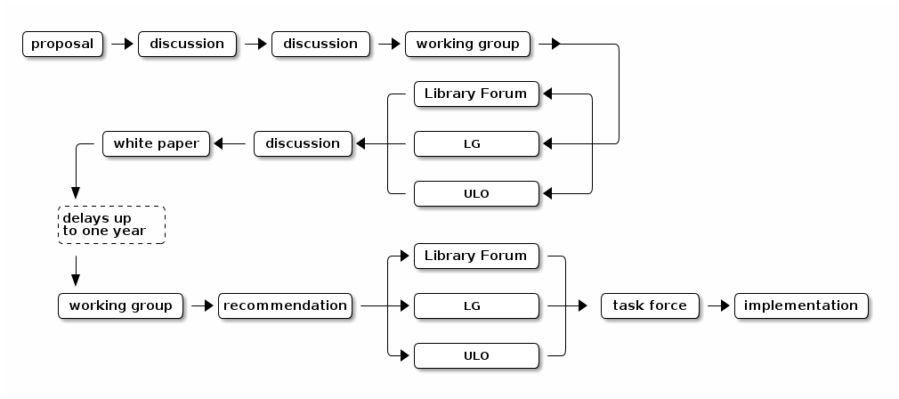
There are certainly some advantages to this method: foremost is the number of opportunities it offers for discussion, analysis and critique of ideas. All librarians and archivists have several chances to offer their opinions and to speak for or against something (sometimes both in the same meeting).
But the process is obviously inefficient. Sometimes the same people and same groups hear about and argue over the same idea several times in the space of weeks. Streamlining the process will save people time and allow more concentrated and productive focus on the idea at hand. The process also inefficiently scatters both problemizing and problematizing across those people and groups: sometimes it is unclear whether they should do one, the other, or both, in what order.
Problemization and problematization
Before I set out the more efficient process, we must distinguish between problemizing and problematizing. The OED defines them:
- “Problemize. v. intr. To discuss or consider problems.”
- “Problematize v. intr. To render problematic; to view, interpret, or analyse (an issue, discipline, etc.) as a problem or system of problems to be solved.”
To problemize is simple: “There is a problem with X because Y.” To problematize is more complex, but is explained by Foucault (1990) in his usual lucid prose: “Problematisation doesn’t mean representation of a pre-existing object, nor the creation by discourse of an object that doesn’t exist. It is the totality of discursive or non-discursive practices that introduces something into the play of true and false and constitutes it as an object for thought (whether in the form of moral reflection, scientific knowledge, political analysis, etc.).”[*]
Both problemizing and problematizing are part of my proposed solution: the Problem(at)ization Committee.
[*] To say something is “problematic” can be used in either sense. For example, a proposal to keep the Frost Library open 24 hours a day, 365 days a year, is problematic (in the problemize sense) for many reasons: not enough staff, increased costs, university is closed on statutory holidays and over Christmas, etc. It is also problematic in the problematize sense because it raises issues of Frost’s role at Glendon, Glendon’s role in York, why a library should be open at all, and, if it should, why Frost is being privileged over a Keele campus library. Therefore I propose that in our discourse we use problemic for the first sense (as in, “Can you cover my reference desk shift tomorrow?” “I’m afraid that’s problemic.”) and problematic for the second sense (as in, “Can you cover my reference desk shift tomorrow?” “I’m afraid that’s problematic.”).
Digital Oydyssey talk: On Dentographs
(This is the text of a short talk I gave today at the Digital Odyssey one-day conference run by the Ontario Library and Information Technology Association. Thanks to Steve Marks for inviting me.)
Hello everyone. My name is Bill Denton, and I’m here to talk about a kind of data visualization I invented called a dentograph.
This here is a dentograph. It is a one-by-one checkerboard dentograph. I’ll explain more about it in a minute, but I’m not going to get into any technical details. Every technical thing I could say I said in a paper in the Code4Lib Journal last year called On Dentographs, A New Method of Visualizing Library Collections. If you search your favourite search engine for “dentographs,” you’ll find it. Also, I’m putting this talk up on my web site and there will be a link to it from the OLITA site. The paper has all of the data, all of the code and all of the commands you need to make dentographs. You can just copy and paste line after line from the paper and make all of the images that it shows. Every step is there. Everything is fully reproducible.
So, no code today, no slides. I’m just going to talk. I’m going to talk about three things: dentographs, data, and art.
Dentographs
A dentograph is a way of visualizing the breadth and depth of a library’s collection, and it’s especially useful for comparing different collections at a glance. There are two kinds so far: checkerboard dentographs like this, which work best with the Dewey Decimal Classification, and mountain dentographs, which work with the Library of Congress Classification. Today I’ll just talk about checkerboards.
A brief reminder about the Dewey Decimal Classification. Given some part of the universe of human knowledge, such as a book, you follow a complicated set of rules and end up with a call number such as 512.7 KNU. Dewey numbers always begin with a three-digit number from 000 to 999, then possibly a decimal expansion, then some kind of Cutter number and a bunch of other stuff. The main subject of the book is encoded in those first numbers: 512.7.
Melvil Dewey built the system in a very rigid way. The hundreds divide all knowledge into ten broad categories: the 0 hundreds today are computer science, LIS and general works; the 100s are philosophy; the 200s are religion; and so on. The tens divide each hundred up into ten smaller subdivisions. The 500s are science, and within that the five-zero-zeroes (500 to 509) are general science, the 510s are mathematics, the 520s are astronomy, and so on. Within each ten that more specific subject is divided into ten still narrower areas. In this case, 512 is algebra, and within that there are ten more subdivisions, and 512.7 is number theory.
In reality, not every object in the universe and every concept humans have thought of divides and subdivides naturally into tens in a neat hierarchy, but Dewey made this Procrustean scheme and it’s what public libraries use. It’s what the Toronto Public Library uses.

This here is the Toronto Public Library’s collection. It’s a ten by ten grid of coloured squares. It works this way: the columns are hundreds and the rows are tens. It goes from the zero hundreds on the left to the 900s on the right, and from the zero tens at the bottom up to the nineties at the top. Bottom left corner is 000–009, above it is 010–019, and so on up to 090–099. In the bottom right corner is 900–909 and so on up that column to the top right which is 990–999.
The squares are all coloured differently, and the lightness or darkness shows the number of holdings in each ten. The lighter the square, the less TPL has; the darker, the more. (This is equivalent to what Katie Legere did with volume, but here it’s with value.)
Knowing this, if you know Dewey, you can tell a lot about the TPL’s collection just by looking. The column of the 300s (social sciences) is pretty dark and stands out especially compared to the 400s (language). The square four over from the left and four up from the bottom is the 330s, economics. On the right at the bottom of the 800s (literature) you can see the two darkest squares: the 810s are “American literature in English” (which includes writing about Canadian literature) and the 820s are “English and Old English literatures.”
Note that fiction isn’t included here, because like most public libraries TPL files fiction in a FICTION section and doesn’t give it a Dewey number. Fair enough. We use what we have.
In my paper I put TPL side-by-side with with the San Francisco Public Library, with the two collections measured to the same scale. If you look it up you’ll see that it does let you compare them at a glance. Toronto has a much, much richer and deeper collection than San Francisco. The general collection patterns are similar, the lights and darks are in roughly the same proportion, but in San Francisco both the lights and darks are much, much lighter.
That’s no judgment on San Francisco. It’s a smaller city with a smaller public library system, so you would expect this. But why am I comparing Toronto and San Francisco? Because of the availability of data.
Data
Like all other visualizations, dentographs require data. When I wanted to build some, I went to the Internet Archive. There is a collection of data files there that are MARC records uploaded to help the Open Library. (Remember that the Open Library was conceived by Aaron Swartz, who committed suicide in January because he was being persecuted for actions he took because he believed knowledge should be free.)
The Toronto Public Library uploaded its MARC records three years ago, in April 2010. No updates since then. I’m not singling them out: the San Francisco Public Library’s data is from December 2010 and not updated since then. Anyway, who am I to criticize anything? I work at York University and our data isn’t publicly available. It was MJ Suhonos who got the TPL data uploaded in his brief time working there, and I thank him for it. I have an inkling of how hard it must have been. It was probably equally hard at the other libraries that have made their catalogue dumps freely available. But it’s because that data is available that I could do my work.
You need data to do your work. And when you have some data it makes you think about other data. And when you’re working with some data it makes you think about working with other data. New ideas arise in the doing. This dentograph is a representation of the non-fiction holdings of the Toronto Public Library in April 2010. What was like it like two months ago, in April 2013? Wait a minute, what was it like in April 2011 and April 2012? If we had that data we could compare year to year, and then we could do an animated visualization of how the collection is changing year to year.
Why just year to year? Why not day to day? What if there were daily dumps? And what if it wasn’t just the collection, but other activity? What if anonymized borrowing records were available, and you could do an animated visualization of them day to day? Imagine something like this but alive, and flickering and changing fast before your eyes, showing all the borrowing patterns of Toronto citizens, responding to the ebb and flow of the school year and summer vacations and Christmas holidays. That would be fascinating to see.
Or what if it wasn’t borrowing but the holds people have put on books? The TPL has a wonderful system where if a book isn’t available at your local branch you can put a hold on it and they will drive it over there from wherever it happens to be. That’s a real indicator of a strong desire for a book. What if you had all that data and you could visualize that?
A full set of anonymized Toronto Public Library usage data would definitely be big data … big public data … except it doesn’t exist. Maybe there’s a TPL person here that can help liberate it. I hope so. Or if not, maybe they can at least get access to it internally and analyze it and make the results available.
And for all of us here today, if we can go back to where we work and get access to data from our own institutions, we can make our own visualizations, and then ask more questions and have other people ask questions about what we’ve done, and then get more data, and so on. Where I work, we’re asking these questions not just about our collections but also about our users and about what happens at our reference desks. We’re just beginning but there’s a hypothesis we’re going to test and the results could reshape what we do.
Art
Finally, about art.
This is a painting. I made the visualization on a computer, and then I painted it. It’s done in acrylics, dated 2013, and it’s called “TPL One-by-One Checkerboard Dentograph.”
When I made the first dentographs I was looking at them on my computer screen, and I liked them, but then I began to think, what if it was bigger? Maybe I could generate a huge 600 dpi image and take it to a print shop and get a poster printed. Then I could hang it on my wall. That would look nice.
But then I though, wait a minute, I could paint it. For the last few years I’ve been taking painting lessons and doing some amateur drawing and painting. I’ve found that the more I do, the more I enjoy it, and every painting I do, the more I learn and the better I get. One day I had the idea: what if I painted a dentograph?
So I went out and bought the biggest canvas I could find, four feet by four feet. I hung it on my wall, and it stayed there for months. Here’s a unexpected piece of interior decorating advice: if you need something to put on a wall, try a blank canvas. It’s more interesting than most paintings. On the one hand, the play of light and shadow on the white canvas through the day is fascinating, and on the other, every time you look at it, you’ll think, “Hmm … what could I make there?”
I made a dentograph. Once I had the supplies it took five days: one to prepare the canvas and four to paint it. I drew the lines in very very faint pencil, and because the canvas isn’t perfectly square I had to do what you do when you’re tiling a floor: I started in the middle and then worked out to the edges. I had to buy a four foot level so I could draw perfectly straight lines. I drew the ten by ten grid and then I masked off every other column and every other row with tape. I mixed ten jars of paint of varying shades and I painted the squares according to the intensity required by the raw numbers in my data analysis. I let it dry over night, then I took off the tape for the rows, remasked, and painted in the other missing rows, then the next two days I did the same for the missing columns.

When I do it again, I’ll do it differently, but it’s only by doing that I know what I’ll change next time—just like it’s only by doing data visualizations and hacking on them that you know what to change next time or ask next time.
Making art makes you think about things in different ways. Transferring something from one medium to another causes new ideas. Physically making something causes new ideas. Doing a painting or performing music gives us new insights and can make us go back to the original work in new ways.
It can also extend the work into new frontiers. A visualization on a computer screen is one thing, but what if you make a painting of a visualization you’ve done? What if you did several? I have plans to paint more dentographs. (In fact, if I can get more current TPL collection data, I will paint a dentograph of my neighbourhood branch and donate it to them. If there is anyone here from TPL that can help me with that, please talk to me after.) Maybe you will do some paintings of your own. Then we could have a show! Then artists and art critics would come and they look at the work from an entirely different point of view, and have fresh insights into it and interpret it in an entirely new way.
The same thing is true of sonification, like Katie Leger was showing. She had some data and she turned it into music. And she actually performed it. It’s impressive enough what she did on computer, but then she and other musicians played it live. By doing that, they moved it into a whole new realm of performance and changed it into a whole new work of art.
Conclusion
To finish up, I want to say that of course we need access to big open data. That’s a given. We need to be able to take it, reshape it, reform it, analyze it, ask new questions, get new data, answer those questions and then ask more questions. Visualizations will help with that. We need to look for the best available visualizations and we need to make up new visualizations.
And then on top of that we should push that work into art. We should turn the data and the analysis into music or into painting or into other disciplines. With the same set of TPL data maybe Katie could make music and I could make an animation and someone could put it together into a movie. Maybe someone could take the combination of sound and movement and turn it into a ballet. Maybe you could make a sculpture. Or maybe you’re good with materials and you could make something out of cloth—imagine a quilt that looked like this.
Whatever you do, I encourage you to make something new in an entirely different medium, and take it out to new audiences and show them that you’re taking something from our world into theirs, from library data analysis into fine art. We who work in libraries need to push out into new domains—“the library is a growing organism”—and this is one way we can do it. Thank you.
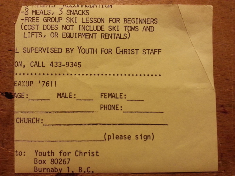
Manuscript found in a Pinter play
Scrap of paper, used as a bookmark, found inside a blue 1975 Eyre Methuen edition of Harold Pinter’s The Birthday Party:
Laertes update
I’ve updated Laertes, the special purpose point of interest provider I wrote for the augmented reality application Layar. It brings together geolocated tweets using one or more defined hash tags with points of interest from Google Maps to give an AR view of goings on and happenings for everyone at an event or conference.
I tried Laertes in February in Chicago and wrote it up in Code4Lib 2013 in Layar with Laertes. I noticed two problems: first that the map points could overwhelm the tweets, and second that old tweets can be uninteresting. If I’m out and want to know who’s around now, I want to see only recent tweets: I don’t care who was in this part of town two days ago.
This update fixes both those problems by adding in two filters: the first a checkbox so you can display tweets and/or map points, and the second a radio button so you can filter tweets to show only those from the last hour, four hours, twenty-four hours, the current day, or all.
Laertes is driving a Layar layer for HASTAC 2013, the Humanities, Arts, Science, Technology Advanced Collaboratory that’s happening at York University in Toronto later this week. (There’s another Twitter-related thing going on, +CITY, which I’m looking forward to seeing.)
Here’s what it looks like showing one map point for the Scott Library:

I hope there are a lot of people tweeting with geolocation turned on. I’m curious to see how it works out.
Complete installation instructions are on GitHub (with images!) if you want to try it yourself, but I’m happy to try hosting the POI end if someone wants to configure a Layar layer to talk to it. I’m running this at Heroku at the basic free level of hosting.