(This is the text of a short talk I gave today at the Digital Odyssey one-day conference run by the Ontario Library and Information Technology Association. Thanks to Steve Marks for inviting me.)
Hello everyone. My name is Bill Denton, and I’m here to talk about a kind of data visualization I invented called a dentograph.
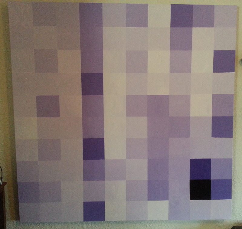
This here is a dentograph. It is a one-by-one checkerboard dentograph. I’ll explain more about it in a minute, but I’m not going to get into any technical details. Every technical thing I could say I said in a paper in the Code4Lib Journal last year called On Dentographs, A New Method of Visualizing Library Collections. If you search your favourite search engine for “dentographs,” you’ll find it. Also, I’m putting this talk up on my web site and there will be a link to it from the OLITA site. The paper has all of the data, all of the code and all of the commands you need to make dentographs. You can just copy and paste line after line from the paper and make all of the images that it shows. Every step is there. Everything is fully reproducible.
So, no code today, no slides. I’m just going to talk. I’m going to talk about three things: dentographs, data, and art.
Dentographs
A dentograph is a way of visualizing the breadth and depth of a library’s collection, and it’s especially useful for comparing different collections at a glance. There are two kinds so far: checkerboard dentographs like this, which work best with the Dewey Decimal Classification, and mountain dentographs, which work with the Library of Congress Classification. Today I’ll just talk about checkerboards.
A brief reminder about the Dewey Decimal Classification. Given some part of the universe of human knowledge, such as a book, you follow a complicated set of rules and end up with a call number such as 512.7 KNU. Dewey numbers always begin with a three-digit number from 000 to 999, then possibly a decimal expansion, then some kind of Cutter number and a bunch of other stuff. The main subject of the book is encoded in those first numbers: 512.7.
Melvil Dewey built the system in a very rigid way. The hundreds divide all knowledge into ten broad categories: the 0 hundreds today are computer science, LIS and general works; the 100s are philosophy; the 200s are religion; and so on. The tens divide each hundred up into ten smaller subdivisions. The 500s are science, and within that the five-zero-zeroes (500 to 509) are general science, the 510s are mathematics, the 520s are astronomy, and so on. Within each ten that more specific subject is divided into ten still narrower areas. In this case, 512 is algebra, and within that there are ten more subdivisions, and 512.7 is number theory.
In reality, not every object in the universe and every concept humans have thought of divides and subdivides naturally into tens in a neat hierarchy, but Dewey made this Procrustean scheme and it’s what public libraries use. It’s what the Toronto Public Library uses.

This here is the Toronto Public Library’s collection. It’s a ten by ten grid of coloured squares. It works this way: the columns are hundreds and the rows are tens. It goes from the zero hundreds on the left to the 900s on the right, and from the zero tens at the bottom up to the nineties at the top. Bottom left corner is 000–009, above it is 010–019, and so on up to 090–099. In the bottom right corner is 900–909 and so on up that column to the top right which is 990–999.
The squares are all coloured differently, and the lightness or darkness shows the number of holdings in each ten. The lighter the square, the less TPL has; the darker, the more. (This is equivalent to what Katie Legere did with volume, but here it’s with value.)
Knowing this, if you know Dewey, you can tell a lot about the TPL’s collection just by looking. The column of the 300s (social sciences) is pretty dark and stands out especially compared to the 400s (language). The square four over from the left and four up from the bottom is the 330s, economics. On the right at the bottom of the 800s (literature) you can see the two darkest squares: the 810s are “American literature in English” (which includes writing about Canadian literature) and the 820s are “English and Old English literatures.”
Note that fiction isn’t included here, because like most public libraries TPL files fiction in a FICTION section and doesn’t give it a Dewey number. Fair enough. We use what we have.
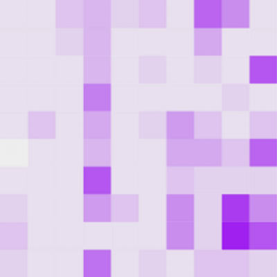
In my paper I put TPL side-by-side with with the San Francisco Public Library, with the two collections measured to the same scale. If you look it up you’ll see that it does let you compare them at a glance. Toronto has a much, much richer and deeper collection than San Francisco. The general collection patterns are similar, the lights and darks are in roughly the same proportion, but in San Francisco both the lights and darks are much, much lighter.
That’s no judgment on San Francisco. It’s a smaller city with a smaller public library system, so you would expect this. But why am I comparing Toronto and San Francisco? Because of the availability of data.
Data
Like all other visualizations, dentographs require data. When I wanted to build some, I went to the Internet Archive. There is a collection of data files there that are MARC records uploaded to help the Open Library. (Remember that the Open Library was conceived by Aaron Swartz, who committed suicide in January because he was being persecuted for actions he took because he believed knowledge should be free.)
The Toronto Public Library uploaded its MARC records three years ago, in April 2010. No updates since then. I’m not singling them out: the San Francisco Public Library’s data is from December 2010 and not updated since then. Anyway, who am I to criticize anything? I work at York University and our data isn’t publicly available. It was MJ Suhonos who got the TPL data uploaded in his brief time working there, and I thank him for it. I have an inkling of how hard it must have been. It was probably equally hard at the other libraries that have made their catalogue dumps freely available. But it’s because that data is available that I could do my work.
You need data to do your work. And when you have some data it makes you think about other data. And when you’re working with some data it makes you think about working with other data. New ideas arise in the doing. This dentograph is a representation of the non-fiction holdings of the Toronto Public Library in April 2010. What was like it like two months ago, in April 2013? Wait a minute, what was it like in April 2011 and April 2012? If we had that data we could compare year to year, and then we could do an animated visualization of how the collection is changing year to year.
Why just year to year? Why not day to day? What if there were daily dumps? And what if it wasn’t just the collection, but other activity? What if anonymized borrowing records were available, and you could do an animated visualization of them day to day? Imagine something like this but alive, and flickering and changing fast before your eyes, showing all the borrowing patterns of Toronto citizens, responding to the ebb and flow of the school year and summer vacations and Christmas holidays. That would be fascinating to see.
Or what if it wasn’t borrowing but the holds people have put on books? The TPL has a wonderful system where if a book isn’t available at your local branch you can put a hold on it and they will drive it over there from wherever it happens to be. That’s a real indicator of a strong desire for a book. What if you had all that data and you could visualize that?
A full set of anonymized Toronto Public Library usage data would definitely be big data … big public data … except it doesn’t exist. Maybe there’s a TPL person here that can help liberate it. I hope so. Or if not, maybe they can at least get access to it internally and analyze it and make the results available.
And for all of us here today, if we can go back to where we work and get access to data from our own institutions, we can make our own visualizations, and then ask more questions and have other people ask questions about what we’ve done, and then get more data, and so on. Where I work, we’re asking these questions not just about our collections but also about our users and about what happens at our reference desks. We’re just beginning but there’s a hypothesis we’re going to test and the results could reshape what we do.
Art
Finally, about art.
This is a painting. I made the visualization on a computer, and then I painted it. It’s done in acrylics, dated 2013, and it’s called “TPL One-by-One Checkerboard Dentograph.”
When I made the first dentographs I was looking at them on my computer screen, and I liked them, but then I began to think, what if it was bigger? Maybe I could generate a huge 600 dpi image and take it to a print shop and get a poster printed. Then I could hang it on my wall. That would look nice.
But then I though, wait a minute, I could paint it. For the last few years I’ve been taking painting lessons and doing some amateur drawing and painting. I’ve found that the more I do, the more I enjoy it, and every painting I do, the more I learn and the better I get. One day I had the idea: what if I painted a dentograph?
So I went out and bought the biggest canvas I could find, four feet by four feet. I hung it on my wall, and it stayed there for months. Here’s a unexpected piece of interior decorating advice: if you need something to put on a wall, try a blank canvas. It’s more interesting than most paintings. On the one hand, the play of light and shadow on the white canvas through the day is fascinating, and on the other, every time you look at it, you’ll think, “Hmm … what could I make there?”
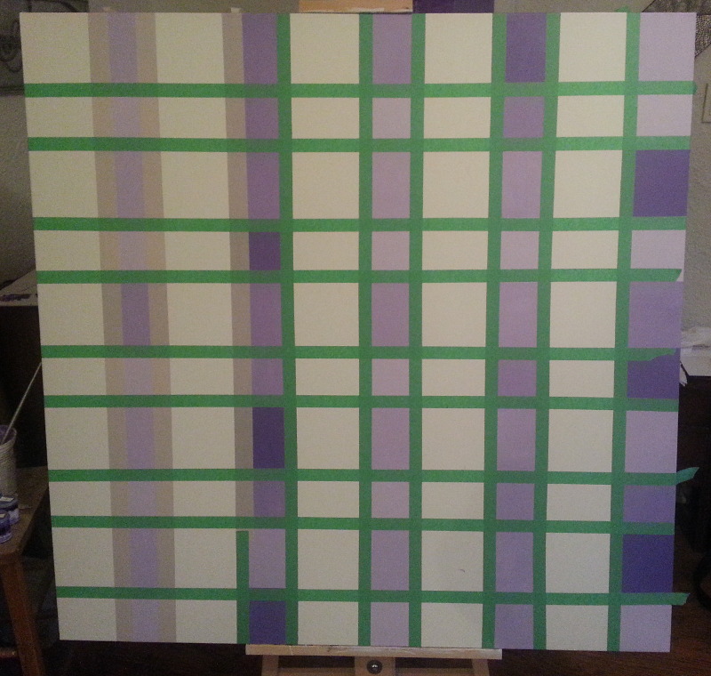
I made a dentograph. Once I had the supplies it took five days: one to prepare the canvas and four to paint it. I drew the lines in very very faint pencil, and because the canvas isn’t perfectly square I had to do what you do when you’re tiling a floor: I started in the middle and then worked out to the edges. I had to buy a four foot level so I could draw perfectly straight lines. I drew the ten by ten grid and then I masked off every other column and every other row with tape. I mixed ten jars of paint of varying shades and I painted the squares according to the intensity required by the raw numbers in my data analysis. I let it dry over night, then I took off the tape for the rows, remasked, and painted in the other missing rows, then the next two days I did the same for the missing columns.

When I do it again, I’ll do it differently, but it’s only by doing that I know what I’ll change next time—just like it’s only by doing data visualizations and hacking on them that you know what to change next time or ask next time.
Making art makes you think about things in different ways. Transferring something from one medium to another causes new ideas. Physically making something causes new ideas. Doing a painting or performing music gives us new insights and can make us go back to the original work in new ways.
It can also extend the work into new frontiers. A visualization on a computer screen is one thing, but what if you make a painting of a visualization you’ve done? What if you did several? I have plans to paint more dentographs. (In fact, if I can get more current TPL collection data, I will paint a dentograph of my neighbourhood branch and donate it to them. If there is anyone here from TPL that can help me with that, please talk to me after.) Maybe you will do some paintings of your own. Then we could have a show! Then artists and art critics would come and they look at the work from an entirely different point of view, and have fresh insights into it and interpret it in an entirely new way.
The same thing is true of sonification, like Katie Leger was showing. She had some data and she turned it into music. And she actually performed it. It’s impressive enough what she did on computer, but then she and other musicians played it live. By doing that, they moved it into a whole new realm of performance and changed it into a whole new work of art.
Conclusion
To finish up, I want to say that of course we need access to big open data. That’s a given. We need to be able to take it, reshape it, reform it, analyze it, ask new questions, get new data, answer those questions and then ask more questions. Visualizations will help with that. We need to look for the best available visualizations and we need to make up new visualizations.
And then on top of that we should push that work into art. We should turn the data and the analysis into music or into painting or into other disciplines. With the same set of TPL data maybe Katie could make music and I could make an animation and someone could put it together into a movie. Maybe someone could take the combination of sound and movement and turn it into a ballet. Maybe you could make a sculpture. Or maybe you’re good with materials and you could make something out of cloth—imagine a quilt that looked like this.
Whatever you do, I encourage you to make something new in an entirely different medium, and take it out to new audiences and show them that you’re taking something from our world into theirs, from library data analysis into fine art. We who work in libraries need to push out into new domains—“the library is a growing organism”—and this is one way we can do it. Thank you.
 Miskatonic University Press