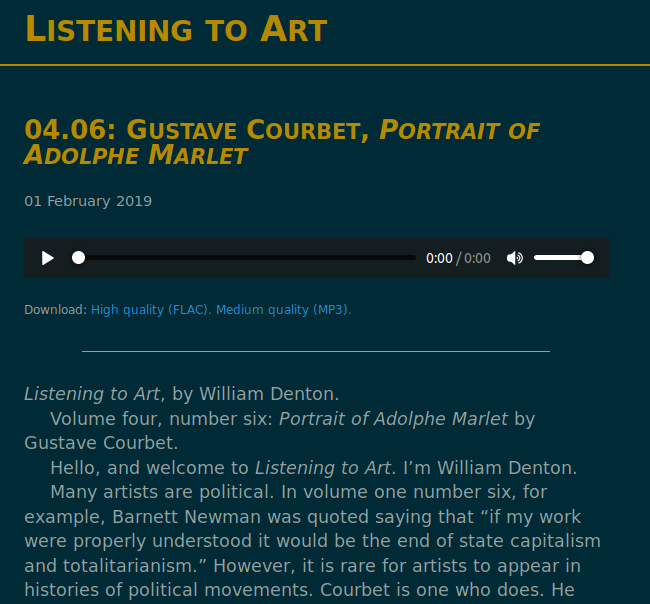
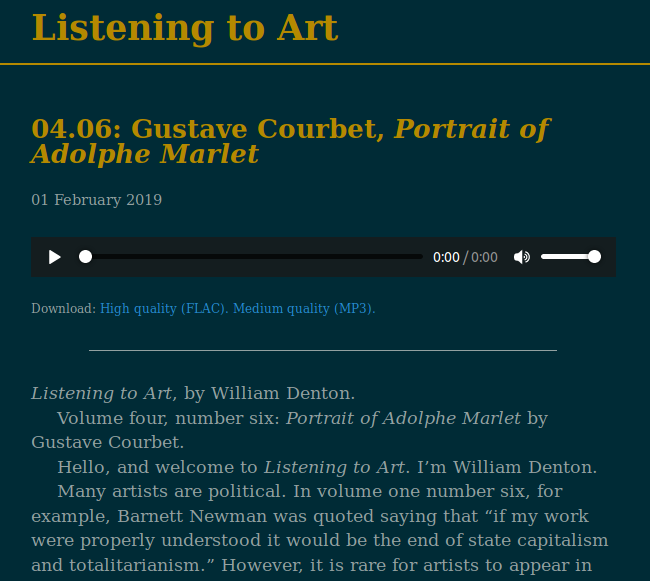
Today I changed Listening to Art so it uses a self-hosted copy of the Libre Baskerville Google Font. For future reference, here’s how I did it.
First, I decided I wanted to change the font to Baskerville because that’s what I use in print. I checked up on Google Fonts and discovered it has Libre Baskerville, which would do me fine, and it’s under an open license.
However, instead of letting visiting browsers load it from Google, I’d have to self-host it, because I do not want to have my sites loading in anything from outside providers. That helps advertisers and content delivery networks track people from site to site.

Second, I did a bunch of stuff that turned out to be not the best thing to do and anyway it didn’t work. Then I read How to host google web fonts on my own server? on Stack Overflow.
Third, I downloaded google-font-download, which is a free and open source bash script. I ran it on the three scripts listed at Google Fonts.
$ ./google-font-download "Libre Baskerville:400" "Libre Baskerville:400italic" "Libre Baskerville:700"
Downloading Libre Baskerville:400...woff2 woff eot svg ttf
Downloading Libre Baskerville:400italic...woff2 woff eot svg ttf
Downloading Libre Baskerville:700...woff2 woff eot svg ttf
This left me with a bunch of Libre_Baskerville_* files and font.css.
Fourth, I moved all those files into the Listening to Art /css/ directory and renamed the CSS file to baskerville.css.
Fifth, I edited the main CSS file. I added this to point to the local fonts:
@import url("baskerville.css")
Then I told it to use Libre Baskerville with this font-family line:
body {
  font-size: 125%;
  line-height: 140%;
  background: #002b36;
  font-family: 'Libre Baskerville', serif;
}
For some reason the main text on the pages lost its light colour and went black, so I had to force the text colour to be what I wanted, but that was the only thing that went wrong. Also, I removed the small caps from the headings.

Of course it looks much nicer in print (where I use the LaTeX BaskervaldX font), but I’m happy they’re closer now.
 Miskatonic University Press