MARC magic for file
I was chuffed to see Kevin Ford report that the Unix utility file now recognizes MARC records:
$ file 101015_001.mp3
101015_001.mp3: Audio file with ID3 version 2.3.0, contains: MPEG ADTS, layer III, v1, 192 kbps, 44.1 kHz, Stereo
$ file my-cats.jpg
my-cats.jpg: JPEG image data, JFIF standard 1.02
$ file OL.20100104.01.mrc
OL.20100104.01: MARC21 Bibliographic
If you download the source and look at the magic/Magdir/marc21 file you’ll see what makes it work. Every file type has some “magic” that lets you identify it:
#--------------------------------------------
# marc21: file(1) magic for MARC 21 Format
#
# Kevin Ford (kefo@loc.gov)
#
# MARC21 formats are for the representation and communication
# of bibliographic and related information in machine-readable
# form.  For more info, see http://www.loc.gov/marc/


# leader position 20-21 must be 45
20      string  45

# leader starts with 5 digits, followed by codes specific to MARC format
>0      regex/1 (^[0-9]{5})[acdnp][^bhlnqsu-z]  MARC21 Bibliographic
!:mime  application/marc
>0      regex/1 (^[0-9]{5})[acdnosx][z] MARC21 Authority
!:mime  application/marc
>0      regex/1 (^[0-9]{5})[cdn][uvxy]  MARC21 Holdings
!:mime  application/marc
0       regex/1 (^[0-9]{5})[acdn][w]    MARC21 Classification
!:mime  application/marc
>0      regex/1 (^[0-9]{5})[cdn][q]     MARC21 Community
!:mime  application/marc

# leader position 22-23, should be "00" but is it?
>0      regex/1 (^.{21})([^0]{2})       (non-conforming)
!:mime  application/marc
A small victory now that a basic Unix/Linux utility can recognize a key library file format, but as Kyle Bannerjee put it on the Code4Lib mailing list, “I’m not sure whether to laugh or cry that it’s a sign of progress that a 40 year old utility designed to identify file types is now just beginning to be able to recognize a format that’s been around for almost 50 years.”
Code4Lib North #c4ln tweets
About a month ago I was at Great Lakes THAT Camp 2012 (staying in a former convent) and I made a graph of tweeting action and posted about it at #thatcamp hashtags the Tony Hirst way.
The last couple of days I was at Code4Lib North 2012 (staying in a former convent) and on the train back home I made a graph of tweeting action, this time using ggplot2 in R the way Tony Hirst had. This should let you recreate it:
> require(ggplot2)
> require(twitteR)
> require(plyr)
> tweets <- searchTwitter("#c4ln", n=500)
> tw <- twListToDF(tweets) # turn results into a data frame
> tw1 <- ddply(tw, .var = "screenName", .fun = function(x) {return(subset(x, created %in% min(created),select=c(screenName,created)))})
> tw2 <- arrange(tw1, -desc(created))
> tw$screenName <- factor(tw$screenName, levels = tw2$screenName)
> library(stringr)
> trim <- function (x) sub('@','',x)
> tw$rt=sapply(tw$text,function(tweet) trim(str_match(tweet,"^RT (@[[:alnum:]_]*)")[2]))
> tw$rtt=sapply(tw$rt,function(rt) if (is.na(rt)) 'T' else 'RT')
> png(filename = "20120525-c4ln-tweets.png", height=800, width=600)
> ggplot(tw)+geom_point(aes(x=created,y=screenName,col=rtt))
> dev.off()
(If you don’t have the twitteR (or ggplot2 or plyr) package installed then run install.packages("twitteR") (or the other package name) to get it.)
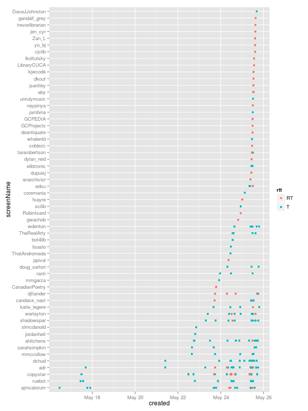
What does this show us? Original tweets and old-style RT retweets, first off. That a few people started using the hash tag early(@ajmcalorum was first off the bat). That a few people used it a lot (the usernames, lower down, with a lot of dots along their horizontal line) and more people used it only once (usually retweets). That there were a number of tweets on 23 May (the day before, when people were travelling to Windsor to get there), but things started in earnest on the first day, 24 May.
Correcting timestamp on photographs taken on an Acer Android phone
I have an Acer Liquid E phone running Android. All of the photographs it takes are timestamped in the internal EXIF metadata to 8 December 2002. Turns out there’s a bug in the camera app: it seems that instead of using “insert correct date here” in libcamera.so somehow the December 2002 date got hardcoded in.
The timestamp on the file itself is correct, however, so I wrote this script to use that to edit the EXIF times. It uses ExifTool, which is probably in your package manager:
#!/bin/bash

for I in 2002-12-08*jpg
do
  TIMESTAMP=`stat --printf "%y" "$I"`
  NAME=`echo "$I" | sed 's/2002-12-08 12.00.00-//'`
  NAME="acer-$NAME"
  echo "$I --> $NAME ($TIMESTAMP)"
  cp -p "$I" $NAME
  exiftool -P -DateTimeOriginal="$TIMESTAMP" -CreateDate="$TIMESTAMP" $NAME
done
For example, a file named 2002-12-08 12.00.00-460.jpg timestamped 2012-04-10 19:30 would have the DateTimeOriginal and CreateDate EXIF fields corrected to to 2012-04-10 19:30 and the file would be renamed to acer-460.jpg. The original file is left untouched.
It worked for me, and it won’t delete your files, so use it if it helps. Make sure that whenever you copy files off your Acer phone you use cp -p to preserve the original timestamp. Otherwise your photos will have their internal dates set to today!
Ref desk 5: Fifteen minutes for under one per cent
This is the fifth and last in a series about using R to look at reference desk statistics recorded in LibStats. Previously:
- Ref desk 1: LibStats
- Ref desk 2: Questions asked per week at a branch
- Ref desk 3: Comparing question.type across branches
- Ref desk 4: Calculating hours of interactions
I’ve been making some other charts showing other kinds of ratios and calculations but I’m going to skip to one last pair of charts where I bring in the number of our students to figure out how many students we help with research help each week and for how long.
First, a brief review of the four branches of the York University Libraries system we’re looking at:
- Scott is arts, humanities and social sciences, and the building includes the map library, the archives, and music/film library
- Bronfman is business
- Frost is on the Glendon campus in another part of the city and handles all of the students there
- Steacie is science, engineering and health
(Osgoode is law but they don’t use LibStats so we’ll forget about them for now.)
I calculated how many “home students” each library has. Bronfman handles everyone in the business school and in the administrative studies program in another faculty. Steacie handles everyone in the science and health faculties (except psychology, which is handled at Scott). Frost handles everyone at Glendon. Scott handles everyone else. The York University Factbook let me look up how many students were in each faculty, and I did a bit of adding and subtracting and figured out:
- Scott has 34,388 “home students”
- Bronfman has 6,050
- Frost has 2,677
- Steacie has 10,018
That’s 53,133 students total, as of last fall. (We have about 43 librarians and archivists, for a ratio of 1235 students to each librarian, which is one of the worst in Canada.)
You can figure out something very similar for your library, probably.
With those numbers, we’re all set for some more work in R.
First, I make a libstats.bigscott data frame, which gloms together all of the reference desk activities that happen in the Scott Library building (which as I said contains three smaller libraries) into one. This is necessary to group together all possible arts/humanities/social sciences questions. These lines below rename certain library.name fields by saying, for example for SMIL, for every entry in this data frame where library.name equals “SMIL”, make library.name equal “Scott.” Nice example of vector thinking in R.
> libstats.bigscott <- libstats
> libstats.bigscott$library.name[libstats.bigscott$library.name == "SMIL"] <- "Scott"
> libstats.bigscott$library.name[libstats.bigscott$library.name == "ASC"] <- "Scott"
> libstats.bigscott$library.name[libstats.bigscott$library.name == "Maps"] <- "Scott"
> libstats.bigscott$week <- as.Date(cut(as.Date(libstats.bigscott$timestamp, format="%m/%d/%Y %r"), "week", start.on.monday=TRUE))
Next, use our old friend ddply to count how many research questions are asked each week.
> research.users <- ddply(subset(libstats.bigscott,
                                 question.type %in% c("4. Strategy-Based", "5. Specialized")),
                          .(library.name, week), nrow)
> names(research.users)[3] <- "users"
> research.users$user.ratio <- NA
> head(research.users)
> library.name       week users user.ratio
1     Bronfman 2011-01-31    48         NA
2     Bronfman 2011-02-07    80         NA
3     Bronfman 2011-02-14    42         NA
4     Bronfman 2011-02-21    61         NA
5     Bronfman 2011-02-28    53         NA
6     Bronfman 2011-03-07    59         NA
Now, another probably heinous non-R way of dividing the number of users (or, actually, questions) each week by the number of “home students”:
> for (i in 1:nrow(research.users)) {
    if (research.users[i,1] == "Bronfman"          ) { research.users[i,4] = research.users[i,3] / 6050  }
    if (research.users[i,1] == "Frost"             ) { research.users[i,4] = research.users[i,3] / 2677  }
    if (research.users[i,1] == "Scott"             ) { research.users[i,4] = research.users[i,3] / 34388 }
    if (research.users[i,1] == "Steacie"           ) { research.users[i,4] = research.users[i,3] / 10018 }
  }
> library.name       week users  user.ratio
1     Bronfman 2011-01-31    48 0.007933884
2     Bronfman 2011-02-07    80 0.013223140
3     Bronfman 2011-02-14    42 0.006942149
4     Bronfman 2011-02-21    61 0.010082645
5     Bronfman 2011-02-28    53 0.008760331
6     Bronfman 2011-03-07    59 0.009752066
user.ratio there is what we’re after. It looks low, doesn’t it? Multiply it by 100 to get a percentage. It’s still low.

The y-axis is per cent, so this shows that usually through term time we see give research help to under 1% of our students. There are a few weeks in some branches where it gets above that, but it’s never above 1.5%.
That really surprised me. I have no idea what the numbers are like at other universities. If you figure it out for where you work, let me know. Perhaps one per cent is a common figure? Could it be five per cent at some universities? It would have to be a small university, I think, or have a lot of librarians.
Know that we know how many students we help with research, I wondered how long we spend helping them. More calculations in R, using ref.desk.spent, the function I defined in the last post to add up an estimate of how much time is spent at the desk. Here we break it down by branch by week, create a research.time.bigscott data frame, which I then merge with research.users so I can divide to create the research.mins.ratio which is what I’m after:
> research.time.bigscott <- data.frame(library.name = factor(), week = factor(), research.mins = numeric())
> branches <- c("Scott", "Frost", "Bronfman", "Steacie")
> for (i in 1:length(branches)) {
    branchname <- branches[i]
    for (j in 1:length(weeks)) {
      spent <- desk.time.spent(ddply(subset(libstats.bigscott,
                                            library.name == branchname & week==weeks[j] &
                                            question.type %in% c("4. Strategy-Based", "5. Specialized")),
                                     .(time.spent), nrow))
      rbind(research.time.bigscott,
            data.frame(library.name = branchname, week = weeks[j], research.mins = spent)) -> research.time.bigscott
    }
  }
> research.users$week <- as.factor(research.users$week) # Necessary for merge to work cleanly
> research.time.bigscott <- merge(research.time.bigscott, research.users, by=c("library.name", "week"))
> research.time.bigscott$research.mins.ratio <- research.time.bigscott$research.mins / research.time.bigscott$users
> head(research.time.bigscott)
  library.name       week research.mins users  user.ratio research.mins.ratio
1     Bronfman 2011-01-31           758    48 0.007933884            15.79167
2     Bronfman 2011-02-07          1340    80 0.013223140            16.75000
3     Bronfman 2011-02-14           595    42 0.006942149            14.16667
4     Bronfman 2011-02-21           997    61 0.010082645            16.34426
5     Bronfman 2011-02-28           775    53 0.008760331            14.62264
6     Bronfman 2011-03-07           901    59 0.009752066            15.27119
> xyplot(research.mins.ratio ~ as.Date(week) | library.name, data = research.time.bigscott,
         type = "h",
         ylab = "Length of average research interaction (minutes)",
         xlab = "Week",
         main = "Average length of research interactions (Scott includes ASC/Maps/SMIL)",
         sub = paste("From Feb 2011 to", up.to.week),
         abline=list(h=15, lty=3, col="lightgrey"),
        )
In this xyplot command I throw in an extra abline to draw a dashed light grey line along y=15 to help point out that generally we spend about fifteen minutes on each research interaction.

The Steacie library stands out from the others, and there are some peaks here and there, but overall we spend on average about fifteen minutes on each research interaction with students.
Put those two charts together and it shows that during term time we spend on average about fifteen minutes a week giving research help to each of under one per cent of our students.
Hat Rack
This is Hat Rack, by Marcel Duchamp, at the Art Institute of Chicago. The label dates it at 1964 and adds “(1916 original now lost).”

Here is the signature on the bottom:

Seeing Duchamp’s work in any gallery is a joy.
Ref desk 4: Calculating hours of interactions
(Fourth in a series about using R to look at reference desk statistics recorded in LibStats. Third was Ref desk 3: Comparing question.type across branches.)
The last two posts looked at two straightforward breakdowns of reference desk activity at a library with several branches: questions by branch (to look at all activity at a single branch) and branches by question (to compare how many questions of the same type are asked at all branches). Both are very useful and lead to interesting questions and discussions. I’m sticking to numbers and charts here, but they are just the beginning of a larger discussion about the purpose of the reference desk is and how it works at a library—and how reference desk statistics are recorded, and what the act of recording means.
It’s important to talk about all of that, and I do enjoy those discussions. But right now I’m going to make another chart.
Another fact we record about each reference desk interaction is its duration, which in our libstats data frame is in the time.spent column. As I explained in Ref Desk 1: LibStats, these are the options:
- NA (“not applicable,” which I’ve used, though I can’t remember why)
- 0-1 minute
- 1-5 minutes
- 5-10 minutes
- 10-20 minutes
- 20-30 minutes
- 30-60 minutes
- 60+ minutes
We can use this information to estimate the total amount of time we spend working with people at the desk: it’s just a matter of multiplying the number of interactions by their duration.
Except we don’t know the exact length of each duration, we only know it with some error bars: if we say an interaction took 5-10 minutes then it could have taken 5, 6, 7, 8, 9, or 10 minutes. 10 is 100% more than 5: relatively that’s a pretty big range. (Of course, mathematically it makes no sense to have a 5-10 minute range and a 10-20 minute range, because if something took exactly 10 minutes it could go in either category.)
Let’s make some generous estimates about a single number we can assign to the duration of reference desk interactions.
| Duration | Estimate |
|---|---|
| NA | 0 minutes |
| 0-1 minute | 1 minute |
| 1-5 minutes | 5 minutes |
| 5-10 minutes | 10 minutes |
| 10-20 minutes | 15 minutes |
| 20-30 minutes | 25 minutes |
| 30-60 minutes | 40 minutes |
| 60+ minutes | 65 minutes |
This means that if we have 10 transactions of duration 1-5 minutes we’ll call it 10 * 5 = 50 minutes total. If we have 10 transactions of duration 20-30 minutes we’ll call it a 10 * 25 = 250 minutes total. These estimates are arguable but I think they’re good enough. They’re on the generous side for the shorter durations, which make up most of the interactions.
Next, we need to figure out how many interactions happened of each possible duration. This is easily done using ddply as we did before, but this time to count by time.spent:
> tmp <- ddply(libstats, .(time.spent, week), nrow)
> head(tmp)
  time.spent       week   V1
1 0-1 minute 2011-01-31  811
2 0-1 minute 2011-02-07 1220
3 0-1 minute 2011-02-14 1177
4 0-1 minute 2011-02-21  592
5 0-1 minute 2011-02-28  949
6 0-1 minute 2011-03-07 1037
This tells us that across our library system in the week starting 2011-01-31 there were 811 interactions that took 0-1 minutes. What else happened that week? How many interactions were there of all other durations?
> subset(tmp, week == " 2011-01-31")
       time.spent       week  V1
1      0-1 minute 2011-01-31 811
65    1-5 minutes 2011-01-31 299
129 10-20 minutes 2011-01-31  72
212 20-30 minutes 2011-01-31  28
274 30-60 minutes 2011-01-31   6
332  5-10 minutes 2011-01-31 153
447          <NA> 2011-01-31  11
What’s the total amount of time spent dealing with people at the desk? We’ll use our rule defined above, and just ignore the NAs:
> 811*1 + 299*5 + 72*15 + 28*25 + 6*40 + 153*10
[1] 5856
> round(5856/60)
[1] 98
Answer: about 98 hours.
That’s just one week, though. How can we figure it out for each week, and then chart that? I’d hoped to be able to do it in a nice R way with one of the apply functions, because I was in exactly the situation that Neil Saunders describes in A brief introduction to “apply” in R:
At any R Q&A site, you’ll frequently see an exchange like this one:
Q: How can I use a loop to […insert task here…] ?
A: Don’t. Use one of the apply functions.
I’d hoped to go at it with some kind of arrangement with a data frame of duration factors and estimated times:
     duration       estimate
   0-1 minute              1
  1-5 minutes              5
 5-10 minutes             10
10-20 minutes             15
20-30 minutes             25
30-60 minutes             40
  60+ minutes             60
Then I’d apply a function to each row of tmp that would check the value of time.spent, look up the equivalent duration in this data frame to find the estimate that goes with it, multiply V1 * estimate and then put the result in an interaction.time column. I took a stab at but couldn’t get it working, so I did it with a loop. It’s not the R way, but it worked, and I’ll take another crack at it another day.
So to do it the ugly way, first I define a function:
> desk.time.spent <- function(x) {
    if (nrow(x) == 0) { return(0) }
    sum = 0
    for (i in 1:nrow(na.omit(x))) {
      if      (x[i,1] == "0-1 minute"   ) { sum = sum + 1 * x[i,2]  }
      else if (x[i,1] == "1-5 minutes"  ) { sum = sum + 5 * x[i,2]  }
      else if (x[i,1] == "5-10 minutes" ) { sum = sum + 10 * x[i,2]  }
      else if (x[i,1] == "10-20 minutes") { sum = sum + 15 * x[i,2] }
      else if (x[i,1] == "20-30 minutes") { sum = sum + 25 * x[i,2] }
      else if (x[i,1] == "30-60 minutes") { sum = sum + 40 * x[i,2] }
      else if (x[i,1] == "60+ minutes"  ) { sum = sum + 65 * x[i,2] }
    }
    return(sum)
  }
Then I create an empty data frame and reset which branches to look at, just in case I fiddled that somewhere before:
> interaction.time <- data.frame(library.name = factor(), week = factor(), desk.mins = numeric())
> interaction.time$week = as.Date(interaction.time$week) # Can't set this in the line above
> branches <- levels(libstats$library.name)
Then I loop through the branches, using ddply to calculate how many of each question was asked each week, and passing that data frame to the desk.time.spent() function for multiplication. It returns the number of minutes spent that week helping people, and then rbind matches things up to add a new row to the interaction.time data frame.
> for (i in 1:length(branches)) {
    branchname <- branches[i]
    write (branchname, stderr())
    for (j in 1:length(weeks)) {
      spent <- desk.time.spent(ddply(subset(libstats,
    library.name == branchname & week==weeks[j]), .(time.spent), nrow))
      rbind(interaction.time,
        data.frame(library.name = branchname, week = weeks[j], desk.mins = spent)) -> interaction.time
    }
  }
> tail(interaction.time)
    library.name       week desk.mins
429      Steacie 2012-02-27      1460
430      Steacie 2012-03-05      1180
431      Steacie 2012-03-12      1110
432      Steacie 2012-03-19      1286
433      Steacie 2012-03-26      1042
434      Steacie 2012-04-02      1523
(desk.mins is actually time spent not only at the desk but in offices and anywhere else. Just ignore the name, or change it—I’m copying this from a script that does something slightly different.)
> xyplot(desk.mins/60 ~ as.Date(week)|library.name, data = interaction.time,
         type = "h",
         ylab = "Hours",
         xlab = "Week",
         main = "Hours of interactions",
         sub = paste("From Feb 2011 to", up.to.week),
        )

Let’s narrow things down and look at only research questions (4s and 5s) at the reference desk. Librarians and archivists often help people with research questions in an office, not at the desk—such practices vary from library to library and discipline to discipline, and of course not all branches have reference/research desks—and those aren’t counted here. Nevertheless, it’s an interesting view on what happens at the desk, and it’s an instructive example about how to slice the data more finely, but as always we have to remember what data is being shown.
> branches <- c("Bronfman", "Frost", "Scott", "Steacie")
> research.interaction.time <- data.frame(library.name = factor(), week = factor(), research.mins = numeric())
> for (i in 1:length(branches)) {
    branchname <- branches[i]
    write (branchname, stderr())
    for (j in 1:length(weeks)) {
      spent <- desk.time.spent(ddply(subset(libstats,
                                          library.name == branchname & week==weeks[j] &
                                          location.name %in% c("Consultation Desk", "Drop-in Desk", "Reference Desk") &
                                          question.type %in% c("4. Strategy-Based", "5. Specialized")
                                          ),
                                   .(time.spent), nrow))
      rbind(research.interaction.time, data.frame(library.name = branchname, week = weeks[j],
      research.mins = spent)) -> research.interaction.time
    }
  }
> interaction.time <- merge(interaction.time, research.interaction.time, by=c("week", "library.name"))
> tail(interaction.time)
          week library.name desk.mins research.mins
243 2012-03-26        Scott      2856          1946
244 2012-03-26      Steacie      1042           110
245 2012-04-02     Bronfman       781           270
246 2012-04-02        Frost       351            55
247 2012-04-02        Scott      1467           960
248 2012-04-02      Steacie      1523            20
> xyplot(research.mins/60 ~ as.Date(week) | library.name, data = interaction.time,
         type = "h",
         ylab = "Hours",
         xlab = "Week",
         main = "Research desk research interactions (hours)",
         sub = paste("From Feb 2011 to", up.to.week),
        )

In the next post, the last of this short series, I’ll bring in the number of students and do a couple of calculations based on that.
#thatcamp hashtags the Tony Hirst way
I really admire what Tony Hirst does at OUseful.Info, the blog. If you don’t know of him, go have a look, and perhaps follow him on Twitter at @psychemedia.
In February he did one of his usual lengthy, richly informative, visually striking, thought-provoking posts called Visualising Activity Around a Twitter Hashtag or Search Term Using R. I’d filed this away as something worth trying and since I’m taking a short break at Great Lakes THAT Camp 2012 I thought I’d try what he did on the #thatcamp hashtag on Twitter. It’s complicated by the fact that there are two THAT Camps going on simultaneously, but let’s see what happens.
What I do is all copied from what Tony did, except that I decided not to use ggplot, only because I’ve never used it before. I ran R and did:
> install.packages("twitteR")
> library(twitteR)
> library(plyr)
> tweets <- searchTwitter("#thatcamp", n=500) # do a search
> tw <- twListToDF(tweets) # turn results into a data frame
> colnames(tw)
 [1] "text"         "favorited"    "replyToSN"    "created"      "truncated"    "replyToSID"   "id"
 [8] "replyToUID"   "statusSource" "screenName"
> # Find the earliest tweet for each user
> tw1 <- ddply(tw, .var = "screenName", .fun = function(x) {return(subset(x, created %in% min(created),select=c(screenName,created)))})
> colnames(tw1)
[1] "screenName" "created"
> head(tw1)
     screenName             created
1     _amytyson 2012-04-18 19:26:40
2     acavender 2012-04-19 12:12:12
3   acrlulstech 2012-04-20 16:57:39
4   adamarenson 2012-04-18 17:22:58
5 adamkriesberg 2012-04-17 20:44:28
6    adelinekoh 2012-04-21 14:10:00
> # Arrange usernames in order of first tweet time
> tw2 <- arrange(tw1, -desc(created))
> head(tw2)
       screenName             created
1    foundhistory 2012-04-16 14:43:56
2        thatcamp 2012-04-16 14:47:18
3  THATCampCaribe 2012-04-16 15:32:11
4       PhDeviate 2012-04-16 15:36:52
5       nickmimic 2012-04-16 15:59:19
6 AfrolatinProjec 2012-04-16 16:14:07
> # Now use this order to reorder our original tw dataframe
> tw$screenName <- factor(tw$screenName, levels = tw2$screenName)
> png(filename = "20120421-thatcamp-tweets.png", height=1000, width=500)
> plot(tw$created, tw$screenName, xlab = "Time",
  ylab = "Username",
  main = "Last 500 #thatcamp tweets as of Sat 21 Apr 2012", yaxt="n")
> # Label the y-axis nicely, hope it's readable
> axis(2, at = 1:length(levels(tw$screenName)), labels=levels(tw$screenName), las=2, cex.axis=0.4)
> dev.off()
That generates this image, which puts a dot to indicate who tweeted when with the #thatcamp hashtag.
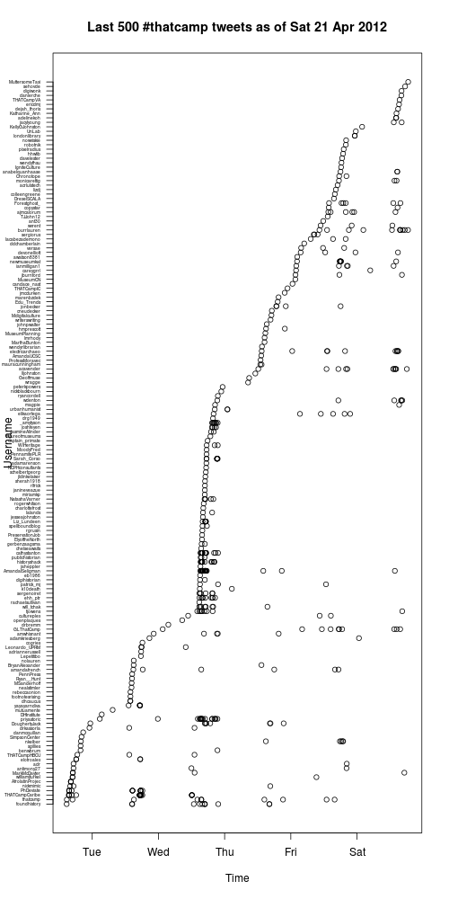
Not as pretty as what Tony did, but it’s a start.
Ref desk 3: Comparing question.type across branches
(Third in a series about using R to look at reference desk statistics recorded in LibStats, following Ref Desk 1: LibStats and Ref desk 2: Questions asked per week at a branch.)
How about comparing how many of each question type was asked across all branches? With the libstats data frame and the ddply command we can do that in one command per question, using subset to pick out one particular kind of question):
> xyplot(V1 ~ week | library.name,
         data=ddply(subset(libstats, question.type == "2. Skill-Based: Tech Support"),
       .(library.name, week), nrow),
         type = "h",
         main = "2. Skill-Based: Tech Support questions asked at each branch",
         sub = paste("Feb 2011 to", up.to.week),
         ylab = "Number of questions",
         xlab = "Week",
         par.strip.text = list(cex=0.7),
         )
(ddply(subset(libstats, question.type == "2. Skill-Based: Tech Support"), .(library.name, week), nrow) means “out of the whole libstats data frame, form a subset of only the type 2 questions, and then on that new data frame run ddply and count up how many of this type of question happened at each branch (library.name) each week by using nrow to do the counting.”)

To look at strategy-based questions, change the question.type restriction:
> xyplot(V1 ~ week | library.name,
         data = ddply(subset(libstats, question.type == "4. Strategy-Based"), .(library.name, week), nrow),
         type = "h",
         main = "4. Strategy-Based questions asked at each branch",
         sub = paste("Feb 2011 to", up.to.week),
         ylab = "Number of questions",
         xlab = "Week",
         par.strip.text = list(cex=0.7),
         )

It’s misleading the way that ASC (the archives), Maps and SMIL (the Sound and Moving Image Library) appear here, because they are entirely different kinds of things from the Bronfman, Frost (which started recording data months after the others), Scott and Steacie libraries: most importantly, they don’t have research help desks. People who work here know all of that and can put the numbers into context, but if you don’t know this library system then I’ll leave it to you to think about how different branches at your library would appear if they were charted this way.
Comparing these two charts, one thing that stands out is the Scott/Scott Information split. “Scott” is the main library’s research desk (which is actually two desks: drop-in or by appointment). “Scott Information” is the main library’s information and tech support desk. They’re right beside each other. If you need a stapler or want to print from your laptop or need to find a known book or get to an article your prof put on reserve, the information desk will help you, and help you quickly. If you have a strategy-based or specialized question, the research desk will help you. Dividing things up this way has makes everything more efficient and gets the right help to the students more quickly.
I have an R script that generates all kinds of charts and puts them together into one PDF. Part of it is a loop that generates all variations of the two charts above by doing something like this:
> filename = paste("questions-by-branch", up.to.week, ".pdf", sep="")
> pdf(filename)
> questiontypes <- c("1. Non-Resource",
                     "2. Skill-Based: Tech Support",
                     "3. Skill-Based: Non-Technical",
                     "4. Strategy-Based",
                     "5. Specialized")
> for (i in 1:length(questiontypes)) {
    questionname <- questiontypes[i]
    write (questionname, stderr())
    print(xyplot(V1 ~ week | library.name,
                 ## Leave out Scott Information because it overwhelms everything else for 1-3
                 data = ddply(subset(libstats,
                   question.type == questionname & library.name != "Scott Information"),
                   .(library.name, week), nrow),
                 type = "h",
                 main = paste("Number of", questiontypes[i]),
                 sub = paste("Feb 2011 to", up.to.week),
                 ylab = "Number of questions",
                 xlab = "Week",
          ))
  }
> dev.off()
I need to print the plot because, as the lattice docs say, “High-level lattice functions like xyplot are different from traditional R graphics functions in that they do not perform any plotting themselves. Instead, they return an object, of class ‘trellis’, which has to be then print-ed or plot-ted to create the actual plot.”