I wanted to turn a table of date ranges into a chart, and I figured out a way to do it that seems worth noting in case it’s of use. I’m doing this with R in Org mode, but the only Org-specific thing is how the data is ingested—it could just as easily come from as CSV file or a spreadsheet.
Let’s say in Org I have a table of date ranges associated with a name. The date could represent when someone did something, or was somewhere, or when a type of event happened, whatever. The way I have it set up, the date ranges are MMM DD–MMM DD, separated with an en dash. (It may seem silly to use an en dash, but they are correct for connecting date ranges, so it’s not silly, it’s pedantic.) We’ll turn that into something more general.
#+NAME: example_table
| name | range         | year |
|------+---------------+------|
| A    | Jul 16–Aug 18 | 2020 |
| B    | Jul 16–Aug 01 | 2020 |
| B    | Aug 13–Aug 22 | 2020 |
| B    | Sep 03–Sep 07 | 2020 |
| A    | Sep 01–Oct 02 | 2020 |
| C    | Aug 04–Aug 12 | 2020 |
| C    | Aug 19–Oct 02 | 2020 |
| A    | Jun 28–Jul 16 | 2019 |
| B    | Jun 28–Jul 03 | 2019 |
| A    | Jul 10–Jul 16 | 2019 |
| B    | Aug 08–Aug 30 | 2019 |
| C    | Aug 22–Aug 28 | 2019 |
| C    | Sep 01–Oct 12 | 2019 |
| A    | Aug 08–Aug 13 | 2019 |
Now I start the R source blocks. First is always the setup, which I’ll only run once per session.
#+begin_src R :session R:days :results silent
library(tidyverse)
library(lubridate)
#+end_src
The next block has a pipeline that reads the data from the table (thank you, Org) and splits the date ranges on the en dash so it can make two new columns with properly formatted dates for the start and end. The separate command comes from tidyr. If the original data looked like this, it wouldn’t be necessary to munge it, but I’m dealing with what I have.
#+begin_src R :session R:days :results value :var raw_example_dates=example_table :colnames yes
example_dates <- raw_example_dates %>%
    separate(col = "range", sep = "–", c("start", "end")) %>%
    mutate(start = paste0(start, ", ", year), end = paste0(end, ", ", year)) %>%
    mutate(start = mdy(start), end = mdy(end)) %>%
    mutate(name = as.factor(name)) %>%
    select(-year) %>%
    as_tibble()
head(example_dates)
#+end_src

#+RESULTS:
| name |      start |        end |
|------+------------+------------|
| A    | 2020-07-16 | 2020-08-18 |
| B    | 2020-07-16 | 2020-08-01 |
| B    | 2020-08-13 | 2020-08-22 |
| B    | 2020-09-03 | 2020-09-07 |
| A    | 2020-09-01 | 2020-10-02 |
| C    | 2020-08-04 | 2020-08-12 |
Now I have a data frame (actually a tibble) with start and end dates for each thing. If your data is kept in a more orderly way, you could start here.
Next I need to build a tibble that has one row for each day for each thing. The next block has this and some more stuff.
First, I set up tmp_dates, a tibble that has a throwaway row that is just there to set up the column types. There’s probably a better way to do this, but I didn’t see how.
Next, I use pmap_dfr from purrr to iterate over the rows in the data. What I’m doing I copied from Map over each row of a dataframe in R with purrr by Angelo Zehr, because I’m new to purrr, but thanks to Zehr’s example I got the hang of it.. Row by row (where each row becomes a one-row tibble called current), I build a new multi-row tibble (tmp_table) where one column is the name (repeated on each row) and the other is a sequence of dates, made using seq from the start date to end date. The new tibble has one row for each date in the date range. It adds this table (with bind_rows) to the tmp_dates table it’s building along the way, which ends up being the return value of the function.
After that, I throw away the row I don’t need any more, and I do a date trick I use when I’m comparing dates across years and want everything to line up year to year: I make a column for the year that will be used for identification, and then adjust all the years so they are in 2020. For example, “2019-08-01” is in year 2019 but is changed to “2020-08-01” so it’s simple to compare 2019 and 2020 to each other.
Finally, I find the minimum and maximum dates so I can set limits on what the charts show. My data is focused on spring–fall, so I don’t want to waste space showing January or December.
#+begin_src R :session R:stony :colnames yes
tmp_dates <- tibble(name = "X", date = as.Date("2020-01-01")) ## Set up so column types are set.
eg_dates <- example_dates %>%
    pmap_dfr(function(...) {
        current = tibble (...)
        dates <- seq(current$start, current$end - days(1), by = "day")
        tmp_table <- tibble(name = current$name, date = dates)
        details <- bind_rows(tmp_dates, tmp_table)
    })
eg_dates <- eg_dates %>%
    filter(! name == "X") %>%
    mutate(year = year(date), date = date - years(year - 2020))
min_x_date <- min(eg_dates$date)
max_x_date <- max(eg_dates$date)
head(eg_dates)
#+end_src

#+RESULTS:
| name |       date | year |
|------+------------+------|
| A    | 2020-07-16 | 2020 |
| A    | 2020-07-17 | 2020 |
| A    | 2020-07-18 | 2020 |
| A    | 2020-07-19 | 2020 |
| A    | 2020-07-20 | 2020 |
| A    | 2020-07-21 | 2020 |
Now I can make a chart. I’ll switch to syntax-highlighted R here.
ggplot(eg_dates, aes(x = date, y = as.character(year), fill = as.factor(year))) +
    geom_tile(show.legend = FALSE, aes(width = 1, height = 0.8)) +
    xlim(min_x_date, max_x_date) +
    facet_grid(name ~ .) +
    labs(title = "Days (by name)",
         x = "", y = "") +
      scale_colour_brewer(palette = "Dark2")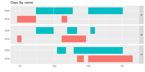
geom_tile makes a nice viz, but geom_point could also be used, though you’d need to change fill to colour. With three names and two years using colours may not be necessary, but with more data, it helps. I set the y-axis to be as.character(year) so R doesn’t show 2019, 2019.25, 2019.5, 2019.75, 2020.
Finally, here’s a chart groups by years, comparing names within each year. Left alone the years ended up with 2019 at the top, which I didn’t like (in other charts it goes low up to high, so 2020 is at the top) so I had to reorder (by reversing) the factors. As always, there’s probably a better way to do this, but it works.
## Here to get 2020 at the top we need to fiddle with factors.
reordered_eg_dates <- eg_dates %>% mutate(year = as.factor(year))
reordered_eg_dates$year <- factor(reordered_eg_dates$year, levels = rev(levels(reordered_eg_dates$year)))

ggplot(reordered_eg_dates, aes(x = date, y = name, fill = name)) +
    geom_tile(show.legend = FALSE, aes(height = 0.8)) +
    xlim(min_x_date, max_x_date) +
    facet_grid(year ~ .) +
    labs(title = "Days (by year)",
         x = "", y = "") +
    scale_colour_brewer(palette = "Dark2")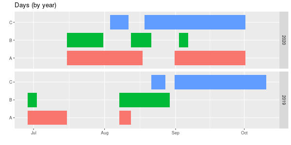
Those are just the visualizations I wanted.