At Carveth’s Marina on Stony Lake in Ontario there’s a sign up where they keep track of the day when the ice is completely out of the lake. (Being in central Ontario the lake freezes over completely in the winter.) The data is also available on their web site. I got curious about it and wondered if I could see any patterns.
I set up an Org file where I would use R. First, the raw data as a table:
#+NAME: tbl_raw_dates
|       date |
|------------|
| 1935-04-10 |
| 1936-04-27 |
| 1943-04-25 |
| 1945-03-28 |
| 1956-05-03 |
| 1957-04-17 |
| 1958-04-16 |
| 1959-04-23 |
| 1960-04-22 |
| 1961-04-28 |
| 1963-04-16 |
| 1964-04-19 |
| 1965-05-01 |
| 1968-04-08 |
| 1969-04-18 |
| 1970-04-27 |
| 1971-04-28 |
| 1972-05-03 |
| 1973-04-09 |
| 1974-04-20 |
| 1975-04-28 |
| 1976-04-12 |
| 1977-04-13 |
| 1978-05-01 |
| 1979-04-19 |
| 1980-04-11 |
| 1981-04-04 |
| 1982-04-25 |
| 1983-04-14 |
| 1984-04-16 |
| 1985-04-18 |
| 1986-04-07 |
| 1987-04-08 |
| 1988-04-09 |
| 1989-04-23 |
| 1990-04-20 |
| 1991-04-10 |
| 1992-04-28 |
| 1993-04-23 |
| 1994-04-20 |
| 1995-04-06 |
| 1996-04-24 |
| 1997-04-24 |
| 1998-04-07 |
| 1999-04-07 |
| 2000-03-28 |
| 2001-04-17 |
| 2002-04-14 |
| 2003-04-21 |
| 2004-04-19 |
| 2005-04-19 |
| 2006-04-12 |
| 2007-04-19 |
| 2008-04-18 |
| 2009-04-05 |
| 2010-04-02 |
| 2011-04-14 |
| 2012-03-24 |
| 2013-04-19 |
| 2014-04-25 |
| 2015-04-18 |
| 2016-03-31 |
| 2017-04-08 |
| 2018-04-25 |
Then I have an R source block that sets up the R session I’m going to use (I name all R sessions I use from Org as R:something):
#+begin_src R :session R:ice :results silent :var raw_dates=tbl_raw_dates
library(dplyr)
library(lubridate)
library(ggplot2)
library(ggridges)
#+end_src
The next block loads the raw data, forces the dates to be known as dates instead of just text, adds a new column for just the year, adds a num_days column that is the number of days since the start of the year (I don’t want to work with dates like “19 April,” which are clumsy, and leap years throw things off), adds a column for the decade the year is in, and then drops everything from before 1960.
#+begin_src R :session R:ice :results silent
ice_out <- raw_dates %>%
    mutate(date = as.Date(date)) %>%
    mutate(year = year(date)) %>%
    mutate(num_days = yday(date)) %>%
    mutate(decade = 10 * ( year %/% 10)) %>%
    filter(year >= 1960)
#+end_src
Flipping over the the R:ice session, I can check that the ice_out data frame looks how I want:
ℝ> head(ice_out)
        date year num_days decade
1 1960-04-22 1960      113   1960
2 1961-04-28 1961      118   1960
3 1963-04-16 1963      106   1960
4 1964-04-19 1964      110   1960
5 1965-05-01 1965      121   1960
6 1968-04-08 1968       99   1960
Next, a chart showing, for each year, how many days it takes for the ice to go out. I add a best-fit line with the lm model (here’s a nice full explanation).
#+begin_src R :session R:ice :results graphics :file carveths-days-to-ice-out.png :width 600 :height 400
ggplot(ice_out, aes(x = year, y = num_days)) + geom_line() + geom_smooth(method = "lm") + labs(title = "Stoney Lake: days to ice out", x = "", y = "Days from start of year")
#+end_src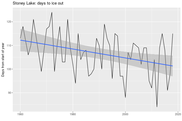
Visually there’s a definite downward trend there: the ice is going out earlier. I assume this is caused by climate change. Statistically, is there anything really going on here?
In the R session we can find out more about that linear regression by setting it up and then asking it to explain itself.
ℝ> ice_model <- lm(ice_out$num_days ~ ice_out$year)
ℝ> ice_model

Call:
lm(formula = ice_out$num_days ~ ice_out$year)

Coefficients:
 (Intercept)  ice_out$year
    481.7245       -0.1885

ℝ> summary(ice_model)

Call:
lm(formula = ice_out$num_days ~ ice_out$year)

Residuals:
     Min       1Q   Median       3Q      Max
-18.4424  -6.5977   0.4311   6.6667  14.0172

Coefficients:
              Estimate Std. Error t value Pr(>|t|)
(Intercept)  481.72452  135.67877   3.550 0.000806 ***
ice_out$year  -0.18851    0.06817  -2.765 0.007765 **
---
Signif. codes:  0 ‘***’ 0.001 ‘**’ 0.01 ‘*’ 0.05 ‘.’ 0.1 ‘ ’ 1

Residual standard error: 8.425 on 54 degrees of freedom
Multiple R-squared:  0.124,	Adjusted R-squared:  0.1078
F-statistic: 7.647 on 1 and 54 DF,  p-value: 0.007765
It’s saying this is a statistically valid model (the Pr values are small), but the R-squared measures (the coefficients of determination) are very low: about 10% of the num_days value is explained by the year.
The model is saying the line shown represents y = -0.18851*x + 481.72452. Over a range of 10 years that means the line changes by 1.8851 downwards, and -1.8851 is pretty close to -2.0, so I think of that as saying “every decade the ice goes out, more or less, almost two days earlier.” (The 481 is the intercept on the y axis, and it’s large because we’re working with contemporary years like 2015; if you subtract 1960 from the years the intercept gets much smaller but the slope of the line stays the same.)
The data does not fit close to the line, as we can see. From one year to the next the ice could go out 25 days earlier or 25 days later. As to the variance, here’s the standard deviation of the number of days to ice out over each decade:
ℝ> ice_out%>% group_by(decade) %>% mutate(std_dev = sd(num_days)) %>% select(decade, std_dev) %>% distinct
# A tibble: 6 x 2
# Groups:   decade [6]
  decade std_dev
   <dbl>   <dbl>
1   1960    7.43
2   1970    8.60
3   1980    6.92
4   1990    8.70
5   2000    7.52
6   2010   11.1
Seems like this decade the variation in when the ice goes out is greater. That fits with the idea of climate change bringing out greater variability in weather, but of course this is just a guess here.
Back on Org, here’s a histogram of num_days:
#+begin_src R :session R:ice :results graphics :file carveths-days-histogram.png :width 600 :height 400
ggplot(ice_out, aes(num_days)) + geom_bar(binwidth = 5)
#+end_src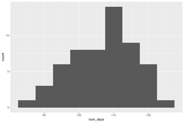
That got me wondering how that changed over the decades.
#+begin_src R :session R:ice :results graphics :file carveths-days-histogram-by-decade.png :width 600 :height 400
ggplot(ice_out, aes(num_days)) + geom_bar(binwidth = 5) + facet_grid(decade ~ .)
#+end_src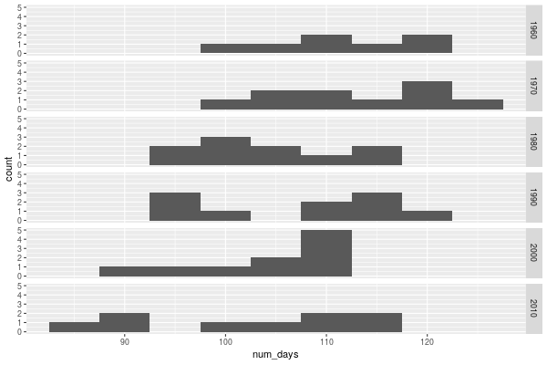
And then I realized that finally I had a chance to try out the ggridges library I’d heard of, because it can do just what I did, and much more, and make it look much nicer.
#+begin_src R :session R:ice :results graphics :file carveths-days-ridges-by-decade.png :width 600 :height 400
ggplot(ice_out, aes(x = num_days, y = decade, group = decade)) + geom_density_ridges(rel_min_height = 0.01, size = 0.25) + theme_ridges() + scale_y_reverse() + labs(title = "Stoney Lake: days to ice out", y = "", x = "Days from start of year")
#+end_src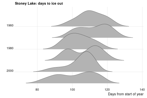
It certainly looks like things are creeping leftward: there is more > 120 at the top than the bottom, and look how there is more < 80 recently.
Now, bear in mind I’m not a climate scientist and I’m not a statistician, and all I had was a range of dates and I made a linear model and a histogram. There are many factors determining when the ice goes out: one must be the daily temperatures, and historical data on that is available from Environment Canada, but I’m not going to get into that. I have no information about when the lake froze in the first place (anecdotally, it’s later), or how thick the ice is (anecdotally, thinner; I don’t think people drive pickup trucks full of lumber over the ice any more).
Nevertheless, it seems reasonable to say that on average, more or less, since the 1960s the ice is going out almost two days earlier every decade.
For more about this, see Drew Monkman’s presentations on climate change in the Kawarthas (that’s the lake system that Stony is in).