(Third in a series about using R to look at reference desk statistics recorded in LibStats, following Ref Desk 1: LibStats and Ref desk 2: Questions asked per week at a branch.)
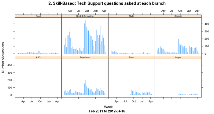
How about comparing how many of each question type was asked across all branches? With the libstats data frame and the ddply command we can do that in one command per question, using subset to pick out one particular kind of question):
> xyplot(V1 ~ week | library.name,
         data=ddply(subset(libstats, question.type == "2. Skill-Based: Tech Support"),
       .(library.name, week), nrow),
         type = "h",
         main = "2. Skill-Based: Tech Support questions asked at each branch",
         sub = paste("Feb 2011 to", up.to.week),
         ylab = "Number of questions",
         xlab = "Week",
         par.strip.text = list(cex=0.7),
         )
(ddply(subset(libstats, question.type == "2. Skill-Based: Tech Support"), .(library.name, week), nrow) means "out of the whole libstats data frame, form a subset of only the type 2 questions, and then on that new data frame run ddply and count up how many of this type of question happened at each branch (library.name) each week by using nrow to do the counting.")

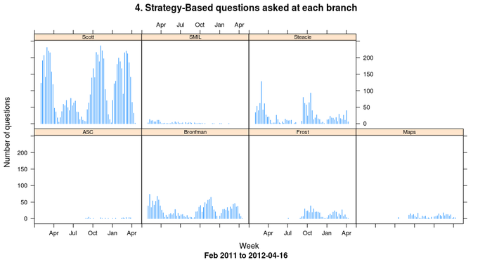
To look at strategy-based questions, change the question.type restriction:
> xyplot(V1 ~ week | library.name,
         data = ddply(subset(libstats, question.type == "4. Strategy-Based"), .(library.name, week), nrow),
         type = "h",
         main = "4. Strategy-Based questions asked at each branch",
         sub = paste("Feb 2011 to", up.to.week),
         ylab = "Number of questions",
         xlab = "Week",
         par.strip.text = list(cex=0.7),
         )

It's misleading the way that ASC (the archives), Maps and SMIL (the Sound and Moving Image Library) appear here, because they are entirely different kinds of things from the Bronfman, Frost (which started recording data months after the others), Scott and Steacie libraries: most importantly, they don't have research help desks. People who work here know all of that and can put the numbers into context, but if you don't know this library system then I'll leave it to you to think about how different branches at your library would appear if they were charted this way.
Comparing these two charts, one thing that stands out is the Scott/Scott Information split. "Scott" is the main library's research desk (which is actually two desks: drop-in or by appointment). "Scott Information" is the main library's information and tech support desk. They're right beside each other. If you need a stapler or want to print from your laptop or need to find a known book or get to an article your prof put on reserve, the information desk will help you, and help you quickly. If you have a strategy-based or specialized question, the research desk will help you. Dividing things up this way has makes everything more efficient and gets the right help to the students more quickly.
I have an R script that generates all kinds of charts and puts them together into one PDF. Part of it is a loop that generates all variations of the two charts above by doing something like this:
> filename = paste("questions-by-branch", up.to.week, ".pdf", sep="")
> pdf(filename)
> questiontypes <- c("1. Non-Resource",
                     "2. Skill-Based: Tech Support",
                     "3. Skill-Based: Non-Technical",
                     "4. Strategy-Based",
                     "5. Specialized")
> for (i in 1:length(questiontypes)) {
    questionname <- questiontypes[i]
    write (questionname, stderr())
    print(xyplot(V1 ~ week | library.name,
                 ## Leave out Scott Information because it overwhelms everything else for 1-3
                 data = ddply(subset(libstats,
                   question.type == questionname & library.name != "Scott Information"),
                   .(library.name, week), nrow),
                 type = "h",
                 main = paste("Number of", questiontypes[i]),
                 sub = paste("Feb 2011 to", up.to.week),
                 ylab = "Number of questions",
                 xlab = "Week",
          ))
  }
> dev.off()
I need to print the plot because, as the lattice docs say, "High-level lattice functions like xyplot are different from traditional R graphics functions in that they do not perform any plotting themselves. Instead, they return an object, of class 'trellis', which has to be then print-ed or plot-ted to create the actual plot."
 Miskatonic University Press