So we have a nice long file that records the details of 87,464 reference desk interactions since February 2011.
$ wc -l libstats.csv
87464 libstats.csv
$ head -5 libstats.csv
question.type,question.format,time.spent,library.name,location.name,initials,timestamp
4. Strategy-Based,In-person,5-10 minutes,Scott,Drop-in Desk,CC,02/01/2011 09:20:11 AM
4. Strategy-Based,In-person,10-20 minutes,Scott,Drop-in Desk,CC,02/01/2011 09:43:09 AM
4. Strategy-Based,In-person,5-10 minutes,Scott,Drop-in Desk,CC,02/01/2011 10:00:56 AM
3. Skill-Based: Non-Technical,Phone,5-10 minutes,Scott,Drop-in Desk,CC,02/01/2011 10:05:05 AM
Let's look at it in R. First load in three libraries we're going to need: lattice for graphics, Hadley Wickham's plyr for data manipulation, and chron to help us with dates. Then load the CSV file into a data frame called libstats.
> library(lattice)
> library(plyr)
> library(chron)

> libstats <- read.csv("libstats.csv")
Each line in the file represents a single reference desk interaction. I want to analyze them by the week, so I add a column that specifies which week the interaction happened. This seems to be a pretty ugly way of doing it, but it works. The week column gets filled with YYYY-MM-DD dates that are the Mondays of the week in question.
> libstats$week <- as.Date(cut(as.Date(libstats$timestamp, format="%m/%d/%Y %r"), "week", start.on.monday=TRUE))
> head(libstats,4)
                  question.type question.format    time.spent library.name
1             4. Strategy-Based       In-person  5-10 minutes        Scott
2             4. Strategy-Based       In-person 10-20 minutes        Scott
3             4. Strategy-Based       In-person  5-10 minutes        Scott
4 3. Skill-Based: Non-Technical           Phone  5-10 minutes        Scott
  location.name initials              timestamp       week
1  Drop-in Desk       CC 02/01/2011 09:20:11 AM 2011-01-31
2  Drop-in Desk       CC 02/01/2011 09:43:09 AM 2011-01-31
3  Drop-in Desk       CC 02/01/2011 10:00:56 AM 2011-01-31
4  Drop-in Desk       CC 02/01/2011 10:05:05 AM 2011-01-31
> up.to.week <- tail(levels(as.factor(libstats$week)), 1)
up.to.week is the most recent week date, and I'll use it for labelling charts. levels tells you the elements in a list of factors. The names of the library branches are a great example: there are eight different values for library.name through out 87,464 entries, one for each of our libraries plus one for an information desk that doesn't do research help. (The Osgoode Hall Law School Library doesn't record their reference statistics in this system so they're not here.)
> branches <- levels(libstats$library.name)
> branches
[1] "ASC"               "Bronfman"          "Frost"             "Maps"              "Scott"
[6] "Scott Information" "SMIL"              "Steacie"
Let's look at the statistics for the Bronfman library. Turns out there are 10,754 encounters recorded there.
> bronfman <- subset(libstats, library.name == "Bronfman")
> nrow(bronfman)
[1] 10754
We have a problem to solve before we can make a chart. Each line in the bronfman data frame records one desk enounter. We want to analyze things by the week. How do we aggregate a week's worth of data into one number? We'll use ddply, whose help files defines what it does as: "For each subset of a data frame, apply function then combine results into a data frame."
A short example will help explain it. Make a data frame about some coloured clothing. ddply(tmp, .(colour), nrow) means "look at the data frame called tmp, pick out the individual entries in the colour column, and run the function nrow on each element to find out how many of them there are." Using nrow here is a nice way of counting up how many of something there are, but if you were doing real statistics you might use mean or some other function.
> tmp <- data.frame(colour = c("red", "red", "green", "red", "blue"),
                    item = c("shirt", "socks", "shirt", "socks", "socks"))
> tmp
  colour  item
1    red shirt
2    red socks
3  green shirt
4    red socks
5   blue socks
> ddply(tmp, .(colour), nrow)
  colour V1
1   blue  1
2  green  1
3    red  3
> ddply(tmp, .(item), nrow)
   item V1
1 shirt  2
2 socks  3
Back to our bronfman data frame. For each week I want to know how many of question.type was asked:
> questions <- ddply(bronfman, .(question.type, week), nrow)w
> head(questions)
    question.type       week V1
1 1. Non-Resource 2011-01-31 44
2 1. Non-Resource 2011-02-07 58
3 1. Non-Resource 2011-02-14 43
4 1. Non-Resource 2011-02-21 20
5 1. Non-Resource 2011-02-28 49
6 1. Non-Resource 2011-03-07 37
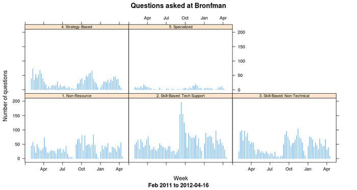
This new data frame has a count of how many 1s were asked each week, then how many 2s, and so on up to how many 5s were asked each week. xyplot does the trick for making a chart of this:
> xyplot(V1 ~ as.Date(week) | question.type,
         data = questions,
         type = "h",
         main = "Questions asked at Bronfman",
         sub = paste("Feb 2011 to", up.to.week),
         ylab = "Number of questions",
         xlab = "Week",
         par.strip.text=list(cex=0.7),
         )

Notice how nicely R figured out how to label the x and y axes. Because it knows that the week column consists of dates, it was able to divide up the x-axis into three-month chunks. Beautiful.
 Miskatonic University Press