The Association of Research Libraries records a lot of statistics every year from its member libraries and makes them available in machine-readable format (CSV files). A Guide to the Machine-Readable Version of the ARL Statistics explains all about the numbers. With all of that we're armed with a nice big set of data about ARL members, the libraries of the research universities in North America (see Principles of Membership for more).
To have a bit of fun and learn more about R I decided to use lattice graphics to compare ratios at Canadian university libraries. Here's what I did.
Before anything else, I had to clean up the ARL data to put it all into one big valid CSV file. I wrote a Ruby script to remove dollar signs, turn "-1" into an empty string, remove double spaces, and a few other things. The result is arl-statistics-clean.csv. (I can't guarantee I didn't make mistakes, so don't base any important decisions on that file; use the raw stuff from the ARL.)
With that out of the way, let's look at how total circulation per student (initial circs plus renewals) is changing over the years at Canadian universities. To follow along with my snippets, just run R and get to the command prompt and paste in the lines below. We're going to load the ARL stats into a "data frame," then make a subset of that for just the Canadian libraries, and then plot different variables.
# You can load in data by HTTP.  Pretty cool.
> arl = read.csv("http://www.miskatonic.org/files/arl-statistics-clean.csv", header=T)

# Check the data.  I won't show the output.
> head(arl)

# These are column headings
> names(arl)
 [1] "YEAR"       "INSTNO"     "INAM"       "TYPE"       "REGION"
 [6] "MEMBYR"     "LAW"        "MED"        "EXCH"       "VOLS"
[11] "VOLSADG"    "VOLSADN"    "VOLSWDN"    "TITLES"     "MONO"
[16] "SERPUR"     "SERPURE"    "SERPURP"    "SERNPUR"    "SERNPURC"
[21] "SERNPURF"   "SERNPURP"   "SERNPURGD"  "SERNPURE"   "SERNPURP.1"
[26] "CURRSER"    "MICROF"     "GOVDOCS"    "MSS"        "MAPS"
[31] "GRAPHIC"    "AUDIO"      "VIDEO"      "COMPFIL"    "ILLTOT"
[36] "ILBTOT"     "GRPPRES"    "PRESPTCP"   "REFTRANS"   "TOTCIRC"
[41] "RSRVCIRC"   "PRFSTF"     "NPRFSTF"    "STUDAST"    "TOTSTF"
[46] "TOTSTFX"    "EXPMONO"    "EXPSER"     "EXPOTH"     "EXPMISC"
[51] "EXPLM"      "EXPBND"     "SALPRF"     "SALNPRF"    "SALSTUD"
[56] "TOTSAL"     "OPEXP"      "TOTEXP"     "EXPCOMPF"   "EXPESERL"
[61] "EXPBIBUL"   "EXPBIBUE"   "EXPHASO"    "EXPDDILL"   "SVCPOINT"
[66] "SVCHOURS"   "TOTSTU"     "GRADSTU"    "PHDAWD"     "PHDFLD"
[71] "FAC"        "INDEX"

# Let's pick out just the Canadian libraries and put them in a new
# data frame.  If TYPE is C then the library is Canadian.
> canada <- subset(arl, TYPE=="C")

# Load in lattice, to make the next command work.
> library(lattice)

# Now chart total circulation per student at these libraries
> xyplot (TOTCIRC/TOTSTU~YEAR|INAM, canada)
If you're running R and you enter those commands, this image will magically appear:
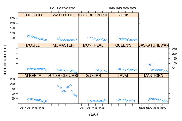
Three commands to get that image! Pretty easy, eh? Could have done it in two, and included the subsetting in the xyplot command, but this is easier to read. xyplot has quite a few options, but here we're saying "plot TOTCIRC divided by TOTSTU on the y-axis, against YEAR on the x-axis, conditional on the variable INAM" (which means that each university will end up in its own little box).
Let's have a look at that chart. The first thing I notice is that the University of British Columbia is wildly different from all the others. In 1996 they were apparently circulating about 250 books per student, while everyone else (except for Saskatchewan) was around 50. Up until five years ago their numbers are still bizarrely high. Why? Who knows. But let's assume UBC is anomalous and discard them for now. And just because Saskatchewan's first two years look odd, let's discard them too. Sorry, Saskatchewan.
One more thing: notice how 1990-1994 is always blank? They started recording total circulation in 1995, so let's toss out years before that.
Let's make a new data frame for years 1995 and onwards, ignoring UBC and Saskatchewan, and call it canada.1995.
> canada.1995 <- subset(canada, YEAR %in% seq(1995,2008) & INAM != "BRITISH COLUMBIA" & INAM != "SASKATCHEWAN")
> xyplot (TOTCIRC/TOTSTU~YEAR|INAM, canada.1995)
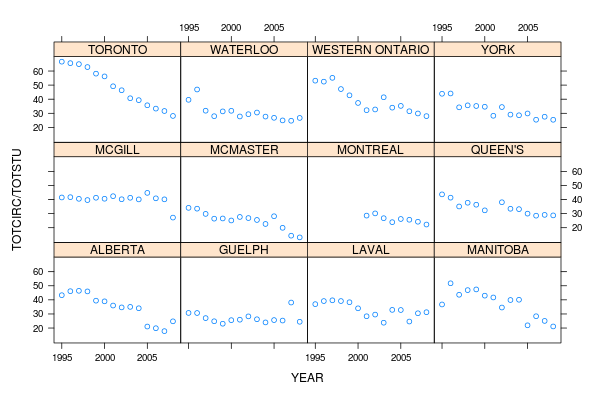
Aha! We can make out a lot more detail now. There's a very clear and almost linear decline at Toronto; York, McMaster, Western (as we call the University of Western Ontario), and Alberta are all declining, but Guelph and McGill seem much flatter.
Let's polish this chart up by adding labels to the x- and y-axis (with xlab and ylab), a title at the top (main), and shrinking the names of the universities in the "strips" so they fit (par.strip.text, which is a confusing parameter name). Let's have the y-axis start at 0 (ylim) so McMaster, which is under 20 circs per student now, doesn't look like it's at 0. And for fun let's have R do some linear regression for us and draw a best-fit line for each university (setting the type so its both p, the default, for points, and r, for regression).
> xyplot (TOTCIRC/TOTSTU~YEAR|INAM, canada.1995,
  type=c("p","r"), par.strip.text=list(cex=0.8),
  ylab="Circulation per student", xlab = "Year",
  main = "Total circs per student at Canadian ARL members (except two)",
  ylim=c(0,75))
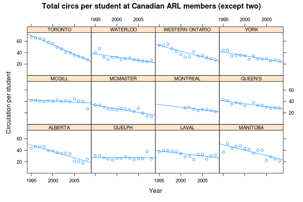
That's not the simplest command, but by R standards it's not complicated, and if you've used Perl or Python or Ruby you're not blanching at it. Once we knew a bit about the data and made a couple of refinements, we could generate this nice diagram in one command. Imagine doing that in Excel! You'd be clicking and doing all kinds of junk for a long time. A few quick commands in R, however, and we show at a glance that circ per student is decline across the country, except possibly at Guelph, and that Toronto's decline is the steepest. (Of course, as always with circ numbers, electronic resources aren't included, so this is just one part of a much larger picture. I have no idea how Toronto's other usage numbers are changing.)
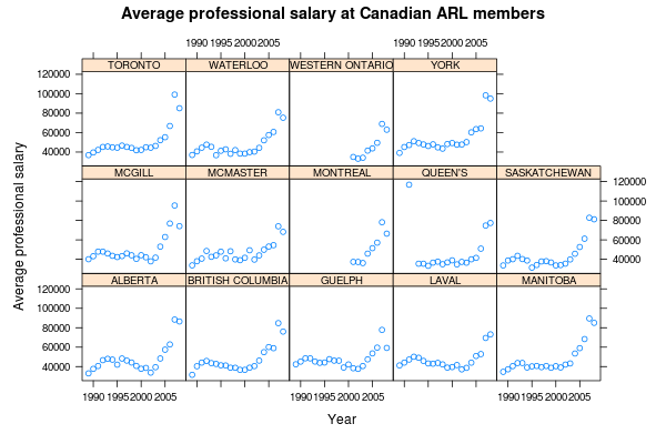
You can plot any other ratio you want by putting in different variables, but if you do, make sure you drop the ylim setting because the y-axis numbers will be different. For example, we could map SALPRF (professional salaries) against PRFSTF (number of professional staff) to find the average salary for professional staff (librarians and others, but not support staff or students).
> xyplot (SALPRF/PRFSTF~YEAR|INAM, canada, par.strip.text=list(cex=0.8), ylab="Average professional salary", xlab = "Year", main = "Average professional salary at Canadian ARL members")
For a last thing, let's plot a different ratio among a different set of universities. Let's make a new data frame of some large American and Canadian universities, the kind to which York might want to compare itself:
# Make a subset of the arl data frame, specifying particular universities by name.
# c() is how you make an array
> comparison <- subset(arl, INAM %in% c('YORK', 'HARVARD', 'YALE', 'TORONTO', 'CALIFORNIA BERKELEY', 'MCGILL', 'BROWN', 'PRINCETON', 'CHICAGO', 'CORNELL', 'SOUTHERN CALIFORNIA', 'TEXAS', 'WATERLOO', 'MCMASTER'))

# Now plot ratio of students to professional staff, with font size of strip text at 0.7 ratio.
> xyplot (TOTSTU/PRFSTF~YEAR|INAM, comparison, par.strip.text=list(cex=0.7))
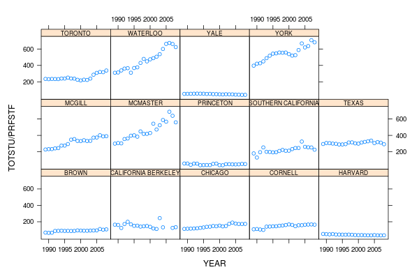
Look at Yale and Harvard! The ratio is actually declining, which is good: there are more librarians per student! Look how low Princeton is! But at some universities the ratio is bad and getting worse. McMaster, Waterloo and York (all Canadian) have the worst ratios of this set of libraries — in fact they have about the worst ratios of all ARL members. I work at York.
Notice how few commands we needed to generate these charts. R and the lattice package are very powerful, and this is just a small taste of what you can do with them. And compare how easy and friendly this is to Excel (for certain values of "easy" and "friendly")!
 Miskatonic University Press