I was delighted today when the Autumn 2023 issue of Illustration magazine arrived in the mail. It has a long profile of my mother Kady MacDonald Denton, rich with examples of her work from various books. It was written by Warren Clements (publisher at Nestlings Press), who does regular features in the magazine. It’s a wonderful profile, covering her life and career with thoughtful and informed insight into her art.
Cover of the issue
If you’re at all interested in illustration in books and magazines from the Victoria era onwards, I highly recommend investigating Illustration if you don’t know it. It’s very good. Also look at the books Nestlings Press has done bringing back into print the work of Mervyn Peake, Peter Newell and others.
Another weekend, another batch of great listening on BBC Radio 6 Music (see also its schedule). These shows are two hours unless otherwise.
Freak Zone Playlist (Thursday 0000, one hour): “Hand-crafted playlists from creators of underground and experimental music.” Huge variation and always interesting.
The Craig Charles Funk and Soul Show (Saturday 1800, three hours): Live show, with a fantastic selection of funk, soul, R&B and disco; classics and new releases merge together perfectly. The half-hour guest-DJed Trunk of Funk is usually an incredible mix. It’s followed immediately by …
Don Letts’ Culture Clash Radio (Saturday 2100): It’s a treat to hear this voice I know from Big Audio Dynamite records. Letts plays a bass-heavy mix with a lot of dub and reggae, but mixes it up and you could hear King Tubby followed by Nancy Sinatra.
Iggy Confidential (Sunday 1600): Iggy Pop hosts this with a voice like a bucket in a coal mine, giving anecdotes and opinion (“I hate arena rock”) amidst a wildly varied selection: in one show you might hear some sixties garage rock followed by rhythmic noise, then Devo, then Zamrock from Chrissy “Zebby” Tengo, and Coleman Hawkins to cool things down.
Stuart Maconie’s Freak Zone (Sunday 2000): Underground, left-field, experimental music, with a lot of prog and psych folk, plus modern classical, Black Sabbath, the Residents, Peruvian funk, Valentina Magaletti, The Caretaker, Vietnamese disco, film scores, Sheffield industrial, and much more. I first heard “Go Dig My Grave” by Lankum here (video); it’s a traditional folk song that turns into a surging, yawing drone. (A couple of years ago I was delighted to hear Maconie reading a letter I sent.)
I also follow Radio 1’s Essential Mix, which every weekend does a new two-hour DJ mix, usually house music, and plays a classic from its thirty-year archive. Great DJs from all over the world doing some unbelievable sets of unstoppable dance music.
The secret of all the shows is that they have great DJs who pick music they want to play. Every host is drawing on enormous musical knowledge to put together sets that blend perfectly from start to finish, taking you through moods and themes and genres, slowing you down or getting you moving. They are the opposite of “Afternoon Focus” or “Late Night Chill” that are made so corporations can profit by renting forgettable music to people not paying attention.
A shelf full of bound volumes of Soviet Literature
The BBC shows are available for streaming for a few weeks after broadcast. It’s also possible to use get_iplayer to download them, if you know your way around the command line. My setup has this in ~/.get_iplayer/options:
outputradio /usr/local/media/audio/
And this in ~/.get_iplayer/presets/music:
type radio
search (freak zone|essential mix|craig charles funk and soul|culture clash radio|iggy pop)
I run this to download the shows, which go (as .m4a files) to the directory I configured.
get_iplayer --preset=music --get
And if you’re handy at the command line you might also try my own Whip Radio, which lets you tune in to 6 Music and other BBC Radio streams.
While doing some collection development work I was looking at our holdings of The Science Teacher, a publication of the National Science Teaching Association. I flipped through some issues from the late eighties and was very impressed. This is top-notch science literacy.
Here’s a quote from “Atmospheric Science: It’s More Than Meteorology,” by David R. Smith and Gerald H. Krockover (who died in 2020), in The Science Teacher vol. 55 no. 1 (January 1988) (JSTOR 24142757):
The amount of carbon dioxide has increased approximately 10 percent in the past 25 years. Because plants help to moderate the amount of carbon dioxide in the air by using the gas in photosynthesis, extensive deforestation operations only exacerbate the problem. Projections indicate that the level of carbon dioxide is likely to double in the next 50 to 100 years.
What will be the effect of such an increase in carbon dioxide on our atmosphere? Computer models suggest that doubling the amount of carbon dioxide could raise the global average temperature by 1.5 to 4.5°C, which would result in the warmest climate seen on Earth in 5000 years. The side effects of such a global warming could include melting of the polar ice caps, shifting of key crop zones, and changing of animal migration patterns.
And a few months later, from “The Greenhouse Effect in a Vial,” by Richard Golden (who also died in 2020) and Cary Sneider in The Science Teacher vol. 56 no. 5 (May 1989) (JSTOR 24141686).
For years, scientists have been warning us that the excessive burning of fossil fuels could bring on a general global warming through an enhanced greenhouse effect. Since the beginning of the industrial revolution, the industrialized world’s consumption of energy has increased the CO₂ content of the atmosphere by more than 25 percent. The concentration of CO₂ has increased by 9 percent in just the last 30 years. And at our current rate of fuel consumption, we release as much carbon each year, in the form of CO₂, as it took the Earth 130,000 years to bury (Postel, 1986).
Today’s high school students will be faced, through all their adult years, with decisions related to energy use. For these students to make intelligent and responsible choices, they need to comprehend the underlying scientific principles of the greenhouse effect, and they need to know what social, economic, and political consequences could result from even a moderate climactic change.
On a code block for copying scripts, I hit C-c C-c
I ssh to the remote machine
I run conforg/scripts/tor-install-system.sh
I run conforg/scripts/tor-run.sh
Aside from the time to compile the code, this takes under one minute.
The explanation
As I said in my earlier post, I use my own Conforguration tool to handle this sort of thing. It uses Org to edit and manage shell scripts that I can run locally or on remote servers. The list above is a great example of how Org can make things much easier if you’ve set things up just the way you want them, while remaining cryptic to non-Org users. Here’s an explanation of most of what’s going on.
In the Tor section of Conforguration, first I set a variable with the version number I want to install. Today I updated it.
#+begin_src shell :tangle conforg/scripts/tor-install-system.sh :shebang "#!/bin/bash" :var TOR_VERSION=TOR_VERSION
cd /usr/local/src/tor/
curl --location --remote-name https://dist.torproject.org/tor-${TOR_VERSION}.tar.gz
tar --extract --verbose --gunzip --file tor-${TOR_VERSION}.tar.gz
cd tor-${TOR_VERSION}
./configure && make && sudo make install
echo "Now run ~/conforg/scripts/tor-run.sh"
#+end_src
(I say tar --extract --verbose --gunzip --file instead of tar xzvf because I like to use the most readable arguments in scripts. I do use short forms when I’m typing at the command line.)
The :tangle argument to the code block is covered under extracting source code in the manual. When I hit C-c C-v t (which runs org-babel-tangle) then that chunk of code is exported to the file named by the argument. It’s given a shebang and the TOR_VERSION variable is passed into it, resulting in this:
#!/bin/bashunset TOR_VERSION
declare-aTOR_VERSION=('0.4.8.11')cd /usr/local/src/tor/
curl --location--remote-name https://dist.torproject.org/tor-${TOR_VERSION}.tar.gz
tar--extract--verbose--gunzip--file tor-${TOR_VERSION}.tar.gz
cd tor-${TOR_VERSION}
./configure && make &&sudo make install
echo"Now run ~/conforg/scripts/tor-run.sh"
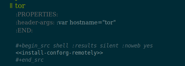
Now I need to get that script to one of the machines where I run a Tor relay. In my ssh configuration it’s aliased to the name tor, so I go down to this section of Conforguration and hit C-c C-c on the code block to execute:
The angle bracket thing is noweb syntax, which allows me to use this snippet of code that’s set up earlier in the file, with the hostname variable passed in:
That pushes the scripts and dot files to the other machine and freshens the symlinks for all the dot files. In other words, it refreshes everything on the remote machine—all by hitting C-c C-c.
Now ~/conforg/scripts/tor-install-system.sh is on the other machine. I could execute it remotely from inside Conforguration, but it takes a while to run, so I like to log in to the other machine and do it locally. I ssh over and run:
conforg/scripts/tor-install-system.sh
It downloads the source code and compiles it. When it’s done, it finishes up by installing files on the system, and then ends with:
make[1]: Leaving directory '/usr/local/src/tor/tor-0.4.8.11'
Now run ~/conforg/scripts/tor-run.sh
I run:
conforg/scripts/tor-run.sh
This detects that a Tor tmux session is running, kills it off while waiting for the Tor daemon to die nicely, then sets it up again. When it starts fresh, the new Tor server is running.
Another way
For my bridge running on another machine, I could do the upgrade the same way, but to match how I’d installed it I did it like this (after upgrading the version number and pushing the commit to the repository):
cd src/conforguration
git pull
install/install.sh
~/conforg/scripts/tor-install-system.sh
~/conforg/scripts/tor-run.sh
There are other ways to handle configuration management and upgrading servers, but I’ve built one I really like.
The Tor Project had a call out for people to set up bridges to help fight censorship. Here’s how I set one up in about ninety minutes.
About bridges
There are three types of relays in the Tor network: guard, middle and exit. They all run the same program but have different purposes. Exits are configured specially and require more care to run: they are where requests come out from the Tor network and hit the open web. The non-exit relays (the Tor network decides whether one should be an entry-point guard or in the middle) don’t require much attention except to make sure the system is working and up to date.
Bridge relays are Tor relays that are not listed in the public Tor directory.
That means that ISPs or governments trying to block access to the Tor network can’t simply block all bridges. Bridges are useful for Tor users under oppressive regimes, and for people who want an extra layer of security because they’re worried somebody will recognize that they are contacting a public Tor relay IP address.
A bridge is just a normal relay with a slightly different configuration.
Bridges are special in that their IP address are not shared, so they are much less likely to get blocked. People have to do a bit of work to find out how to connect to a bridge, and this is apparently enough to confound repressive governments, for a while at least. Eventually bridges can be found and blocked. That’s one reason why Tor always needs more.
Bridge relays (or “bridges”) are Tor relays that aren’t listed in the main directory. Since there is no complete public list of them, even an ISP that filters connections to all the known Tor relays probably won’t be able to block all the bridges. Also, websites won’t treat you differently because they won’t know you’re running Tor. If you can be a real relay, please do; but if not, be a bridge!
A bridge will move a lot of bandwidth in and out, but nothing will get out to the public web. It should be able to just do its job quietly without attracting attention. That’s what I want to run.
Setting up the system
I began with a fresh Ubuntu 22.04 LTS machine as a virtual private server run at a hosting company. The use policy doesn’t allow Tor exit nodes, but this won’t be one.
I made an account for myself and gave it sudo access.
I set up ssh access, then tightened the OpenSSH server (sshd) by making sure these were set in /etc/ssh/sshd_config:
PasswordAuthentication no
KbdInteractiveAuthentication no
PermitRootLogin no
StrictModes yes
MaxAuthTries 2
I set AllowUsers my_username as well. Only I can log in, only using my SSH key. That’s as secure as I can make that. (Change my_username to your username, of course.) I made sure my home directory and ~/.ssh/ were mode 700 and everything in that directory was mode 600.
(You can restart sshd with sudo /etc/init.d/ssh restart and this won’t kill off your login session. Run that in one window, where you stay logged in, and try connecting in another. If it works, great. If not, you’re still logged in and can fix it.)
It warned me about doing that over ssh, but nothing bad happened.
The next step is to set up my environment. For this I used my own Conforguration, which is a set of configuration management tools done in Org. I use it to manage my dot files and to make it easy to install R, Ruby and Tor from source. These commands download Conforguration, set up some directories, and then install scripts and dot files.
Bingo! The prompt changes and all my aliases work. My shell environment is just the way I like it and I feel at home. (If you try Conforguration yourself let me know how it goes.)
(I don’t usually install Conforguration scripts that way. My usual method is to do it all from inside Emacs on my laptop: I use a source code block in Org to run rsync to push the scripts to the other machine, then ssh to execute the scripts remotely. As so often with Org, once you have it set up right you just hit Ctrl-c Ctrl-c and magic happens.)
Setting up Tor
What’s next requires access to packages with source code, so I edited /etc/apt/sources.list to uncomment all of the deb-src lines, then I ran this to freshen everything up:
sudo apt update
sudo apt upgrade
Setting up a Tor server is part of Conforguration, so I just ran this to get it in place:
The first script installs a bunch of necessary stuff and then the second script gets and installs Tor from source. This took a little while. When it finished the Tor server was ready but not running. (If you don’t want to use Conforguration, just copy what’s in those scripts.)
First I needed to install obfs4. The glossary says, “Obfs4 is a pluggable transport that makes Tor traffic look random like obfs3, and also prevents censors from finding bridges by Internet scanning. Obfs4 bridges are less likely to be blocked than obfs3 bridges.” (I don’t find that understandable either. Worse, the definition of obfs3 is, “Obfs3 is a pluggable transport that makes Tor traffic look random, so that it does not look like Tor or any other protocol. Obfs3 is not supported anymore.”)
Nevertheless, it’s easy to install:
sudo apt-get install obfs4proxy
Configuring
Tor servers are configured in a torrc file, and mine is in /usr/local/etc/torrc. The Ubuntu instructions have a sample torrc, but I think it could be better. Here’s what I’m using (minus comments that are in the example):
The ORPort (where Tor talks) is on 2112 because Rush. I put the ServerTransportListenAddr[ess] on 443 because that’s where HTTPS normally is, so, as I understand it, incoming traffic to the bridge will be less noticeable because it will just blend in with other normal-looking web traffic.
Understanding the settings to manage bandwidth in Tor is not easy. The project needs a good torrc guide on its site, explaining all the options and what they mean. The information is in comments in the default torrc and in the man page, but that man page is on Ubuntu’s site—I can’t find it on Tor’s web site!
I looked at What bandwidth shaping options are available to Tor relays? but How can I limit the total amount of bandwidth used by my Tor relay? had the answers I needed, and I edited the torrc based on that. My server has 500 gigs of bandwidth per month (in and out, combined), so setting a limit of 450 (with AccountingMax 450 GBytes) seems safe. I’ll keep an eye on it. The advice is that a fast server that’s up some of the month is better than a slow server up all month, and the server is smart enough to manage that on its own, so I’ll let it do its work. Months here will begin on the tenth day at midnight, and AccountingRule sum means Tor is adding up traffic in and out.
The logging command sends the server’s notices to a file, which makes them easier to read than if they’re scrolling by on the screen. I needed to make the directory:
mkdir /usr/local/src/tor/log/
Running the bridge
Because I’m using port 443 I need to take a special step next.
That’s a new one to me. setcap allows one to “set file capabilities.” The capabilities man page says the cap_net_bind_service setting allows a program to “bind a socket to Internet domain privileged ports (port numbers less than 1024).” It seems the +ep makes this capability “effective” and “permitted,” which means the binary can do this binding. Putting all that together means I don’t need to be root to run this program and have it bind to port 443.
(A philosophical aside: Speaking of capabilities, it’s worth knowing about the capability approach of Amartya Sen and Martha Nussbaum. It “entails two normative claims: first, the claim that the freedom to achieve well-being is of primary moral importance and, second, that well-being should be understood in terms of people’s capabilities and functionings.”)
The instructions have some commands about systemctl and service but none of that worked for me, I think because I installed from source, not a package. But that’s no problem: I can run tor as myself, and to keep it running I can run it in a tmux session. This is managed by the third script from Conforguration:
~/conforg/scripts/tor-run.sh
Run this to attach to the session:
tmux attach
Then hit Ctrl-b 1 or Ctrl-b 2 or the like to move between windows. Tmux is great.
After running the script information began to scroll by, including this, with a link about the life cycle of a new relay.
[notice] You are running a new relay.
Thanks for helping the Tor network!
If you wish to know what will happen in the upcoming weeks regarding
its usage, have a look at https://blog.torproject.org/lifecycle-of-a-new-relay

[notice] Registered server transport 'obfs4' at '[::]:443'
Right away I used the TCP reachability test to make sure port 443 was working, and it was.
The log also gave me a link to check the status of the bridge (it’s here but that won’t work because I’m not sharing the ID), which a little while later said:
Bridge 123456789xxx advertises:

* obfs4: functional
  Last tested: 2024-04-05 00:55:33.26340596 +0000 UTC (26m26.501321898s ago)
Aside from ssh (port 22) and DNS (port 53) everything is Tor-related. Good. The server is listening on port 443, just as I want.
I was confused about port 41357. Why was tor listening on localhost on that port? I asked about this on the Tor forums. (The port is different there because I’d restarted the server and it grabbed a new high port at random.) I will update when I have an answer.
To use ss (the replacement for netstat; I use the old program by habit) I would run this to see the same information, plus a little more about the programs running:
sudo ss --numeric --tcp --listen --processes
Traffic statistics
I recently discovered vnStat, which is a really useful command line tool for getting network traffic statistics. Here I run vnstat -h to have it show hourly stats. You can have it show daily or monthly or use -q for a general summary.
The tor-run.sh script runs speedometer, which shows a graph of bandwidth use marching by. I’ll probably work vnstat into it too. With these two scripts, and the log file, it’s easy to keep an eye on how busy the relay is.
For both of those you need to know the name of the network interface where the packets are moving. On this server it’s ens3, which I found by running
ifconfig
This reported
ens3: flags=4163<UP,BROADCAST,RUNNING,MULTICAST> mtu 1500
and then a lot of technical details that show it’s online and moving traffic. The ens3 there is the name I needed. (The lo interface you will always see also listed is the loopback interface that lets a machine talk to itself.)
It’s also interesting to see the failed ssh login attempts. Here’s one way to do it:
So far the bridge is running well. I’ll report back about how it goes.
Upgrading
When it comes time to upgrade to the next Tor release, I’ll post about how I do that with Conforguration.
(If anyone notices any technical mistakes in any of this, I’d like to know so I can fix them—but up to the limit of getting a Tor bridge safely up and running, not arcane details about Linux networking.)
UPDATED 08 April 2024: This answer to my question explains about the high port: Because I configured ExtORPort auto (as the instructions set out) the Extended OR Port picks a random high port where it listens on localhost for connections from obfs4proxy. A regular Tor relay will have ORPort 9001 set, but this extended one does a little more.
The Unthanks performing “The Testimony of Patience Kershaw” by Frank Higgins:
The song is based on actual testimony of Patience Kershaw, a seventeen-year-old girl who worked in a coal mine. The text is in Testimony Gathered by Ashley’s Mines Commission at the Victorian Web:
My father has been dead about a year; my mother is living and has ten children, five lads and five lasses; the oldest is about thirty, the youngest is four; three lasses go to mill; all the lads are colliers, two getters and three hurriers; one lives at home and does nothing; mother does nought but look after home.
All my sisters have been hurriers, but three went to the mill. Alice went because her legs swelled from hurrying in cold water when she was hot. I never went to day-school; I go to Sunday-school, but I cannot read or write; I go to pit at five o’clock in the morning and come out at five in the evening; I get my breakfast of porridge and milk first; I take my dinner with me, a cake, and eat it as I go; I do not stop or rest any time for the purpose; I get nothing else until I get home, and then have potatoes and meat, not every day meat. I hurry in the clothes I have now got on, trousers and ragged jacket; the bald place upon my head is made by thrusting the corves; my legs have never swelled, but sisters’ did when they went to mill; I hurry the corves a mile and more under ground and back; they weigh 300 cwt.; I hurry 11 a-day; I wear a belt and chain at the workings, to get the corves out; the getters that I work for are naked except their caps; they pull off all their clothes; I see them at work when I go up; sometimes they beat me, if I am not quick enough, with their hands; they strike me upon my back; the boys take liberties with me sometimes they pull me about; I am the only girl in the pit; there are about 20 boys and 15 men; all the men are naked; I would rather work in mill than in coal-pit.
I’ve been working on some hypertext, with HTML, and chatting on the IRC a fair bit.
That was on Internex Online, the famous io.org. As K.K. Campbell wrote in “Party’s Over: How Internex Online Fell Afoul of the New Internet” in Eye Weekly on 9 November 1995, when IO was collapsing:
IO was the place to be in Toronto cyberspace. The digital generation flocked to it and lit up its modem lights all day and all night. It was the mother ship that launched thousands of netters and dozens of Internet service providers (ISPs).
The next month I noted I was getting three and a half hours a day of free access for working on the hypertext help system, which was built with the text browser Lynx.
The access was with a 2400 bps modem. My current download speed, tested through a VPN on the other side of the country, is 17,500 times faster, which means that averaged out the speed has gone up well over 50,000% annually. I pay about $90 per month (it should be less, but TekSavvy gets hosed by the big telcos), but I get unlimited access all day, and I don’t have to work on the help pages.
I drifted away from IRC but I’m still working with hypertext.
On another note, looking back at some old IO files I saw I’d posted this to the Usenet group sci.logic in October 1994, with the subject “Productivity of Turing machines.” I’d learned about Busy Beaver machines.
I’m doing a metalogic course, and we just finished doing Turing machines. We did the “Busy Beaver” machines - the nth BB being the machine of n states that produces more 1’s on the tape given input of only blanks than any other machine of n states. (Then we went on to prove there is no machine that, given input n, figures out the productivity of the BB of size n.)
We figured out that the productivity of the BB of size 1 was 1. The prof mentioned some work had been done to figure out productivities of bigger BB’s - the 7th is in the thousands, I think he said.
Does anybody know any more about this? Any references I could check? I searched on the Web, but couldn’t find anything. Any further information would be appreciated - I find Turing machines very interesting.
Yes. Start with the review of Brady in The Journal of Symbolic Logic, vol. 56 (1991), page 1091. That gives the known scores for the Busy Beaver game, and references to other papers on the subject. It’s a fun topic.
Incidentally, I am told by people who have translated works on recursion theory from English into other languages that the phrase “busy beaver” gave them a lot of trouble!
And Peter Suber (then a philosophy professor at Earlham College) replied:
A BB of size 5 already has a productivity in the thousands. In 1984, George Uhing constructed a BB(5) with a productivity of 1,915. Of course, we can’t prove that this is the most productive BB(5). But Uhing says he conducted a brute force search of all the 64,403,380,965,376 possible BB(5)’s to find his. (Source: Ivars Peterson, The Mathematical Tourist, W.H. Freeman, 1988, pp. 197-99.)
(Suber used underscores before and after the title. Markdown turns that into italics: plain text from 1994 formats nicely thirty years later!)
I had no idea who either was. They both gave generous and informative answers to a stranger. It may still be September 1993 (who am I to complain? I’d only got in a few months early) but that helpful spirit is still out there, though it’s a lot harder to find.
Some of the Canadaland podcasts have testimonials from supporters at the start. The host will say Canadaland is supported by So-and-So and Someone Else and list a few names, and end with “and also by Maria,” and then there’s audio from Maria saying why she supports the shows and what she likes and perhaps what she doesn’t like (usually a fond gripe about owner and publisher Jesse Brown).