(This page should work pretty well on its own, but for full details see the raw Org file which includes all the raw data and shows how it’s being passed into code blocks.)
Acid Mothers Temple
I’ve seen Acid Mothers Temple & The Melting Paraiso U.F.O. live more than any other band. Seven or eight years ago I’d never heard of them, but now I own almost twenty of their albums and I’ve seen them six times, once a year since 2014 on their annual North American tours. It’s hard to describe the mesmerizing intensity of their style, but I call it “psychedelic Japanese acid noise.” If you like repetition, blazing guitars, spacey sounds and expert musicianship that builds from simple patterns into walls of noise, then you’ll like this band.
If you have a streaming audio service, look up “Cometary Orbital Drive,” which is their standard closing number. It’s a six-note two-bar riff that they start slow, then gradually speed up, faster and faster. You can see them do it live in this video of their 2016 Toronto concert (which I was at). It starts at 1:19:30, where they jump into it from another song. It starts off slow and peaceful, but turns into an absolute monster. Wait for the moment when Kawabata Makoto breaks free of the riff and goes into overdrive. That’s how to close a concert.
This band works hard. Before the show some of them will be selling stuff at the merch table, and then when the opening band is done they all get up on stage and set up their own equipment, crawling around plugging in pedals or helping the others shift speakers or move drums. There’s a pause while they all confirm they’re ready, then they make an astounding blast of noise to start the show, and then they go into the first song. Ninety minutes later they build the end of “Cometary Orbital Drive” to a wall of noise, then it’s over. And they’re back to the merch table. This year when I saw them as soon as they finished guitarist Jyonson Tsu walked across the stage, jumped down, went behind the table, and starting selling shirts and CDs. Later they would have packed it all up and moved on to the next city. That’s damned hard work.
And when they tour North America they do that every night for six or seven weeks without a break, as the tour shirt shows.

After the April concert, I was looking at the shirt. I wondered: Could I make a map of this?
Open data on t-shirts
Here are the other concert shirts I have.


Lots of lovely useful data on those shirts!
Organizing the data
I’m doing all of this in Org mode, of course, so I began by making two tables. One listed dates and cities from the 2016 and 2018 tours, and the others gave geographic information for the cities (a bit of rudimentary normalization).
First, the tour_data table began with:
| date | city |
|---|---|
| 2016-03-13 | Mexico City |
| 2016-03-15 | Los Angeles |
| 2016-03-16 | San Francisco |
| 2016-03-17 | Reno |
| 2016-03-18 | Portland |
| 2016-03-19 | Vancouver |
| 2016-03-20 | Victoria |
| 2016-03-21 | Bellingham |
| 2016-03-22 | Seattle |
| 2016-03-23 | Boise |
| 2016-03-24 | Salt Lake City |
Then cities began with:
| city | adminCode1 | country |
|---|---|---|
| Vancouver | 02 | CA |
| Victoria | 02 | CA |
| Toronto | 08 | CA |
| Windsor | 08 | CA |
| Montreal | 10 | CA |
| Mexico City | 09 | MX |
| Bisbee | AZ | US |
| Phoenix | AZ | US |
| Tucson | AZ | US |
I’d decided to use Geonames to look up the locations of the cities, and it took a bit of poking around to find out that when you mean “province or state (or whatever it is in some other country)” Geonames uses “adminCode1”. In their features codes list it’s ADM1.
I had a little trouble finding adminCode1 information on the Geonames site, but found a file on my system that had everything I needed.
$ locate admin1Code
/usr/share/libtimezonemap/ui/admin1Codes.txt
I can’t explain why this is called admin1Code and not adminCode1. I wasn’t keeping detailed notes. But anyway, it works.
Setting up R
I got things started in Org my usual way, with a source block that creates a named R session where all the code will be run. This keeps this R environment separate from others—I usually have three or four running at a time.
I knew I’d need the geonames package, so I installed it. I already had an account on the system, and for ease of use I’ll just leave my username here, but you should get your own account. It’s free.
If you need to install any of these libraries, uncomment the relevant line.
# install.packages(c("tidyverse", "geonames"))
library(tidyverse)
library(lubridate)
library(geonames)
options(geonamesUsername = "wdenton")
First, we’ll check that all cities have full information. If this query returns any cities then their data needs to be added to the cities table. Fix and rerun until the query returns nothing. (If you’re not looking at this in Org you won’t be able to see how the data in the table is being passed to the code block through a variable specified with :var)
tour_data %>% left_join(cities, by = "city") %>% filter(is.na(adminCode1))
| date | city | adminCode1 | country |
Nothing. Good.

Geolocating the cities
We can’t make a map without knowing exactly where the cities are, so we need to geolocate them using Geonames and the geonames package.
For this I used purrr so I didn’t have to write a big loop. I haven’t used it before aside from copying and pasting a line to load in a bunch of CSV files at once, and it took me a while to realize I had to select columns of data for it to operate on. Then, also based on copying and pasting and editing other people’s code, and with a little helper function, I had one line of R that would run through all the cities (with country) and look up their longitude and latitude. map2dfr takes two lists as input and returns a data frame, which I add to cities.
get_lng_lat <- function(city, country) {
  geo_df <- GNsearch(name_equals = city, country = country)
  geo_df[1, c("lng", "lat")]
}

lng_lat <- purrr::map2_dfr(cities$city, cities$country, ~ get_lng_lat(.x, .y))
cities <- cities %>% bind_cols(lng_lat)
cities %>% head(10)
| city | adminCode1 | country | lng | lat |
|---|---|---|---|---|
| Vancouver | 02 | CA | -123.11934 | 49.24966 |
| Victoria | 02 | CA | -123.3693 | 48.43294 |
| Toronto | 08 | CA | -79.4163 | 43.70011 |
| Windsor | 08 | CA | -83.01654 | 42.30008 |
| Montreal | 10 | CA | -73.58781 | 45.50884 |
| Mexico City | 09 | MX | -99.12766 | 19.42847 |
| Bisbee | AZ | US | -99.37792 | 48.62584 |
| Phoenix | AZ | US | -112.07404 | 33.44838 |
| Tucson | AZ | US | -110.92648 | 32.22174 |
| Arcata | CA | US | -124.08284 | 40.86652 |
Now, match up the tour data with the cities so everything is all in one tibble, amt.
amt <- tour_data %>% left_join(cities, by = "city")
head(amt)
| date | city | adminCode1 | country | lng | lat |
|---|---|---|---|---|---|
| 2016-03-13 | Mexico City | 09 | MX | -99.12766 | 19.42847 |
| 2016-03-15 | Los Angeles | CA | US | -118.24368 | 34.05223 |
| 2016-03-16 | San Francisco | CA | US | -122.41942 | 37.77493 |
| 2016-03-17 | Reno | NV | US | -119.8138 | 39.52963 |
| 2016-03-18 | Portland | OR | US | -122.67621 | 45.52345 |
| 2016-03-19 | Vancouver | 02 | CA | -123.11934 | 49.24966 |
Now we have everything we need to make a map.
What kind of map?
Making Maps with R by Eric C. Anderson was very helpful in getting started with this, and later I read Kieran Healy’s Data Visualization: A Practical Introduction, which is excellent and also covers maps. I needed to install the maps library, which ggplot2 could use to make things easier with the map_data() function. Then I tried making a map of all of North America.
# install.packages("maps")
library(maps)
na_maps <- map_data(map = "world") %>% filter(region %in% c("Canada", "USA", "Mexico"))
ggplot() + geom_polygon(data = na_maps, aes(x = long, y = lat, group = group), fill = NA, colour = "black")
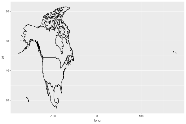
That looks pretty strange. What if I just simplified it to the US to start? As one would expect, that’s built in to the library, because it’s America.
usa <- map_data("usa")
ggplot() + geom_polygon(data = usa, aes(x = long, y = lat, group = group), fill = NA, colour = "black")
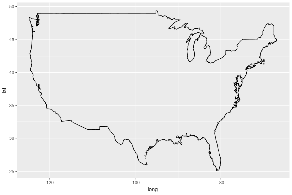
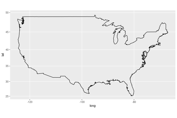
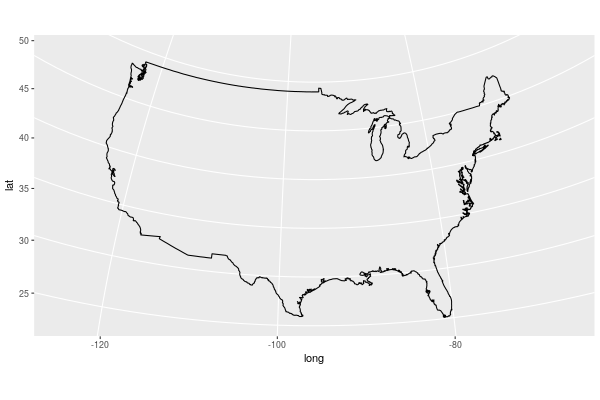
That looks pretty much right, to my unAmerican eyes, but it’s affected by how I size the image, and that’s not right. I want it fixed and accurate. For that, coord_map() does the job. By default it uses the Mercator projection.
ggplot() + geom_polygon(data = usa, aes(x = long, y = lat, group = group), fill = NA, colour = "black") + coord_map()
That looks better, but what about the other projections? For that I need to use the mapproj library. First, hex.
# install.packages("mapproj")
library(mapproj)
ggplot() + geom_polygon(data = usa, aes(x = long, y = lat, group = group), fill = NA, colour = "black") + coord_map(projection = "hex")
That’s not right! What about polyconic?
ggplot() + geom_polygon(data = usa, aes(x = long, y = lat, group = group), fill = NA, colour = "black") + coord_map(projection = "polyconic")
Or gnomonic?
ggplot() + geom_polygon(data = usa, aes(x = long, y = lat, group = group), fill = NA, colour = "black") + coord_map(projection = "gnomonic")
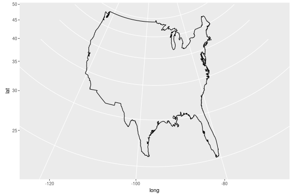
Weird. Finally I decided sinusoidal looks nice.
ggplot() + geom_polygon(data = usa, aes(x = long, y = lat, group = group), fill = NA, colour = "black") + coord_map(projection = "sinusoidal")
Mapping the data
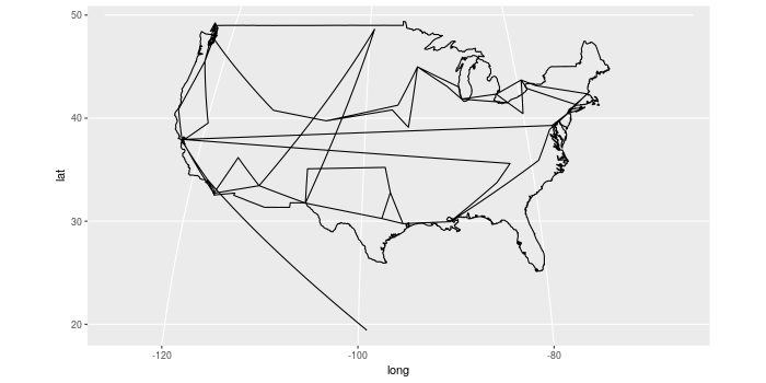
My first attempt at adding points to the map failed.
ggplot() +
    geom_polygon(data = usa, aes(x = long, y = lat, group = group), fill = NA, colour = "black") +
    geom_path(data = amt, aes(x = lng, y = lat)) +
    geom_point() +
    coord_map(projection = "sinusoidal")
I got Error: Discrete value supplied to continuous scale.

I’ve seen that happen before, and it’ll be something to do with the data in amt not being the right type: numbers are characters, or dates are numbers, or something.
str(amt)
ℝ> str(amt)
'org_babel_R_eoe'
str(amt)
'data.frame':	74 obs. of  6 variables:
 $ date      : chr  "2016-03-13" "2016-03-15" "2016-03-16" "2016-03-17" ...
 $ city      : chr  "Mexico City" "Los Angeles" "San Francisco" "Reno" ...
 $ adminCode1: chr  "09" "CA" "CA" "NV" ...
 $ country   : chr  "MX" "US" "US" "US" ...
 $ lng       : chr  "-99.12766" "-118.24368" "-122.41942" "-119.8138" ...
 $ lat       : chr  "19.42847" "34.05223" "37.77493" "39.52963" ...
Everything is “chr”, which means it’s all strings. R doesn’t know what’s a data and what’s a number. No wonder nothing is working. We need to force everything to be the data type we want.
amt <- amt %>%
    mutate(date = as.Date(date),
           city = as.factor(city),
           adminCode1 = as.factor(adminCode1),
           country = as.factor(country),
           lng = as.numeric(lng),
           lat = as.numeric(lat)) %>%
    as_tibble()
head(amt)
| date | city | adminCode1 | country | lng | lat |
|---|---|---|---|---|---|
| 2016-03-13 | Mexico City | 09 | MX | -99.12766 | 19.42847 |
| 2016-03-15 | Los Angeles | CA | US | -118.24368 | 34.05223 |
| 2016-03-16 | San Francisco | CA | US | -122.41942 | 37.77493 |
| 2016-03-17 | Reno | NV | US | -119.8138 | 39.52963 |
| 2016-03-18 | Portland | OR | US | -122.67621 | 45.52345 |
| 2016-03-19 | Vancouver | 02 | CA | -123.11934 | 49.24966 |
Now it’s right:
ℝ> str(amt)
Classes ‘tbl_df’, ‘tbl’ and 'data.frame':	74 obs. of  6 variables:
 $ date      : Date, format: "2016-03-13" "2016-03-15" ...
 $ city      : Factor w/ 52 levels "Albuquerque",..: 29 27 46 41 40 50 51 8 48 10 ...
 $ adminCode1: Factor w/ 31 levels "02","08","09",..: 3 5 5 21 25 1 1 30 30 10 ...
 $ country   : Factor w/ 3 levels "CA","MX","US": 2 3 3 3 3 1 1 3 3 3 ...
 $ lng       : num  -99.1 -118.2 -122.4 -119.8 -122.7 ...
 $ lat       : num  19.4 34.1 37.8 39.5 45.5 ...
Much better. And now if we try the map …
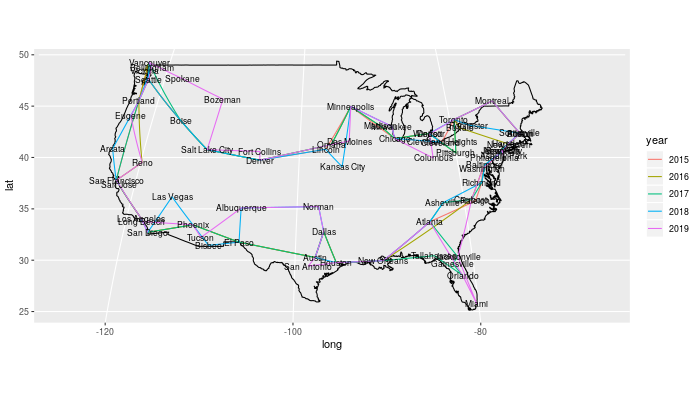
ggplot() +
    geom_polygon(data = usa, aes(x = long, y = lat, group = group), fill = NA, colour = "black") +
    geom_path(data = amt, aes(x = lng, y = lat)) +
    geom_point() +
    coord_map(projection = "sinusoidal")
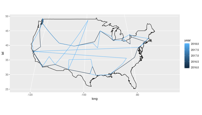
Aha! It works! The Canadian gigs fit in because they’re below the 49th parallel (or so close to it that they fit in the padding, in Vancouver’s case), but the Mexico city show is quite far south. Since there’s just the one that we know of, let’s exclude it for now and maybe add it back later. Something looks strange about the lines inside the US, so let’s colour them by year, which we’ll do with lubridate.
Also, having lng and long is annoying, so let’s rename lng to long.
amt_nomx <- amt %>%
    filter(country != "MX") %>%
    rename(long = lng) %>%
    mutate(year = year(date))
ggplot() +
    geom_polygon(data = usa, aes(x = long, y = lat, group = group), fill = NA, colour = "black") +
    geom_path(data = amt_nomx, aes(x = long, y = lat, colour = year)) +
    geom_point() +
    coord_map(projection = "sinusoidal")
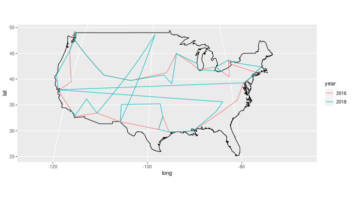
This often happens. It’s treating the year as a continuous variable, but we want them strictly separate. Turning them into factors fixes this.
amt_nomx <- amt %>%
    filter(country != "MX") %>%
    rename(long = lng) %>%
    mutate(year = as.factor(year(date)))
ggplot() +
    geom_polygon(data = usa, aes(x = long, y = lat, group = group), fill = NA, colour = "black") +
    geom_path(data = amt_nomx, aes(x = long, y = lat, colour = year)) +
    geom_point() +
    coord_map(projection = "sinusoidal")
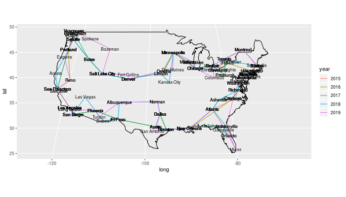
Something’s not right. There’s a big jump from the southwest up to North Dakota or somewhere up there, which wouldn’t happen, and a jump from the east coast to the west and back. The colour says it’s happening with 2018, so let’s just look at that and also label the cities so it’s easier to tell where the problems are.
amt_nomx_2018 <- amt_nomx %>% filter(year == 2018)
ggplot() +
    geom_polygon(data = usa, aes(x = long, y = lat, group = group), fill = NA, colour = "black") +
    geom_path(data = amt_nomx_2018, aes(x = long, y = lat, colour = year)) +
    geom_point() +
    geom_label(data = amt_nomx_2018, aes(x = long, y = lat, label = city)) +
    coord_map(projection = "sinusoidal")
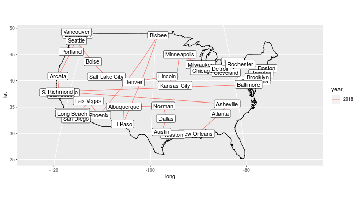
Clearly the Bisbee I’ve got isn’t the right one. It’s supposed to be Arizona, between El Paso and Phoenix. And that Richmond on the west coast should be Richmond VA in the east. Just looking up the cities by name isn’t enough. We need to use the adminCode1 when we look up the locations so we can fix the state.
Instead of figuring out how to make purrr work with three variables, I thought it would probably work to drop country but use adminCode1, which mean just changing a couple of variable names. It’s worth a try to save the time.
get_lng_lat <- function(city, adminCode1) {
  geo_df <- GNsearch(name_equals = city, adminCode1 = adminCode1)
  geo_df[1, c("lng", "lat")]
}

lng_lat <- purrr::map2_dfr(cities$city, cities$adminCode1, ~ get_lng_lat(.x, .y))
cities <- cities %>% bind_cols(lng_lat)
cities %>% head(10)
| city | adminCode1 | country | lng | lat |
|---|---|---|---|---|
| Vancouver | 02 | CA | -123.11934 | 49.24966 |
| Victoria | 02 | CA | -123.35155 | 48.4359 |
| Toronto | 08 | CA | -79.4163 | 43.70011 |
| Windsor | 08 | CA | -83.01654 | 42.30008 |
| Montreal | 10 | CA | -73.58781 | 45.50884 |
| Mexico City | 09 | MX | -99.12766 | 19.42847 |
| Bisbee | AZ | US | -109.92841 | 31.44815 |
| Phoenix | AZ | US | -112.07404 | 33.44838 |
| Tucson | AZ | US | -110.92648 | 32.22174 |
| Arcata | CA | US | -124.08284 | 40.86652 |
Now make the tibble again, and add in all our fixes.
amt <- tour_data %>%
    left_join(cities, by = "city") %>%
    as_tibble() %>%
    mutate(date = as.Date(date),
           city = as.factor(city),
           adminCode1 = as.factor(adminCode1),
           country = as.factor(country),
           lng = as.numeric(lng),
           lat = as.numeric(lat),
           year = as.factor(year(date))) %>%
    rename(long = lng)
amt_nomx <- amt %>%
    filter(country != "MX")
head(amt_nomx)
| date | city | adminCode1 | country | long | lat | year |
|---|---|---|---|---|---|---|
| 2016-03-15 | Los Angeles | CA | US | -118.24368 | 34.05223 | 2016 |
| 2016-03-16 | San Francisco | CA | US | -122.41942 | 37.77493 | 2016 |
| 2016-03-17 | Reno | NV | US | -119.8138 | 39.52963 | 2016 |
| 2016-03-18 | Portland | OR | US | -122.67621 | 45.52345 | 2016 |
| 2016-03-19 | Vancouver | 02 | CA | -123.11934 | 49.24966 | 2016 |
| 2016-03-20 | Victoria | 02 | CA | -123.35155 | 48.4359 | 2016 |
And now we map it.
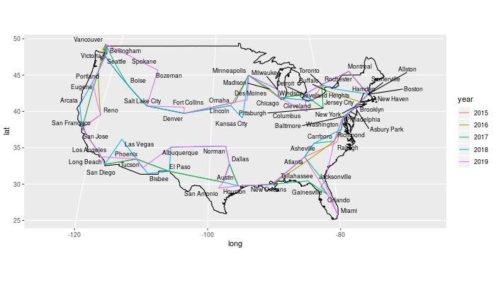
ggplot() +
    geom_polygon(data = usa, aes(x = long, y = lat, group = group), fill = NA, colour = "black") +
    geom_path(data = amt_nomx, aes(x = long, y = lat, colour = year)) +
    geom_point() +
    geom_text(data = amt_nomx, aes(x = long, y = lat, label = city), size = 3) +
    coord_map(projection = "sinusoidal")
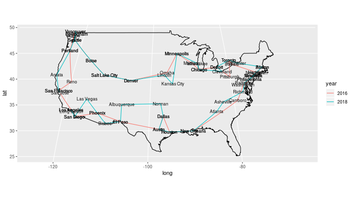
It worked! Much better! Using geom_text means the cities where they played twice are darker, which is a helpful unexpected side-effect while we’re working, but for the final image we’ll want it tidier, which we can do by plotting cities uniquely.
Adding more data
Now we need to add more data. So far I was just using tour information from 2016 and 2018, but I also had shirts for 2015 and 2019, so I made a new table, tour_data_2, with that information. I didn’t get a shirt in 2017, but Acid Mothers Temple & The Melting Paraiso U.F.O. North American Tour 2017 Hallelujah Mystic Tour on their web site lists the details, so I added that to the table too.
With the new data we need to recheck the cities information to make sure no new cities are missing. This code block needs to be rerun until it returns nothing. (As before, the tour data is being passed in to the Org source block through a variable setting only visible in the Org file.)
tour_data %>% bind_rows(tour_data_2) %>% left_join(cities, by = "city") %>% filter(is.na(adminCode1))
| date | city | adminCode1 | country |
Nothing. Good.
Now we go back to geolocating, to look up all the new cities. In fact I just look them all up, even the ones I already now.
lng_lat <- purrr::map2_dfr(cities$city, cities$adminCode1, ~ get_lng_lat(.x, .y))
cities <- cities %>% bind_cols(lng_lat)
cities %>% head(10)
| city | adminCode1 | country | lng | lat |
|---|---|---|---|---|
| Vancouver | 02 | CA | -123.11934 | 49.24966 |
| Victoria | 02 | CA | -123.35155 | 48.4359 |
| Toronto | 08 | CA | -79.4163 | 43.70011 |
| Windsor | 08 | CA | -83.01654 | 42.30008 |
| Montreal | 10 | CA | -73.58781 | 45.50884 |
| Mexico City | 09 | MX | -99.12766 | 19.42847 |
| Bisbee | AZ | US | -109.92841 | 31.44815 |
| Phoenix | AZ | US | -112.07404 | 33.44838 |
| Tucson | AZ | US | -110.92648 | 32.22174 |
| Arcata | CA | US | -124.08284 | 40.86652 |
amt <- tour_data %>%
    bind_rows(tour_data_2) %>%
    left_join(cities, by = "city") %>%
    as_tibble() %>%
    mutate(date = as.Date(date),
           city = as.factor(city),
           adminCode1 = as.factor(adminCode1),
           country = as.factor(country),
           lng = as.numeric(lng),
           lat = as.numeric(lat),
           year = as.factor(year(date))) %>%
    rename(long = lng)
amt_nomx <- amt %>% filter(country != "MX")
head(amt_nomx)
| date | city | adminCode1 | country | long | lat | year |
|---|---|---|---|---|---|---|
| 2016-03-15 | Los Angeles | CA | US | -118.24368 | 34.05223 | 2016 |
| 2016-03-16 | San Francisco | CA | US | -122.41942 | 37.77493 | 2016 |
| 2016-03-17 | Reno | NV | US | -119.8138 | 39.52963 | 2016 |
| 2016-03-18 | Portland | OR | US | -122.67621 | 45.52345 | 2016 |
| 2016-03-19 | Vancouver | 02 | CA | -123.11934 | 49.24966 | 2016 |
| 2016-03-20 | Victoria | 02 | CA | -123.35155 | 48.4359 | 2016 |
Now map all the tours.
ggplot() + geom_polygon(data = usa, aes(x = long, y = lat, group = group), fill = NA, colour = "black") + geom_path(data = amt_nomx, aes(x = long, y = lat, colour = year)) + geom_point() + geom_text(data = amt_nomx, aes(x = long, y = lat, label = city), size = 3) + coord_map(projection = "sinusoidal")
The general shapes of the tours are much clearer now. San Francisco, Portland, up to Vancouver, down to Salt Lake City and Denver, over to Minneapolis, then Chicago, Detroit, up to Toronto, over to the east cost of the US and a lot of gigs along there, then down to Atlanta, New Orleans, Texas, and across to southern California.
Let’s tidy up those city names. Some cities are visited on every tour. Which ones?
tour_years <- amt_nomx %>% select(year) %>% distinct() %>% nrow()
amt_nomx %>% count(city, sort = TRUE) %>% filter(n == tour_years)
| city | n |
|---|---|
| Austin | 5 |
| Brooklyn | 5 |
| Chicago | 5 |
| Dallas | 5 |
| Denver | 5 |
| Houston | 5 |
| Los Angeles | 5 |
| Minneapolis | 5 |
| New Orleans | 5 |
| Philadelphia | 5 |
| Phoenix | 5 |
| Portland | 5 |
| Salt Lake City | 5 |
| San Diego | 5 |
| San Francisco | 5 |
| Seattle | 5 |
| Toronto | 5 |
| Vancouver | 5 |
Nice to see Toronto is always on the itinerary!
While we’re looking, how are the tour lengths changing?
amt_nomx %>% count(year)
| year | n |
|---|---|
| 2015 | 31 |
| 2016 | 33 |
| 2017 | 39 |
| 2018 | 40 |
| 2019 | 46 |
Growing every year!
To show city names more cleanly, first we’ll make a tibble that is just the names and locations of each city, without duplication.
amt_nomx_cities <- amt_nomx %>% select(city, long, lat) %>% distinct()
head(amt_nomx_cities)
| city | long | lat |
|---|---|---|
| Los Angeles | -118.24368 | 34.05223 |
| San Francisco | -122.41942 | 37.77493 |
| Reno | -119.8138 | 39.52963 |
| Portland | -122.67621 | 45.52345 |
| Vancouver | -123.11934 | 49.24966 |
| Victoria | -123.35155 | 48.4359 |
Now do the map but use that list of unique cities for geom_text() so there’s no duplication.
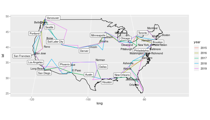
ggplot() +
    geom_polygon(data = usa, aes(x = long, y = lat, group = group), fill = NA, colour = "black") +
    geom_path(data = amt_nomx, aes(x = long, y = lat, colour = year)) +
    geom_point() +
    geom_text(data = amt_nomx_cities, aes(x = long, y = lat, label = city), size = 3) +
    coord_map(projection = "sinusoidal")
That’s cleaner, but in a few places the cities are so close together that their names turn into a mess. For that problem there’s a nice solution: ggrepel.
#install.packages("ggrepel")
library(ggrepel)
Now we can use geom_label_repel() or geom_text_repel().
ggplot() +
    geom_polygon(data = usa, aes(x = long, y = lat, group = group), fill = NA, colour = "black") +
    geom_path(data = amt_nomx, aes(x = long, y = lat, colour = year)) +
    geom_point() +
    geom_text_repel(data = amt_nomx_cities, aes(x = long, y = lat, label = city), size = 3) +
    coord_map(projection = "sinusoidal")
What if we put special labels on the cities that were visited in every tour? And to make it even cleaner, let’s not label any city they only visited once.
amt_nomx_cities <- amt_nomx %>% count(city, long, lat) %>% filter(n > 1 ) %>% mutate(every = (n == tour_years))
head(amt_nomx_cities)
| city | long | lat | n | every |
|---|---|---|---|---|
| Albuquerque | -106.65114 | 35.08449 | 2 | FALSE |
| Allston | -71.12589 | 42.35843 | 2 | FALSE |
| Asheville | -82.55402 | 35.60095 | 2 | FALSE |
| Atlanta | -84.38798 | 33.749 | 4 | FALSE |
| Austin | -97.74306 | 30.26715 | 5 | TRUE |
| Baltimore | -76.61219 | 39.29038 | 2 | FALSE |
ggplot() +
    geom_polygon(data = usa, aes(x = long, y = lat, group = group), fill = NA, colour = "black") +
    geom_path(data = amt_nomx, aes(x = long, y = lat, colour = year)) +
    geom_point() +
    geom_text_repel(data = amt_nomx_cities %>% filter(every == FALSE), aes(x = long, y = lat, label = city), size = 3) +
    geom_label_repel(data = amt_nomx_cities %>% filter(every == TRUE), aes(x = long, y = lat, label = city), size = 3) +
    coord_map(projection = "sinusoidal")
Now let’s clean it all up. I realized I don’t need geom_point() anyway.
ggplot() +
    geom_polygon(data = usa, aes(x = long, y = lat, group = group), fill = NA, colour = "black") +
    geom_path(data = amt_nomx, aes(x = long, y = lat, colour = year)) +
    geom_text_repel(data = amt_nomx_cities %>% filter(every == FALSE), aes(x = long, y = lat, label = city), size = 3) +
    geom_label_repel(data = amt_nomx_cities %>% filter(every == TRUE), aes(x = long, y = lat, label = city), size = 3, fill = "Pink") +
    labs(title = "Acid Mothers Temple & The Melting Paraiso U.F.O. North American tour locations",
         subtitle = "This band puts on mesmerizing, unforgettable shows",
         x = "",
         y = "",
         colour = "",
         caption = "William Denton (www.miskatonic.org) CC-BY") +
    theme_minimal() +
    theme(legend.position = "bottom",
          axis.text.x = element_blank(),
          axis.text.y = element_blank(),
          panel.grid = element_blank()) +
    scale_colour_brewer(palette = "Reds") +
    annotate("text", x = -110, y = 25, label = "And Mexico City in March 2016") +
    coord_map(projection = "sinusoidal")
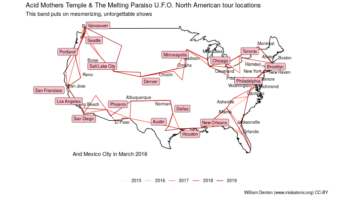
Note that they went backwards in 2017.
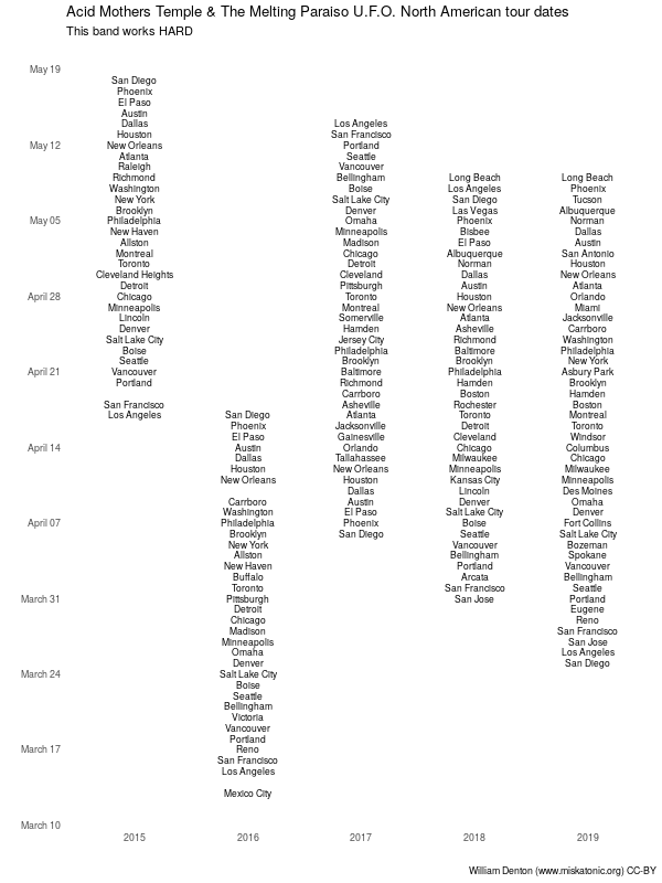
Lengthening tours
With all that data, we can ignore the locations and just look at dates to show how the tours are getting longer. The date thing I do here changes the year of every date to 2017, so that when the dates are mapped only the month and day will be used. I’ve found this is a nice trick to use when comparing years. There are probably better ways to do this, but it works.
ggplot(amt %>% mutate (date = date + years(2017 - as.numeric(year))), aes(x = year, y = date, label = city)) +
    geom_text(size = 3) +
    labs(title = "Acid Mothers Temple & The Melting Paraiso U.F.O. North American tour dates",
         subtitle = "This band works HARD",
         x = "",
         y = "",
         colour = "",
         caption = "William Denton (www.miskatonic.org) CC-BY") +
    theme_minimal() +
    theme(legend.position = "bottom",
          panel.grid = element_blank(),
          ) +
  scale_y_date(date_breaks = "week", date_labels = "%B %d")
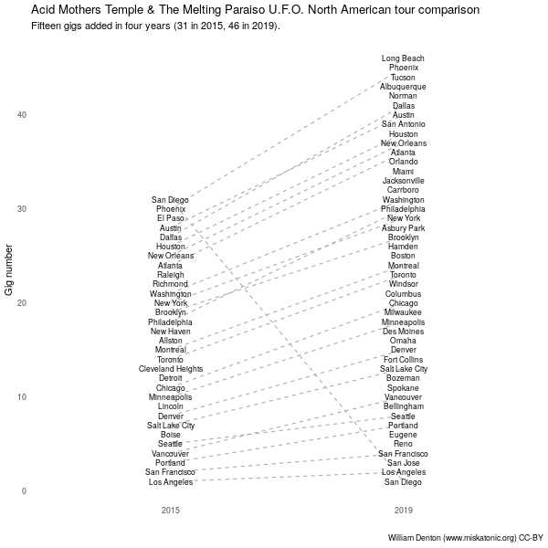
Comparing just the first and latest tours makes that even more obvious, and if we join the cities with lines (making a parallel plot, or something like it) it’s easier to see where new cities have been added and when city order has changed. San Diego stands out because once it was the first stop and once it was the last.
amt %>%
    group_by(year) %>%
    mutate (gig_number = row_number()) %>%
    filter(year %in% c(2015, 2019)) %>%
    ggplot(aes(x = year, y = gig_number, label = city, group = city)) +
geom_path(linetype = "dashed", colour = "darkgrey") +
    geom_text(size = 3) +
    labs(title = "Acid Mothers Temple & The Melting Paraiso U.F.O. North American tour comparison",
         subtitle = "Fifteen gigs added in four years (31 in 2015, 46 in 2019).",
         x = "",
         y = "Gig number",
         colour = "",
         caption = "William Denton (www.miskatonic.org) CC-BY") +
    theme_minimal() +
    theme(panel.grid = element_blank())
Conclusion
That’s it for mapping this Acid Mothers Temple tour data.

write_csv(amt, "amt.csv")
The finished data is in amt.csv if you want to load it in yourself, or refer to the raw Org file for everything.