I just figured out how to fix a small problem that had been bugging me about charts showing annual circulation activity of items in our collection.
Let’s say I have a book that circulated in 2008 and 2015, but no years between.
library(ggplot2)
circ_data <- data.frame(year = c(2008, 2015), circs = c(10, 15))

ggplot (circ_data, aes(x = year, y = circs)) + geom_col()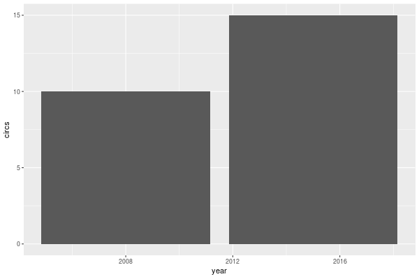
That’s not right. Those columns are just too wide, the years don’t line up, and you can’t tell what’s going on.
The width option does the trick. The docs say, “Bar width. By default, set to 90% of the resolution of the data.” I don’t know why it’s so wide above, but setting it to 0.9 makes it look just right. (And note how nicely the axes look without any special settings—the defaults almost always do just what one needs.)
ggplot (circ_data, aes(x = year, y = circs)) + geom_col(width = 0.9)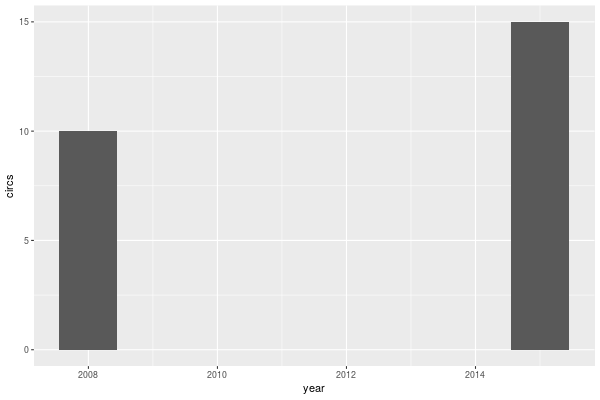
If the x-axis is showing years then using width = "330" works, for example; the width is being measured in days, and that’s about 90% of 365 days. Depending on what units are being shown on the x-axis, some tinkering may be required.